Apple’s latest hardware releases are here, but as always, Apple’s design choices are sparking lively debates among tech enthusiasts. On the chopping block this year? The Magic Mouse’s upside-down charging port and a new power button tucked under the Mac mini. The tech community has some strong opinions about Apple’s quirky design decisions that blend function with frustration.
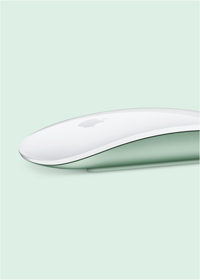
The refreshed Magic Mouse, now with USB-C, still comes with its infamous design flaw where the charging port remains on the bottom of the device. Yes, in 2024, this means you still have to flip the mouse belly-up to charge it, leaving it unusable while powering up. As The Verge quipped, Apple has left this “mocked for nearly a decade” design quirk untouched.

For some, this decision borders on baffling. It’s hard to believe Apple still thinks the best way to charge the Magic Mouse is by flipping it over. Others argue that this minor annoyance is the least of the mouse’s problems. One particularly vocal commenter went so far as to call it “objectively terrible,” adding that while they understand its appeal, the overall design, ergonomics, and even the sensor are still far from functional perfection.
However, some users remain unbothered, calling the port placement more meme-worthy than problematic. “Take a coffee break,” one commenter shrugged, noting it only takes a few minutes to power the mouse for hours of use. Others argued that it was likely deliberate, speculating that if the mouse could be used while charging, Apple loyalists would keep it plugged in, undermining Apple’s “wireless everything” mantra.
The Mac mini’s bottom power button puzzle
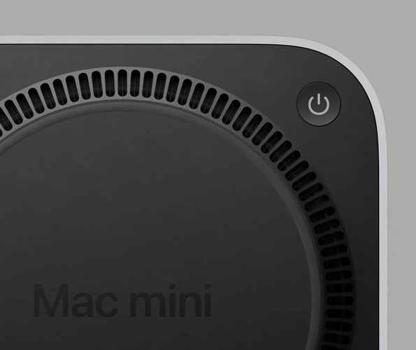
In another twist, Apple has also redesigned the Mac mini with the new M4 chip, slimming it down and adding more ports — but in doing so, they’ve relegated the power button to the device’s underside. Yes, you’ll need to tip up your Mac mini to reach the power button, a change that’s left users both baffled and bemused.
In response, the online reactions have been mixed but largely nonchalant. “Who turns off their Mac, like ever?” one Reddit user asked, capturing a sentiment shared by many: if Macs can practically live in sleep mode, is a power button placement worth a fuss? Some speculated this location might be intentional, to discourage full shutdowns and support a “more seamless” wake-from-sleep experience.
While few users are up in arms about the new power button location, the move isn’t entirely without critics. A Reddit post suggesting that Apple might be sticking it to Amazon by complicating rack-mounted setups for Mac minis gained nearly 600 upvotes. Another user humorously reasoned that it’s “to prevent idiots from turning off someone’s Mac mini” by accident, adding a playful spin to the debate.

Not everyone sees these design choices as a dealbreaker. Despite the backlash, several loyal users have come to the Magic Mouse’s defense, arguing that its shape and design work well for them. “I’ve been using it since forever and have zero complaints,” wrote one user, explaining they hold the mouse in a way that doesn’t impact comfort.
As for the Mac Mini’s elusive power button? Many agree that pressing it is a rare necessity. “I’ve had to press the power button on my 2020 Mac mini maybe five times in the four years I’ve had it,” one user mentioned, suggesting Apple’s choice was more about streamlining design than inconveniencing users.
But for those with less patience, alternative devices are looking more appealing. Many are flocking to the Logitech MX Master series for a more ergonomic mouse experience. “The only reason I bought the MX Master 3 was because it was far more ergonomic,” one user commented, adding that it wasn’t about charging issues but comfort.
Design quirks or deal-breakers?
Apple’s design tweaks have consistently provoked strong reactions. While its hardware may look sleek, these choices raise questions about whether they’re keeping functionality front and center. The Magic Mouse’s charging dilemma and Mac mini’s hidden power button may be minor nuisances for some, but for others, they symbolize an ongoing debate around Apple’s commitment to both form and function. As one commenter humorously put it: “It’s so bad, it’s hilarious.”
In the end, Apple’s latest hardware choices may signal a growing divide between those willing to embrace Apple’s quirks and those who are ready to jump ship for an experience that’s a bit more, well, ergonomic.
TechIssuesToday primarily focuses on publishing 'breaking' or 'exclusive' tech news. This means, we are usually the first news website on the whole Internet to highlight the topics we cover daily. So far, our stories have been picked up by many mainstream technology publications like The Verge, Macrumors, Forbes, etc. To know more, head here.


