Apple Watch users might want to wave goodbye to the Now Playing complication they’ve come to rely on. If you’ve recently updated to watchOS 11 and found yourself squinting at your wrist, wondering where your favorite media control complication disappeared to, you’re not alone. Apple has seemingly shaken things up, and while some users are embracing the change, many are not happy with it.
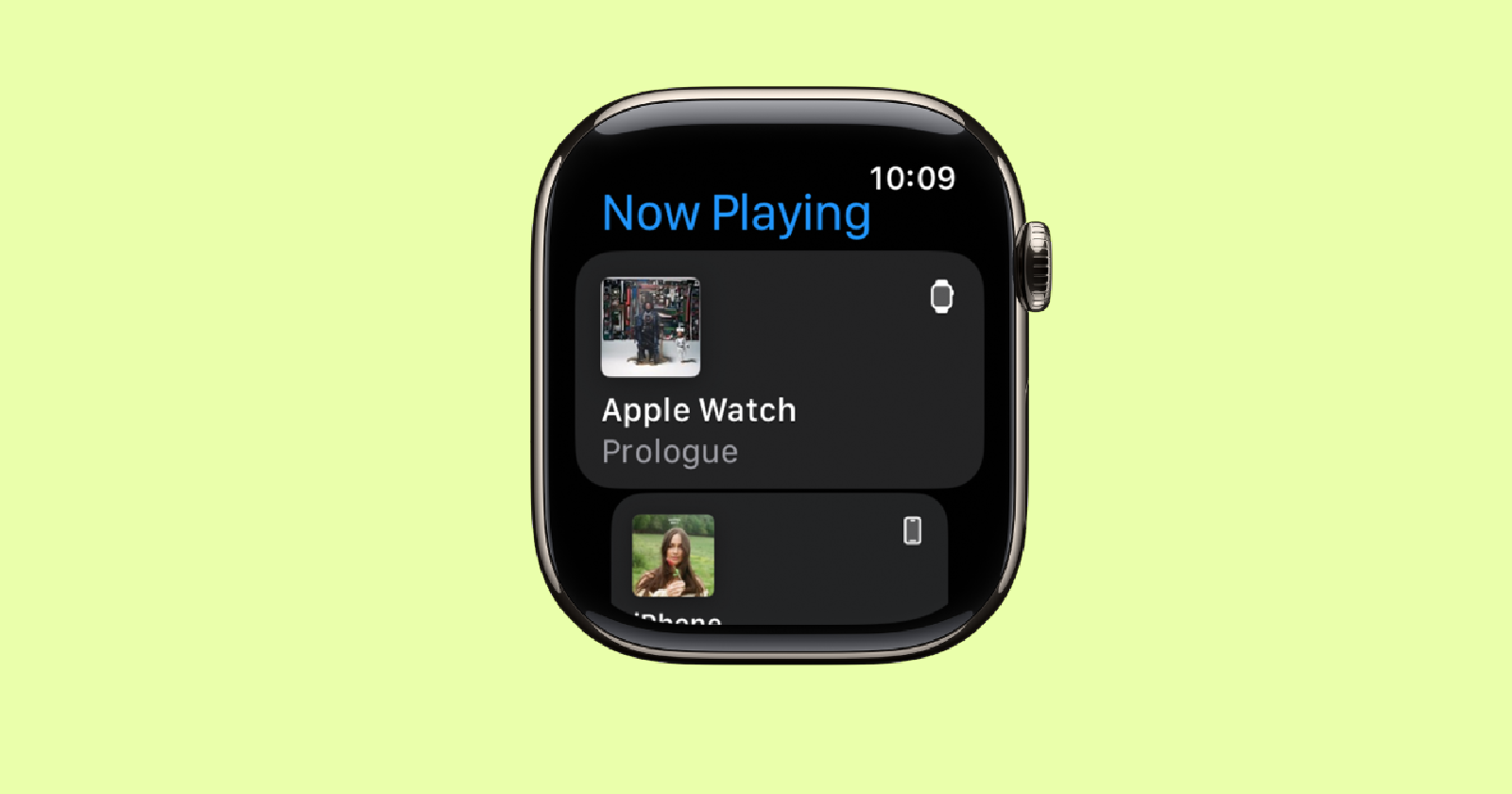
In the latest watchOS 11 update, Apple Watch users are reporting that Apple decided to retire the old Now Playing complication from your watch face and replace it with something… different. Enter Smart Stack — a set of dynamic widgets designed to show you the most relevant information at any given time. Sounds great in theory, right? But in practice, things are a bit messier, especially for Apple Watch users who lived and breathed by the Now Playing complication to control music, podcasts, or audiobooks.
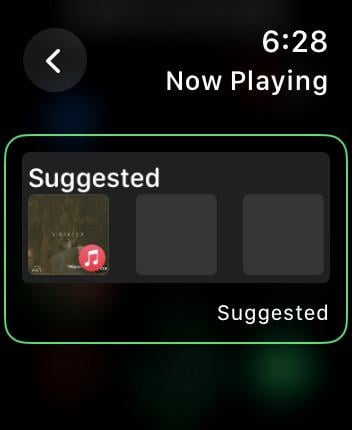
Instead of showing what is playing on your iPhone or HomePod, the new Smart Stack complication seems to prioritize “Suggestions,” which often serve up random songs or podcasts you might (or more likely, might not) be interested in.
Apple hasn’t explained why the change. But the rationale behind this switch seems to be rooted in Apple’s broader vision for Smart Stack, a feature that’s been around for a while. Apple describes Smart Stack as a set of widgets that adapt to your daily routine, showing timely information based on the time, your location, and what you’re doing. Need the weather in the morning? It’s there. Boarding passes when you’re at the airport? Smart Stack’s got you covered. And now in watchOS 11, when you’re playing media, Smart Stack is supposed to show you Live Activities, including the controls for your music or podcasts.
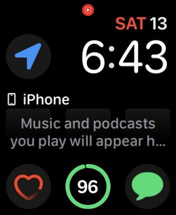
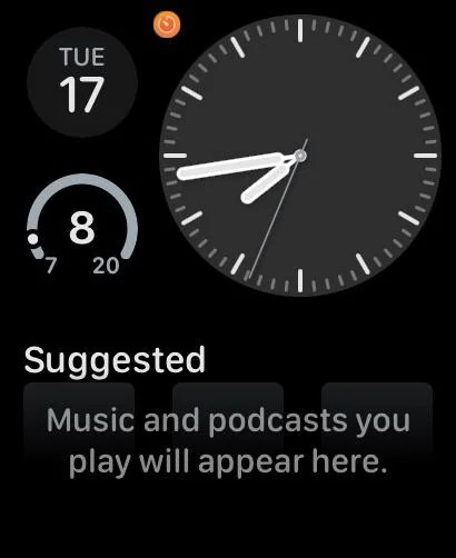
However, there’s a catch. The new setup doesn’t quite work as consistently as its predecessor. Reports from beta testers and users of the stable release are peppered with complaints about the complication’s unresponsive behavior, showing vague messages like, “Music and podcasts you play will appear here.” Not exactly what you want to see when you’re trying to skip to the next track during your workout.
User feedback has been swift and not exactly sweet. Many who used the Now Playing complication daily feel that this new approach is clunky and unreliable. The Smart Stack might occasionally display your current media, but it’s far from guaranteed, and the need to swipe or dig into widgets just isn’t as intuitive as the old one-tap Now Playing control. Some have even gone so far as to set the music app to automatically open when playing media, trying to reclaim a semblance of the simplicity they’ve lost.
But here’s the kicker: even though the Now Playing complication is supposed to appear in the Smart Stack when you’re actively playing something, it often doesn’t, making you scroll or swipe to find it, or worse, showing suggested content you have no interest in.
For those missing the Now Playing complication, the Smart Stack does offer some familiar functionality. You can customize it, adding, removing, and rearranging widgets to your liking. Want to make sure your media controls are at the top of the stack? Pin it! However, it’s still a step down from the effortless glance-and-control experience many users cherished.
For now, be sure to join the chorus of feedback flooding Apple’s support pages and hope they bring back the old Now Playing complication — or at least make Smart Stack a bit smarter. In the meantime, play around with your watch settings and explore workarounds, like configuring your watch to auto-launch the media app when playing content.
TechIssuesToday primarily focuses on publishing 'breaking' or 'exclusive' tech news. This means, we are usually the first news website on the whole Internet to highlight the topics we cover daily. So far, our stories have been picked up by many mainstream technology publications like The Verge, Macrumors, Forbes, etc. To know more, head here.
R16-01-2025
I hate it. I hate it so much. Every time I update I check if they added the original back as an option and every time it makes me mad all over again.
ReplyVinTheDean01-10-2024
If they want to add a new complication and make it the default fine. But they should have left the original one as an option.
Reply


Sss09-04-2025
Reply