Firefox has finally joined the vertical tabs party, introducing a feature that’s been gaining popularity among power users for years. As someone who’s been a big fan of vertical tabs in other browsers, I decided to take the plunge and enabled vertical tabs in Firefox Nightly. Here’s my experience and a guide on how you can try it out too.
Vertical tabs have been a staple in browsers like Microsoft Edge and Vivaldi for some time now, with Edge introducing them back in 2020. Even Chrome has had unofficial extensions providing this functionality. Firefox’s implementation, while still in its early stages, shows promise for users who frequently juggle multiple tabs.
To get started with vertical tabs in Firefox, you’ll need to be running Firefox Nightly, the cutting-edge version where new features are tested. Here’s how to enable the feature:
- Update to the latest Firefox Nightly (version 131 or later).
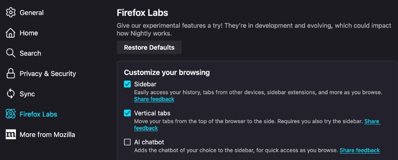
- Navigate to Settings > Firefox Labs.
- Activate both the “Sidebar” and “Vertical tabs” experiments.

It’s important to note that enabling just the vertical tabs option won’t be enough – you need both the sidebar and vertical tabs features activated for this to work.
After enabling these options, you might be puzzled to find that vertical tabs aren’t immediately visible. This is because Firefox currently requires an extra step: adding the sidebar icon to your toolbar. To do this:
- Right-click on the toolbar and select “Customize toolbar.”
- Drag the sidebar icon to your desired location on the toolbar.
This extra step is temporary, and Firefox developers have mentioned that in future updates, the icon will be added automatically.
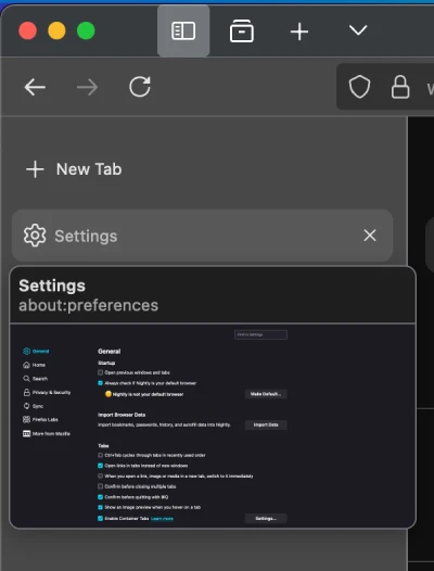
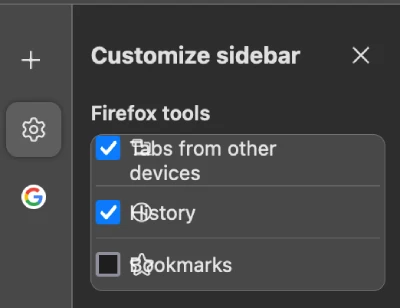
Upon first use, I found the vertical tabs experience in Firefox to be quite basic but functional. The sidebar neatly organizes your tabs in a vertical list, making it easier to read tab titles and manage large numbers of open pages. However, I did notice some UI glitches, particularly with text overlapping the icons in the sidebar, at least on my MacBook Air. This is to be expected in an experimental feature, and I’m sure these issues will be ironed out in future updates.
Compared to other browsers, Firefox’s implementation feels a bit bare-bones at the moment. For instance, Arc Browser, which has become my go-to for its innovative features, offers a more polished vertical tabs experience. However, it’s exciting to see Firefox moving in this direction, and I’m looking forward to seeing how they refine the feature.
One thing I appreciate about Firefox’s approach is the customization options. You can choose which tools appear in the sidebar, such as history and bookmarks, alongside your vertical tabs. This flexibility allows for a more personalized browsing experience.
It’s worth noting that this feature is still very much a work in progress. The Firefox team has been transparent about their plans for improvement, and they’re actively seeking user feedback to shape the future of vertical tabs in the browser.
For heavy multitaskers or those who frequently work with numerous tabs open, vertical tabs can be a game-changer. They make it easier to navigate between tabs, read tab titles at a glance, and manage your browsing sessions more efficiently. If you’re a Firefox user who loves to experiment with new features, I’d encourage you to give vertical tabs a try and share your feedback with the development team.


