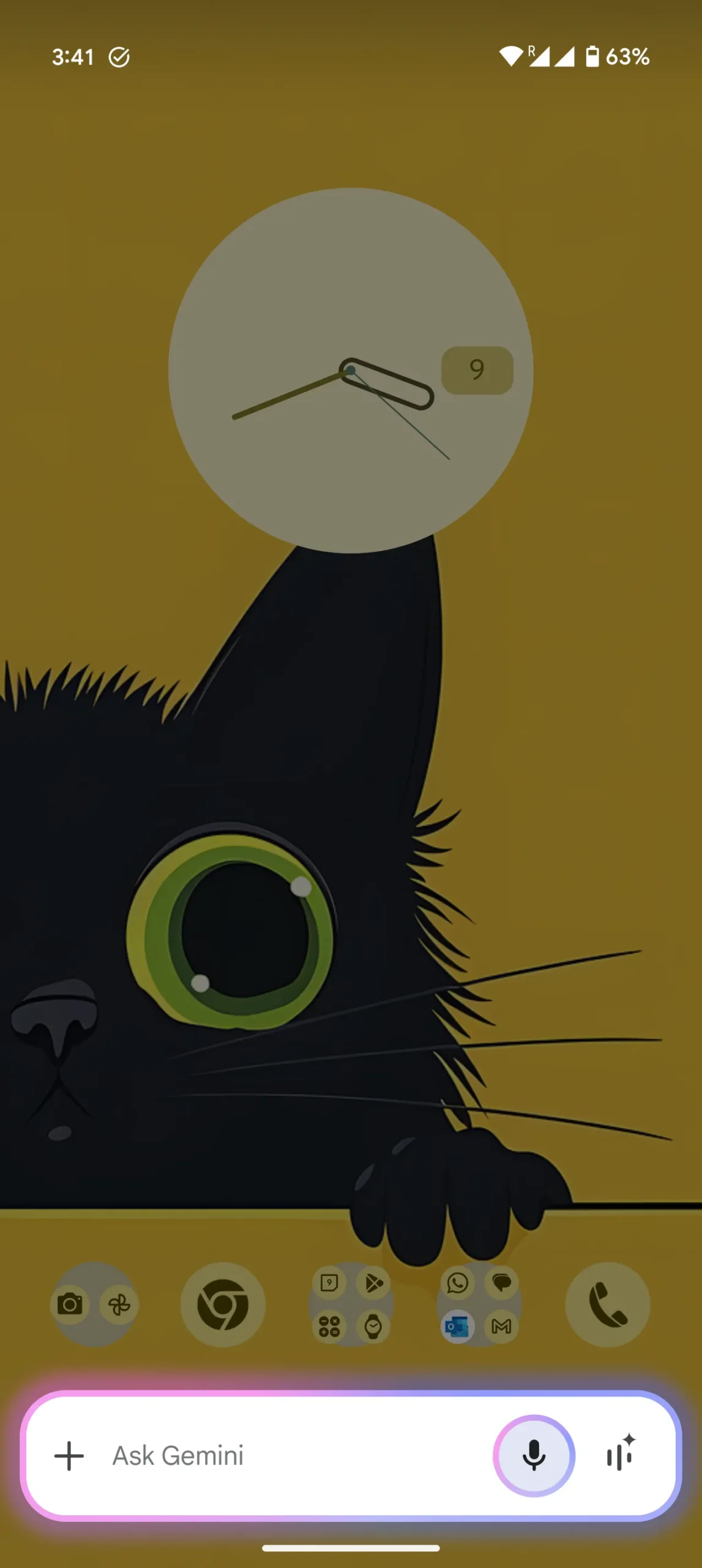
Google Gemini’s floating overlay is getting a small but noticeable makeover, and it’s bringing a splash of color to your screen. A recent screenshot shared by a Redditor shows the updated design with a much brighter and more colorful overlay bar than we’ve seen before. While the earlier reports, like the one from Android Authority, didn’t mention the addition of this extra color, it’s clear from the image that Google is adding some flair to the Gemini experience.
Here’s the screenshot shared by the Redditor for reference:
This colorful update is part of a larger UI overhaul that’s gradually rolling out to users. The new overlay bar keeps the familiar floating format but now sports more vibrant hues, making it stand out a bit more than the previous, more muted version. The change seems to align with Google’s ongoing efforts to update the design of Gemini’s interface, making it sleeker and easier to use.
The latest update isn’t just about looks though. Google is also making tweaks to the layout of Gemini’s floating overlay, shrinking the text box and adding left-aligned suggestions on top. This not only reduces the amount of space the overlay takes up but also makes it more user-friendly by allowing users to quickly view suggestions without having to scroll horizontally.
Like me, if you too aren’t seeing the new UI, you can check out this video for an idea of how things will look once Google flips the switch for you too:
It’s clear that Google is aiming to make Gemini’s interface more intuitive and visually appealing, with this colorful update being just one of the many changes. The addition of a brighter overlay bar is a small step, but it might just make using Gemini a little more fun. Keep an eye out for this new design rolling out in the coming days.


