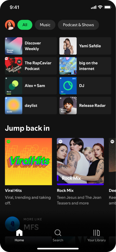
Last month, Spotify unveiled its new bespoke font to replace the familiar Circular typeface, Spotify Mix. This change was spearheaded by Rasmus Wängelin, Spotify’s Global Head of Brand Design, who described Spotify Mix as a variable font merging elements from various styles, evoking the rhythm of sound waves. Designed in collaboration with Berlin-based foundry Dinamo Typefaces, the company touts it as a unique reflection of the dynamic and evolving nature of audio culture that aims to enhance the visual experience on the platform.
But as the rollout of the new Spotify Mix font reaches more users, a chorus of disapproval is growing louder. Social media platforms, especially X, are abuzz with complaints about the new font. Users are describing it as “disgusting,” “awful,” “ugly,” and even comparing it to the much-maligned Comic Sans. Some have expressed frustration over the font’s pointed edges, narrowness, and inconsistent letterforms.
The complaints aren’t just about aesthetics. Some users have also pointed out legibility issues, particularly with the combined IJ letterform, which is commonly used in Dutch and the inconsistent crossbars on the T and F. These technical flaws have further fueled the backlash, with most users preferring the outgoing Circular typeface.

Despite the outcry, some users remained indifferent to the change, focusing instead on the primary purpose of Spotify: listening to music. Sure, the majority of feedback seems to be negative. But as usual, there are a few outliers who actually like the new font while others don’t really care about the change.
As someone who spends a significant amount of time on Spotify, I can understand the uproar. Fonts, though seemingly trivial, play a crucial role in our digital experience. A sudden change can be jarring, especially when it involves a platform so integrated into our daily lives. The new font may feel a bit jarring and perhaps even doesn’t fit with Spotify’s overall aesthetic. Think of wearing a tuxedo with sneakers.
But hey, at the end of the day, the primary function of Spotify is to provide a platform for listening to music and podcasts. And as long as the app continues to do that effectively, the font choice is, at least for me, a minor inconvenience I can live with. While the immediate reaction has been mixed, it’s possible that users will eventually adapt and appreciate the new design.
It remains to be seen whether Spotify will respond to the negative feedback and make any adjustments to the new Mix font. Perhaps they could offer users the option to switch back to the old font, or maybe they’ll refine Spotify Mix based on user feedback.
In the meantime, it seems that many users will have to get used to the new look.


