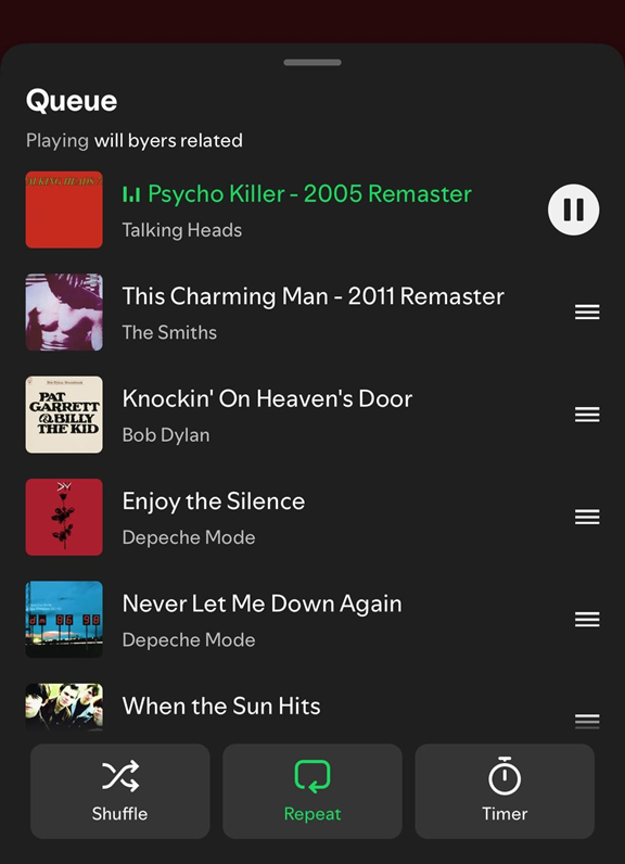
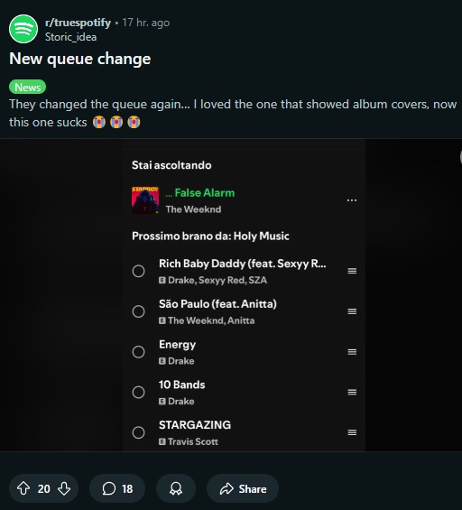
They brought back the old mobile queue on Spotify pic.twitter.com/Eez6uj64N8
— joseph. (@Zeleistt) November 28, 2024
Spotify has once again thrown its users into a whirlwind of emotions with its latest queue layout updates — or should we say experiments? A few weeks back, the music streaming giant rolled out a new queue interface. It flaunted eye-catching album artwork, shuffled essential buttons like Repeat and Timer, and revamped the play-pause area to coexist harmoniously with the currently playing track. A subtle upgrade, you might think, but as with all things in tech, there’s always a catch.
In its quest to dazzle users with aesthetics, Spotify inadvertently axed the multi-select feature. Yep, that oh-so-handy function for purging multiple songs from the queue in one fell swoop disappeared, leaving users clicking on songs individually like it’s 2012. The UI fix may have solved an older issue (cough, missing album art), but it created fresh headaches.

The new interface sparked polarizing feedback. While some basked in the visual upgrades, others grumbled about the practicality of the changes — or lack thereof.
Fast forward to today, and here’s where things get interesting. Spotify appears to be pulling a classic “Oops, we heard you!” move. A couple of reports have emerged that the platform is reverting back to its old, no-nonsense queue layout. Gone are the album artwork and bottom buttons for Shuffle and Timer, and in their place? Good ol’ multi-select functionality and a UI you could use with muscle memory alone.
Now, I’ve been something of a spectator in this saga. Despite having the latest Spotify updates on both Android and iOS, I never saw the fancy new UI on my devices. It’s like being the one person who doesn’t get glitter at a confetti party — though, in hindsight, it seems I dodged the frustration. A couple of users who had the new layout are now noticing a rollback, suggesting Spotify may have taken a cue from user feedback. However, it seems the new UI had already grown on some users.

Given Spotify’s history, it’s entirely possible that this was just a UI test on a select group of users. The company loves to dip its toes in the water before diving in with a full rollout, gauging whether a feature is worth the hype — or the backlash. So, what’s the deal? Was this an experiment gone wrong, or are we witnessing the early stages of a bigger interface overhaul?
For now, the queue confusion is real. Some users have the sleek new layout; others never got it. A few have different layouts on Android and iOS, while some are seeing the old-school UI return. Spotify’s silence on the matter isn’t helping, but hey, maybe they’re busy curating Wrapped 2024 to help us get through the chaos.
Whether you loved or loathed the new design, this saga highlights the importance of user feedback even for a streaming behemoth like Spotify. Let’s just hope that when the dust settles, we end up with a queue layout that combines beauty and brains — without sacrificing functionality.
So, which side are you on? Team album art or team multi-select? Share your thoughts in the comments.
TechIssuesToday primarily focuses on publishing 'breaking' or 'exclusive' tech news. This means, we are usually the first news website on the whole Internet to highlight the topics we cover daily. So far, our stories have been picked up by many mainstream technology publications like The Verge, Macrumors, Forbes, etc. To know more, head here.


