


Bungie is facing a wave of criticism from Destiny 2 players following the launch of the Edge of Fate expansion. The update, which dropped earlier this week, brought a slew of UI overhauls aimed at making the game more accessible for new Guardians.
But for many longtime fans, these tweaks have stripped away some of the charm and functionality that defined the experience. Reddit and X are being flooded with reports from players frustrated over the desaturated director screen, the introduction of a new portal system, and the axing of the Pathfinder reward mechanic.
The director screen has been a staple in Destiny since the beginning. It’s that orbital map where players pick destinations, launch missions, and get a sense of the universe’s scale. With Edge of Fate, Bungie dialed back its colors, leaving it looking washed out and dull. Players argue this was a deliberate move to steer everyone toward the new portal, a fresh hub meant to simplify activity selection. One Reddit user captured the sentiment perfectly, saying, “I can understand them wanting to iterate and evolve the game with time, but the director screen is such an iconic part of destiny’s identity and this treatment of it is so fuc**ng dumb imo.”

As you can see, over two thousand players agree with the OP. Complaints poured in about how the greyer tones make the director feel like abandoned content, almost hostile to use. Some compared it to a low-budget filter slapped on to discourage clicks. This isn’t just aesthetic nitpicking.
Veterans say it disrupts their flow, especially when hopping between planets or checking weekly challenges. Bungie has pitched these changes as part of a broader effort to refresh the game after a decade, but the backlash suggests they might have underestimated how attached players are to the old layout.
Then there’s the portal itself, the centerpiece of the UI revamp. Designed as a one-stop shop for jumping into strikes, crucible matches, and other activities, it’s supposed to cut down on menu diving. In practice, though, many find it clunky and uninspiring. It’s got big, boxy buttons that scream mobile app more than epic space opera.
Activities like raids and dungeons are missing from it entirely, forcing players back to the director anyway. Matchmaking glitches and hidden submenus add to the headaches. The portal’s defenders say it helps newcomers avoid getting overwhelmed by Destiny’s sprawling options, but some players call it a step backward, turning the game into something generic.
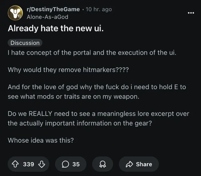
There are multiple posts on Reddit from players who dislike the system. One even went as far as to say that they “hate the new UI.”
Adding fuel to the fire is the removal of the Pathfinder system. This was a grindable bounty board that let players rack up Bright Dust, the in-game currency for cosmetics, at their own pace. Now it’s gone, swapped for a weekly capped version that tops out at around 1,000 Bright Dust if you hit daily challenges. Fans who farmed endlessly before feel cheated, seeing it as a ploy to nudge them toward buying Silver with real money. The old Pathfinder had its flaws, like being tied to specific activities, but after Bungie split it up, it became a reliable way to earn rewards without time gates.

Some players are also pointing out that Destiny 2’s economy has been tightening over the years, with less free stuff and more emphasis on Eververse store purchases. It’s not the first time Bungie has adjusted rewards, but coming alongside the UI mess, it stings extra hard.
Other tweaks are drawing ire too, like scrapping perk names from weapon hover previews. Now you just get icons and flavor text, forcing an extra button hold to see details. It’s a small thing, but when you’re sorting through loot drops, it adds up to real annoyance. Icons are tiny and hard to parse quickly, especially for perks you don’t memorize.

From what I see, players are hoping that Bungie listens and rolls back some changes, keeping the game’s soul intact while welcoming fresh faces. If not, this backlash might linger longer than expected. Anyway, feel free to share your thoughts about the new update in the comments below!
TechIssuesToday primarily focuses on publishing 'breaking' or 'exclusive' tech news. This means, we are usually the first news website on the whole Internet to highlight the topics we cover daily. So far, our stories have been picked up by many mainstream technology publications like The Verge, Macrumors, Forbes, etc. To know more, head here.


Dwayne Cubbins
1454 Posts
For nearly a decade, I've been deciphering the complexities of the tech world, with a particular passion for helping users navigate the ever-changing tech landscape. From crafting in-depth guides that unlock your phone's hidden potential to uncovering and explaining the latest bugs and glitches, I make sure you get the most out of your devices. And yes, you might occasionally find me ranting about some truly frustrating tech mishaps.

