


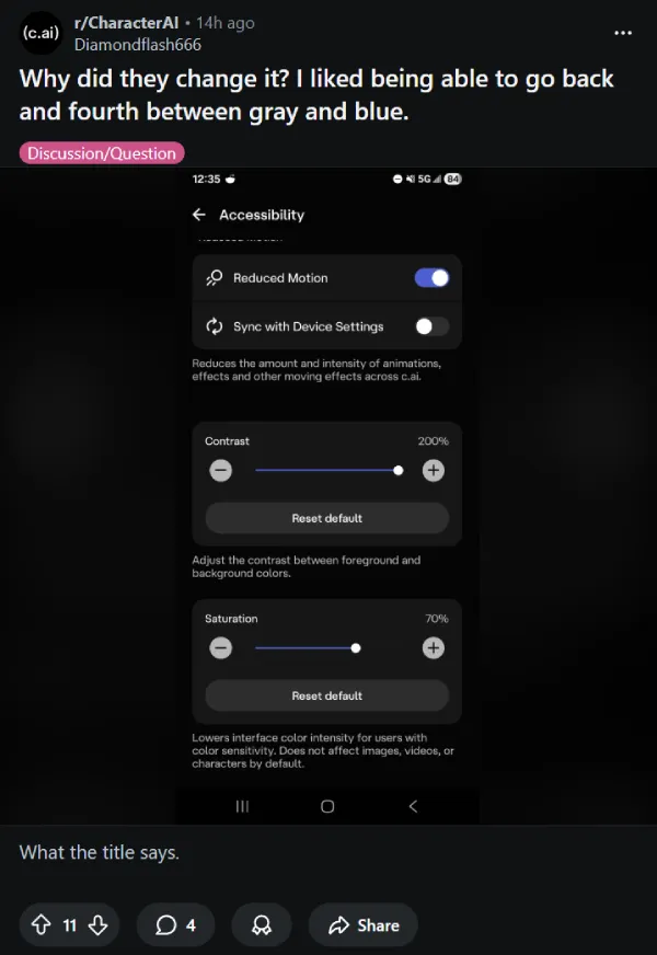
Update 06/02/26 – 05:00 pm (IST): Character.AI has removed the monochrome option from its Accessibility settings, sparking fresh complaints from users dealing with the bright blue interface. The feature is still available but has been relocated to the Chat Layout menu, confusing users who relied on it for accessibility purposes.
Multiple threads posted in the past several hours show users frustrated by the return of blue chat bubbles as the default. “I want the gray chat bubble back. The blue one is a bit too hard on eyes,” one user wrote.
To manually switch back to gray bubbles, users need to tap their profile picture in chat, select Chat Menu, then go to Layout to change the color. The extra steps have left many questioning why the option was removed from Accessibility in the first place.
Original article published on July 11, 2025, follows:
Character.AI is facing a wave of criticism from its user base following a recent update that introduced a significantly brighter blue user interface. Users are reporting eye strain, headaches, and general discomfort, especially those who rely on dark mode and have pre-existing eye conditions.
The change, which many describe as an “obnoxious” and “horrible bright blue,” has taken over various threads on Reddit, with users expressing their dismay. “I am using DARK MODE for A REASON!! You know???” wrote one user on the r/CharacterAI subreddit, highlighting the core issue for many.
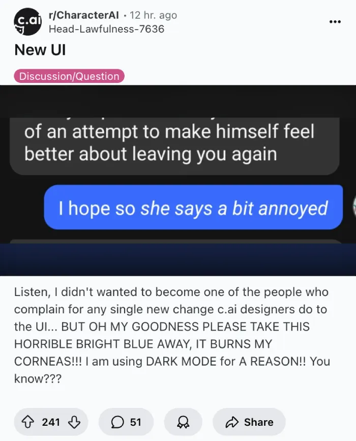
The previously muted blue tones of the interface have been replaced with a vivid, almost neon shade that some liken to Facebook Messenger. This intense blue seems to counteract the very purpose of dark mode, which is designed to reduce eye strain in low-light environments.
Many users with astigmatism and other visual sensitivities are particularly affected. “I have astigmatism, this UI hurts to look at now,” shared a user, pointing out that the previous, softer blue was perfectly fine. Another chimed in, “I have everything on heavy dark mode because the bright lights and colours are quite painful, especially in more than five minute spurts. I’m not going to use an app that does not have an option to get rid of bright colouration. It is not worth the migraines and damage to my vision.” These comments make it clear that there’s a serious accessibility concern. This could make the platform unusable for a segment of its audience.
The sudden shift has left many wondering about the developers’ intentions. Some speculate it could be an attempt to make Character.AI resemble other chat platforms, aiming for a more “real” human-like chat experience. However, a more cynical theory circulating among users is that the vibrant, jarring color might be a tactic to push users towards Character.AI+ subscriptions, implying that customization options to revert or adjust the colors might become exclusive to paid users.

The uproar isn’t just about aesthetics. Users are frustrated that developers are seemingly prioritizing UI tweaks over what they consider to be more pressing issues like server stability, bot memory, and persistent bugs. “Why would you give a single flying f*** about what color the chat bubble is when your servers are notoriously slow, bot memory is in the toilet, and there’s a new major bug every week?” one user questioned in a separate post.
That said, feel free to share your thoughts on this new UI update in the comments section below.
TechIssuesToday primarily focuses on publishing 'breaking' or 'exclusive' tech news. This means, we are usually the first news website on the whole Internet to highlight the topics we cover daily. So far, our stories have been picked up by many mainstream technology publications like The Verge, Macrumors, Forbes, etc. To know more, head here.


Dwayne Cubbins
1443 Posts
For nearly a decade, I've been deciphering the complexities of the tech world, with a particular passion for helping users navigate the ever-changing tech landscape. From crafting in-depth guides that unlock your phone's hidden potential to uncovering and explaining the latest bugs and glitches, I make sure you get the most out of your devices. And yes, you might occasionally find me ranting about some truly frustrating tech mishaps.

