


For anyone who’s kept up with the kerfuffle around the Liquid Glass design in iOS 26 (and macOS 26), this week brought a refreshing dose of good news — and perhaps a sigh of relief.
Ever since Apple rolled out the “Liquid Glass” look during the iOS 26 beta, the tech world’s been buzzing with complaints about one thing: readability. The sleek, glass-like buttons looked futuristic, sure, but actually squinting through them to read content made for a pretty bad experience. Turns out, neither designers nor folks who live on their devices were thrilled about staring at buttons and text that seeminlgy blended into busy backgrounds.
Things only got louder when the stable release dropped. More users chimed in and, pretty soon, the “Liquid Glass readability nightmare” was practically a meme.
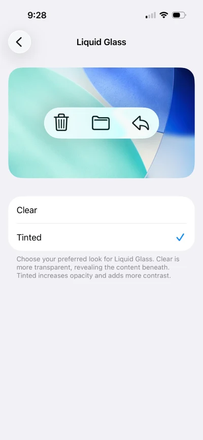
But it seems Apple has finally caved into all the pressure. The newest iOS 26.1 beta 4 and macOS 26.1 beta 4 have both landed with an option that should stop the grumbling in its tracks: you can now pick between Clear Liquid Glass and Tinted Liquid Glass.
It’s not an all-or-nothing move like disabling Liquid Glass through Accessibility’s “Reduce Transparency,” nor does it force you to live with barely-there overlays that clash with colorful backgrounds. Instead, the toggle is a practical middle ground — Clear keeps things ultra-transparent (and risky for contrast), while Tinted bumps up the opacity and adds some much-needed pop for text and icons.
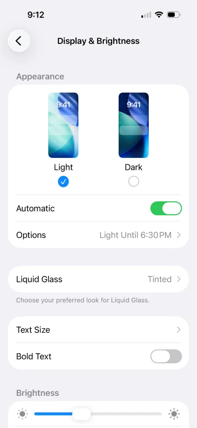
On an iOS 26.1 beta 4, the option can be found in Settings > Display & Brightnes > Liquid Glass.
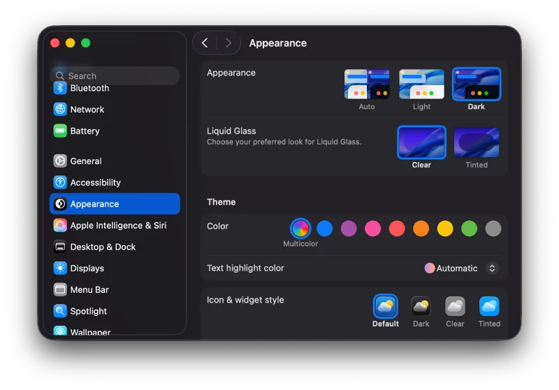
On macOS 26.1 beta4, you can find the option in Settings > Appearance > Liquid Glass.
It’s a simple addition, but it might just be enough to rope in some people who were fending off the update due to Liquid Glass’ readability issues.
Tinted mode genuinely helps foreground details stand out, without sacrificing the signature Apple aesthetic that started all this fuss. Of course, how much of a fix this ends up being will depend on your wallpaper preferences and whether you’re in the “I just want the old look back” camp. Still, just having a choice seems to be the peace offering that users wanted.
It’s rare for Apple to roll out granular design controls like this, but with so much attention on accessibility and user feedback (not to mention some meme-level roasting), it was bound to happen. While many were hoping for a granular slider to control the Liquid Glass effect, it seems Apple isn’t ready to hand over that much control to users just yet.
I’m personally going to stick with the “Clear” Liquid Glass setting, but let me know what’s your prefernce in the comments below.
TechIssuesToday primarily focuses on publishing 'breaking' or 'exclusive' tech news. This means, we are usually the first news website on the whole Internet to highlight the topics we cover daily. So far, our stories have been picked up by many mainstream technology publications like The Verge, Macrumors, Forbes, etc. To know more, head here.


Dwayne Cubbins
1449 Posts
For nearly a decade, I've been deciphering the complexities of the tech world, with a particular passion for helping users navigate the ever-changing tech landscape. From crafting in-depth guides that unlock your phone's hidden potential to uncovering and explaining the latest bugs and glitches, I make sure you get the most out of your devices. And yes, you might occasionally find me ranting about some truly frustrating tech mishaps.

