


Update 26/03/25 – 09:12 pm (IST): The redesigned desktop app UI is now rolling out more widely, so more of you can enjoy the fresh look. Highlights include a sleek new full dark mode called Onyx — perfect for those OLED screens—and a revamped game overlay that’s easier on your system’s performance. Plus, you can now watch Discord streams right from the overlay. If you haven’t seen the update yet, don’t worry — it should be hitting your app soon!
Original article published on February 4, 2025, follows:
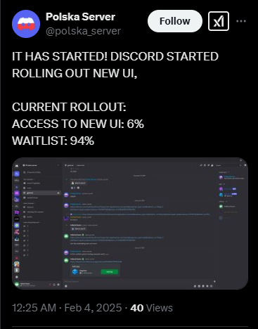
If you’ve logged into Discord recently and thought, “Wait a minute, something looks different,” congratulations! You’re among the chosen 6% who have received Discord’s fresh new desktop app UI. The rest of us are still stuck in the old UI, watching from the sidelines as the redesign slowly trickles out.
A gradual rollout and a chance to opt out
Last month, Discord started preparing for the first public tests of its revamped desktop app. At the time, reports suggested that testers would also get a settings toggle to disable the redesign if they weren’t vibing with it. Fast-forward to today, and the new UI is finally making its way to users — albeit in an ultra-slow drip, currently sitting at just 6% rollout. That means 94% of users (including yours truly) are still rocking the familiar old interface, eagerly waiting the inevitable switch. If you’re dreading this change, a user says you should be able to disable it in Settings > Appearance > Enable desktop refresh. However, this setting will only be available after you receive the updated UI.
What’s new in the UI?
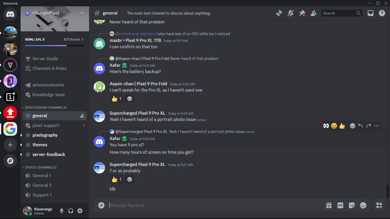
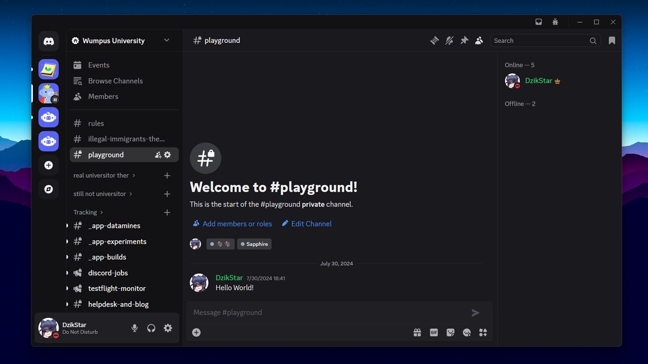
From the images we’ve analyzed, the most prominent changes appear in the text input area. The new design brings a cleaner, more modern aesthetic, likely aimed at improving readability and user experience. While Discord has yet to release an official changelog detailing every tweak, early adopters have noticed refined spacing, new icon placements, and a sleeker look overall. The tweaks may seem subtle at first glance, but for hardcore Discord users, even minor UI shifts can feel like tectonic changes. Click/tap on the images below to view the changes.
Change is always a mixed bag — some users will welcome the redesign with open arms, while others will scramble to find that “disable new UI” setting as fast as humanly possible. The good news? If you’re not a fan of the new look, you might still have the option to revert, at least for now. But knowing how these things go, Discord could eventually phase out the old UI entirely, meaning everyone will have to embrace the changes sooner or later.
When will you get the new Discord UI on desktop?
That’s the golden question. With only 6% of users currently onboarded, it’s unclear how long Discord plans to stretch out the rollout. If history is any indication, we can expect a gradual expansion over the coming weeks or months. For now, if you’re still on the old UI (like me), just sit tight and keep an eye out — you might wake up one day to a freshly redesigned Discord experience.
So, have you received the new UI yet? Love it or hate it? Let us know in the comments.
TechIssuesToday primarily focuses on publishing 'breaking' or 'exclusive' tech news. This means, we are usually the first news website on the whole Internet to highlight the topics we cover daily. So far, our stories have been picked up by many mainstream technology publications like The Verge, Macrumors, Forbes, etc. To know more, head here.


Hillary Keverenge
712 Posts
Tech junkie. Gadget whisperer. Firmware fighter. I'm here to share my love-hate relationship with technology, one unboxing at a time.

congo27-03-2025
I've got the new discord UI, it's nice I feel like its fresh and has a more organised feel I missed from TeamSpeak. I hope they stick to it.
ReplyPlease f****ng read our reviews26-03-2025
It's absolute shite let me go back let me out i don't wanna be in there i'm actually having a f****ng meltdown 😊 And for constructive feedback ? Absolutely awful? Before I start, your designers really need to take their classes again. Because wtf. The settings bar on the side obstructs the flow of servers, so far, everything is everywhere, meaning my eyes cannot decide WHAT to look at. In DM's the side window is not close-able and is just painful to the eye, I cannot concentrate on the messages I'm responding to. Not only that, but you've managed to make going through the settings ABSOLUTELY counterintuitive!! When it comes to discord I'm sure everyone will agree that you're supposed to find settings easily ! Also can you PLEASE take off noise suppression on the phone app ?? It's impossible to hear anything my friends are saying because they keep cutting off. The colours are nice, that's for sure, but I beg of you rework the design to make it look better. It looks like you put a laggy mod over discord.
ReplyDenied726-03-2025
New UI is f*****g shit, anyone got a way to revert it back?
ReplySamo26-03-2025
No way to remove this, huh? Lovely.
Replyjohn26-03-2025
the new layout mess with my ocd.. so much i wanna sue discord for this
Replyi f*****g hate this ui26-03-2025
f*****g SUCKS
Replywhat is this crap25-03-2025
i regret getting this new ui just looks horrible with the square rounded server icons
ReplyKa17-02-2025
I have the new UI. Hate it. Had to download Vencord to force it so that i don't have to use it. Please Discord, stop making stupid shitty updates no one asked for or wanted.
ReplyAmaghini17-02-2025
I am someone who likes new environments. I think this change is great because it intentionally takes me out of my comfort zone. Above all, I am honored to be chosen by 6% of the users.
Replycompact mode should not have random space!17-02-2025
Massive waste of space, if I need to change the size of the app for whatever reason I lose more of chat because the dumb amount of space used up by the new chatbox. There is literally no way I can find to disable the UI changes that I can find. I use discord in compact mode, random space is exactly the kind of thing I'm trying to *avoid* because it makes it actually makes things *harder* for me to read.
Replygive me the old UI back14-02-2025
I'm the 6% and I don't see a desktop refresh button. I hate the changes
Reply6% scum12-02-2025
No revert for me I even send message to discord and they said no revert for you 6% scum
ReplyPoki4212-02-2025
god dude they've kept the old style of UI for years without too much change, and almost EVERY SINGLE TIME, they've gotten pushback on the shitty UI changes they make. can companies PLEASE just listen to their consumers for once and stop making changes everyone hates and nobody wants this is hell
Replyatypical sanity11-02-2025
dude this is genuinely horrible istg 😭😭😭
ReplyFIRE YOUR DESIGNERS11-02-2025
Nav bar is massive for no reason, voice controls don't match rest of the UI, the Message controls are now separate from the chat box. Thanks Agile Development!
Replypuppy11-02-2025
ITS SO BAD !!!!!! WHY DO THEY ALWAYS CHANGE THE UI TO SOMETHING AWFUL WHENEVER ITS DECENT LOOKING! ITS LIKE A BAD REOCCURING NIGHTMARE!!!
ReplyN/A08-02-2025
I just got the update and got a headache because of how bad it is. Misaligned bottom bars, incomplete separation of the dm list and the open dm and small icons for the servers tab, it feels uncoordinated.
Reply:(08-02-2025
BRING THE OLD ONE BACK. THE NEW ONE IS SOOOOOOOOOOOOO LAGGY
Replyslave raper 6908-02-2025
i have it
ReplyInternet Wanderer08-02-2025
Adding to what jONATHAN stated, its an option labeled Desktop Refresh under the experiment tab once you install the plug in.
ReplyT_T :(07-02-2025
GET ME TF OUT THIS 6% I DONT WANT THIS GARBAGE A$$ UI.
Reply:(07-02-2025
It's so ugly
ReplyBayov06-02-2025
Chat input wastes so much vertical space. The buttons were inline before, now they doubled the size. Amateurs.
ReplyjONATHAN 06-02-2025
PSA YALL!!! IF YOU INSTALL VENCORD YOU CAN GET A PLUGIN CALLED "EXPERIMENTS" AND USE THAT TO REVERT BACK TO OLD UI!!! PLEASE SPREAD WORD IS SO USEFULL
ReplyBlueTigress06-02-2025
I have to say, it is extremely frustrating that the devs think this new UI will be appreciated by the users... There's no way I'm paying for this, especially without the option to change it back. THEY NEED TO GIVE US AN OPTION TO REVERT. Opera GX just recently did a UI overhaul too but they had a feature to revert changes. The new Discord layout is counterintuitive strictly from a graphic design standpoint... the fact that they separated the lower left profile/settings bar from the rest of it makes it standout so awkwardly. Everything used to be uniform sizes, now it all looks displaced, lobsided and gives a false feeling of customizability. If all UI elements could be re-arranged by the user, it would help us adapt better to any changes. The rounded edges don't look good. Discord needs to come out with a survey NOW to ask their users these questions so they can get accurate feedback and adjust.
Replyynnargian06-02-2025
New UI looks terrible and I have no option to disable it. Really hope they revert or at least keep a permanent option available to put it back, otherwise I'm probably just gonna stop using discord
ReplyNecro05-02-2025
This is the worst design and I absolutely hate it. It's a complete waste of space utilization with the input box and everything else feels way to compressed. Please god give me back the old UI or the so called "enable desktop" option that I DON'T HAVE.
ReplyWhy God05-02-2025
This new UI sucks and I can't even disable it for some reason
Replyoh naw05-02-2025
i swear if discord doesnt listen to all the people hating on this new UI.. 😭
ReplySnow Blood Wolf05-02-2025
Part of the 6%, i wish i wouldn't got this "luck", it's also not possible to opt out so you are forced with this unecessary update
Reply_0505-02-2025
What the actual fuck is the UI change. This looks like a Betterdiscord plugin and it's not even that good. Honored to be the 6% to receive this kind of update but BRO what the fuck
ReplyHellsy05-02-2025
Looks AWFUL
ReplyHroo05-02-2025
Absolutely HATE IT, I have it set up on a second smaller monitor, which makes the chats feel EXTREMELY SMALL while other things feels WAY TOO BIG I don't like how the icons are too small, I rely on the visibility of the icons much more than the names. The fact the message box is ridiculously big is also a questionable decision??? cause now you have 50% empty space underneath the message box.. I'd rather they put it all in the same box like it was. If this was done so you'd have more writing space,, maybe they should get rid of the dumb present icon (nintro) and put that in the 4 mini icons instead?? I hope I can revert back cause this is ridiculous
ReplySob4chka05-02-2025
The new UI is dogshit. They should fire the designer.
ReplyJxJx05-02-2025
i dont have it and dont underrstand why they dont give it to all nitro users
ReplyWhy05-02-2025
Server icons are WAY too small and other stuff too big. Atleast let me change back to the old UI this is so bad
ReplyKayy05-02-2025
I really hate this discord UI redesign, and I want to revert to the old UI. Maybe there are some newer features that can be considered but I still choose the old UI. I want to go back to the old UI but I can't. I hope the discord will provide compensation for those of us who were sacrificed for this experiment. I hope those of us who got this beta test get discord nitro forever :v lmao
ReplyNA05-02-2025
I have the new ui they somehow make is worse every update
ReplyJordan05-02-2025
I have the new UI and personally I EXTREMELY dislike it. It no longer has the dark background for profiles when on call making everything just mix together and look incoherent. There is a bar at the top saying what menu you are in: friends, nitro, dm's, etc... They also made the icons super small and square making it annoying and hard to look at. The bar at the bottom right where you can see your profile picture, status, and whether or not you're muted or deafened now appears to be an overlay which is something small that bugs me. There are a few more changes I see but haven't mentioned but also many I may not know about. On a personal level however, I really hope they allow us to revert to the old UI as a permanent feature rather than just a way of prolonging your doom.
Replyanimorealista05-02-2025
Hey! I'm from Portugal and I got this stupid UI Discord redesign. How can I revert to the previous UI design? I think this new redesign stinks.
Replymarto05-02-2025
looks like shit
ReplyNA05-02-2025
Oh, one additional note: When actually in a voice channel, the voice controls that appear takes up more space than before, further hiding the channel list, slightly. However, because the user info now extends to the left into the server list section, this extending upwards now will also come at the cost of covering the bottom section of the server list, for those that are involved in enough servers to use that much vertical space, which hides notifications of new messages. Another unpleasant change.
ReplyNA05-02-2025
Forced into the new UI this morning. It is different than your New UI screenshot, so you may want to reach out and get a new one. There is no longer an option to revert. It is possible that setting may still be present for those who were already testing, but for those who were not involved in that testing process, this change is immediate with no configuration tools added to the settings menu for it in any respect. It is largely a terrible series of changes: There is unnecessary space taken up at the top of the screen, expanding the title bar down so that the name of the server and its icon can be present there. The name of the server still shows in the normal place in the upper left, and the server icon is still highlighted on the left side, making this incredibly redundant and a waste of screen space. (this change is new from your screenshot and does not appear in the sample treatments from the testing phase, so it appears that this might have been a last minute addition. It's also ridiculously stupid and shouldn't have been included). The inbox and help buttons have also been moved up top, next to the windows controls, and enlarged. The bookmarks link is missing. I didn't use that, but for anyone who did, that's probably not going to be a welcome change. There is unnecessary space taken up on the bottom of the screen, expanding the chat window up, which is different but is generally presented in your screenshot. While both of these are minor changes, neither was necessary and only reduces the amount of useful chat log space in the middle. The chat box already expanded when writing a longer message. It does not need to be double sized when empty. The left sidebar server icons are now much smaller, with a different shape around them. Not a welcome change but not as pointless as the first two things. The extra dark contrast areas are all much more similar colors, weakening the distinction between these areas. I don't care for it, but someone might like that. The user info in the bottom left is now much bigger and floats slightly off the corner. For any server where the channel lists extends down, now more of that channel space is going to be hidden unnecessarily. The user info section and the chat box also are now very similar, but not aligned vertically: but it looks like they are meant to due to their now same shape and height. This misalignment makes for a poor impression: if these changes were going to be forced, aligning these would have looked better (though still worse than it was before), though that change would have hidden even more of the channel list. Perhaps a small grace they simply made it uglier rather than further worsen the useful space. In general, this is a horrible change, and I strongly oppose it. To be fair, there are two minor points that are positive: Firstly, the server settings/channel list sidebar width can now be adjusted on the fly. For my own purposes, this is absolutely useless as I prefer the previous way, and immediately set it back to that, but for anyone who did not, it will be a welcome change be able to adjust that. That being said, the default setting for it is horrible, extending extremely far to the right needlessly. As no information is given that this is now adjustable, if someone doesn't stumble upon that themselves, it will certainly be incredibly jarring to look at, and further remove useful chat-log space. Furthermore, if such adjustment is possible, why was it limited here: it would have been easy to include that on the top and bottom sections, allowing users to return their chatlog size to it's previous sizes, or if wanted, adjust it further in either direction. That would have been a welcome change for some, likely, and had been far more useful: more options are always welcome. More forced change is generally not. The only other thing I can see that might be considered useful is that the Search Apps & Commands button that appears in the lower right of the chat box has been merged into the chatbox, and all of the lower right icons are slightly smaller, giving a little more useful space in the chatbox when working in it. Because this space does not take away from the chat log, it is more likely to be useful. That being said, I've never used that button, and an option to simply collapse that area and reclaim it would have been better still. I hate everything about this.
ReplyCarmine05-02-2025
Just got this update and felt like it was made for ants, my discord icons are small but the text box got enlarged, not a big fan of this UI update
ReplyNashoid05-02-2025
I have the new UI, and I hate it. It wastes so much space, and makes accessibility worse with scaling and font changes. Cancelled my Discord Subscription over this change.
Replyalex05-02-2025
i fucking hate it
Replydiscord ui hater05-02-2025
ts so buns
ReplyAngry Discord user05-02-2025
If you are still on the old UI, cherish these moments, as there is no way of reverting this garbage change.
ReplyANormalBacon01005-02-2025
how do you change back to the old UI?
ReplyRen05-02-2025
The new UI is an accessibility nightmare. Server icons, and "... is typing" are now ridiculously small. This is not a good change.
ReplyMoog05-02-2025
I woke up today to discover that I have been forced to the Discord Refresh UI and my honest feelings are ones of revulsion. This has very little to do with the fact that change has taken place and more with specific changes that are unbearable. 1. The server icons being smaller feels claustrophobic. 2. The double layer message box takes up too much space. I realize that the secondary bar has six buttons on it but it feels really off to have a second bar for those buttons when they fit perfectly within a single bar before. 3. The Client (Top bar and server list), the server itself, the username and voice controls, and the message bar look like they are just stacked and it gives the feeling of a messy desk. 4. None of the zoom or size settings are robust enough for me to get anywhere close to what the UI was before. These changes may be good for vertical monitors, phones, and tablets but they are not good for the rest of us that use computers and traditional monitors. The only good thing I can say is that I like the darker OLED mode.
Replyliam okeeffe05-02-2025
i hate it and i cant perform a desktop refresh in settings
ReplyKieran05-02-2025
Not gonna lie, the changes to the UI are just weird. Why have the server name in the middle? Why make the Typing bar twice as thick?
ReplyDave05-02-2025
This ui is terrible how do i go back
ReplyNyu05-02-2025
The option to revert the changes is not there and it seems like it won't be coming to so far.
ReplySage05-02-2025
There is no settings to disable the new UI update, I have it and hate it.
ReplyOne of the very unhappy 6%05-02-2025
This update is HORRIBLE, it ruins preformance, takes up a good 30 GB of ram just to run now, everything is messed up, the UI coveres everything, and now some old features i used a lot now are locked behind nitro, this is horrible, i have seen people on reddit have worse problems than me, some cant even send or view images without having nitro
ReplyForvotes1004-02-2025
I really don't like the new design can you make an option to switch from this one to the old one?
ReplyShendue04-02-2025
I hate it. Got it today. Especially the icons. I loved the rounded icons on the left. The square ones look very unpleasing to the eye. I honestly hate the current trend of hyperminimalistic choices in modern design. Hugely preferred the old logos of Firefox, Google, etc.
ReplyV.04-02-2025
Personally I hate the new updated appearance. It looks super busy, while feeling empty. The zoom is also all over the place. I prefered the old UI. It felt cleaner, more compact, and less useless space. Now with the bubbles around everything there is so much empty space that doesn't look nice at all. I dislike the modern bubbly ui anyways. It feels like the old hatred for Comic sans MS font, but accepted and forced for everyone.
Replyc04-02-2025
it sucks
ReplyNoName04-02-2025
There is no option to opt out of it, we're screwed.
ReplyHam446104-02-2025
Absolutely awful. The old UI was fine the way it was. Discord always just has to ruin things by making them more "modern", and not even giving us the option to use the old ui. But yet when we make our own solutions to fix their garbage new ui ideas, they're like "Oh No DoNt dO ThAt We'lL BaN YoU. I hate you Discord.
Reply
pepfre29-03-2025
It is trash
Reply