


Update: 27/05/24 05:09 pm (IST): Discord recently went ahead and updated its app for iPadOS with a new UI too. Similar to how users were disgruntled with the mobile app revamp, many iPad users are frustrated with some UI choices in the new app.
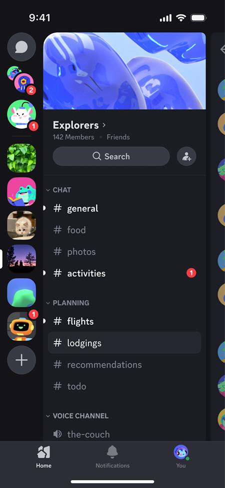
Firstly, the inability to collapse the sidebar is a major point of contention. Previously, users could collapse the sidebar to maximize screen real estate for the main chat area, which was particularly useful on smaller iPad screens like the iPad Mini. With the new update, the sidebar remains permanently visible, occupying a significant portion of the screen and leaving less space for the chat area. This design decision has made the app feel cramped and inefficient, especially on smaller iPad models.
Secondly, the lack of an exit button or mechanism to leave the search screen has caused frustration among users. Once users enter the search screen, they cannot easily navigate back to the main chat view, forcing them to resort to workarounds or restarting the app entirely. This oversight in the user interface design has been criticized as a significant oversight and a hindrance to smooth navigation within the app.
Furthermore, users have reported instances of janky or broken UI states, where elements of the old and new user interfaces seem to clash or behave unexpectedly. These rough edges and inconsistencies in the app’s design and functionality have contributed to an overall sense of dissatisfaction with the update.
Additionally, some users have expressed concern over the apparent waste of screen space, particularly in certain split-view scenarios, where the app displays less message content than expected, even on larger iPad screens. This inefficient use of available screen real estate has been seen as a step backward in terms of usability and accessibility.
Overall, users feel that the update has prioritized a uniform design across platforms over tailoring the experience to the unique capabilities and form factors of iPad devices.
Original article published on May 23, 2024 follows:
Remember that time when Discord decided to revamp their mobile app? Chaos ensued. Users everywhere cried out in agony, mourning the loss of their familiar interface and cursing the gods of change. Some even cancelled their Nitro subscriptions in protest. But hey, Discord, in their infinite wisdom, listened to the wailing masses and is now rolling back some of those controversial changes.
And guess what? Another uproar! This time, it’s the folks who had finally grown accustomed to the new layout who are throwing their digital pitchforks. It seems Discord is caught in a perpetual cycle of “damned if you do, damned if you don’t.”
The great divide between servers and DMs
One of the major points of contention was the separation of servers and direct messages into separate tabs. Initially, Discord’s idea was to streamline navigation, but it ended up feeling like a digital divorce between your communities and your buddies.
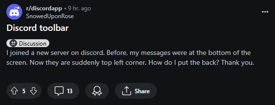
Now, with the great reunion of servers and DMs, Discord claims they’re promoting consistency across platforms. Messages were previously located at the bottom of the screen, but now they’ve suddenly moved to the top left corner. Below is a screenshot showing the updated UI, which is essentially the old UI that Discord kicked out late last year.
However, users who enjoyed the separation are less than thrilled, feeling like their newfound muscle memory is being betrayed.
Discord search shenanigans and the theme tango
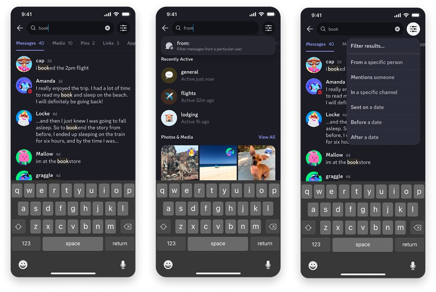
Discord’s search function also got a facelift, but users found it more confusing than helpful. It seems even the simple act of finding the right search filter became an epic quest. But fear not, because Discord has heeded your cries and added in-line prompts for common filters. Now you can search to your heart’s content, without needing a map and compass.
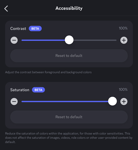
Ah, the never-ending debate of light vs. dark mode. Discord attempted to appease both sides by introducing a darker Dark theme and a battery-saving Midnight/OLED theme. But some users found these themes to be a bit too intense for their delicate eyes. So, Discord is graciously adding saturation and contrast controls to the latest mobile app update, allowing you to customize your visual experience to your heart’s desire.
Performance pitfalls
No UI overhaul would be complete without a few performance hiccups. Discord acknowledges that their mobile app wasn’t always as smooth as butter, especially on older devices. But they’ve been diligently working on improvements, and they even have a new Patch Notes series to keep you updated on their progress.
In the end, it seems like Discord’s UI journey is far from over. They’ve promised to continue listening to user feedback and making adjustments as needed. After all, change is the only constant, right? But perhaps next time, they’ll consider a more gradual approach, instead of springing a surprise redesign on unsuspecting users.
So, what’s the moral of this story? Maybe it’s that you can’t please everyone, no matter how hard you try. Or maybe it’s that change is inevitable, and we should all just embrace the chaos. Either way, one sure thing is that Discord’s UI saga is a wild ride, and we can’t wait to see what twists and turns await us in the future.
TechIssuesToday primarily focuses on publishing 'breaking' or 'exclusive' tech news. This means, we are usually the first news website on the whole Internet to highlight the topics we cover daily. So far, our stories have been picked up by many mainstream technology publications like The Verge, Macrumors, Forbes, etc. To know more, head here.


Himanshu Arora
295 Posts
I have been writing tech-focused articles since 2010. In my around 15 years of experience so far, I have written for many leading publications, including Computerworld, GSMArena, TechSpot, HowtoForge, LinuxJournal, and MakeTechEasier to name a few. I also co-founded PiunikaWeb, which went on to become a huge success within 5 years of its inception. Here at TechIssuesToday, I aim to offer you helpful information in a way that you won't find anywhere else easily.

