If you thought the recent changes to Discord’s UI would be smooth sailing, you’re not alone — but you’d also be wrong. The popular communication app has once again stirred up a hornet’s nest with its latest updates, leaving users frustrated and frantically searching for workarounds.
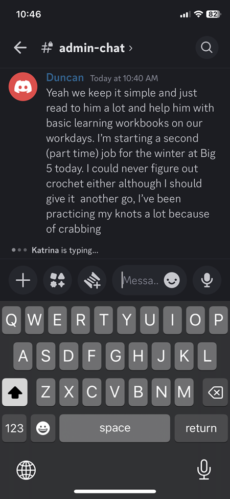
The update, which rolled out recently, added a bunch of new buttons to the chat bar on the desktop and mobile apps, including Activities, Gift a Sub, GIF, Sticker, and Emoji. While these features might sound handy in theory, users are not too pleased with how much space they take up.
A UI change nobody asked for
It all started with Discord’s decision to roll out an updated mobile and desktop UI, which was intended to be sleek and modern but has instead left users scratching their heads. The image below paints a clear picture of the chaos. The mobile interface, once intuitive and user-friendly, now feels like a labyrinth, with options and features seemingly shuffled around in a game of UI roulette.

A particularly sore point for users is the change to the text input area, as shown in the other image shared by a desktop user with clear labels of what they hate about the new UI. “It’s bloating the UI to a frankly silly degree at this point,” one disgruntled Redditor commented. “There’s zero reason to only allow half the width of the chat column to be used.” Another user pointed out that the new layout makes it difficult to use Discord in a smaller window, a common practice for gamers who like to keep the chat app handy while playing.

This isn’t the first time Discord has found itself at odds with its user base over UI changes. Remember the great mobile layout debacle of 2023? Discord decided to switch its mobile UI, and users were quick to voice their discontent. Not long ago, Discord also faced fresh backlash over another UI change that didn’t go well with users.
For its part, Discord support has acknowledged the user feedback but hasn’t exactly promised to roll back the update.
At this time we don’t have a way to remove this button! But I can certainly pass this along to my team as feedback for how we can improve the app. Thank you for reaching out on this!
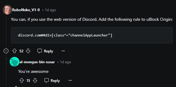
While mobile users are left in UI purgatory, desktop users have discovered a nifty workaround using uBlock Origin. By toggling back to the classic layout option buried deep within the settings menu, they’ve managed to reclaim some semblance of the Discord experience they know and love. Unfortunately, this option doesn’t exist on mobile, leaving many to wonder why they’re being forced to endure these changes without any escape.

Despite the turbulence, the Discord community has once again shown its resilience. In typical fashion, users have come together to share tips, tricks, and memes, turning their collective frustration into a shared experience. And who knows? Maybe, just maybe, Discord will take a page from its own history book and give the people what they want — a return to simplicity.
But until then, if you find yourself battling with the new layout, just know you’re not alone. The Discord family is here, grumbling right along with you.
TechIssuesToday primarily focuses on publishing 'breaking' or 'exclusive' tech news. This means, we are usually the first news website on the whole Internet to highlight the topics we cover daily. So far, our stories have been picked up by many mainstream technology publications like The Verge, Macrumors, Forbes, etc. To know more, head here.


