


New Discord Mobile UI/UX Update is getting developed pic.twitter.com/AktW8KdKoz
— Wumpus Central (@WumpusCentral) February 19, 2024
Discord appears to be rolling out a fresh mobile interface experiment that’s catching users off guard. The latest test replaces the familiar bottom navigation with something they’re apparently calling the “You bar” — a sleek, rounded floating element that houses your profile and settings access.
I spotted a couple of Reddit posts from the past few days where confused users were asking about this sudden change. One user posted screenshots showing how their traditional bottom navigation bar had vanished, replaced by this compact floating design. The new interface eliminates the old home button entirely, along with the three-line server drawer icon that many users relied on.
Check out the screenshots below for reference:
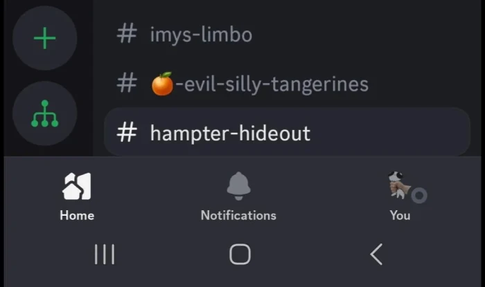
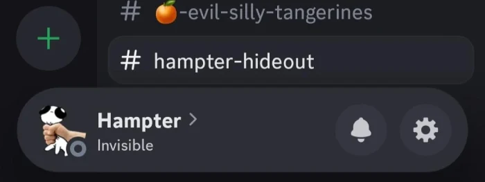
What makes this particularly interesting is how the change affects user flow. The classic setup had distinct tabs at the bottom — Home, Notifications, and your profile section arranged in clear, separate boxes. Now everything gets condensed into this streamlined bar that hovers above the traditional bottom edge.
I found a comment from Woofer210, a top-poster in Discord’s subreddit, explaining that this is indeed a random experiment users can’t manually enable or disable. That randomization explains why some people are frantically searching for toggle switches that simply don’t exist yet (and might never).
While researching more about this, I discovered that early development of this interface dates back to February 2024, when Wumpus Central first shared screenshots of the work-in-progress design.
Back then, it was just internal testing among Discord staff. Now it’s reaching regular users through their experimental rollout system.
User reactions are predictably mixed. Some appreciate the space-saving design and easier settings access. Others miss the quick navigation tricks they’d grown used to, like double-tapping the home button to jump straight to direct messages. One person mentioned how the new design makes it harder to navigate when you’ve hit Discord’s server limit.
A few longtime users noted that this rounded approach reminds them of Discord’s much earlier mobile designs from around 2016, before the current tab system took hold.
Whether this change becomes permanent or not remains to be seen. For now, those randomly selected for the test will have to adapt to this reimagined mobile experience.
TechIssuesToday primarily focuses on publishing 'breaking' or 'exclusive' tech news. This means, we are usually the first news website on the whole Internet to highlight the topics we cover daily. So far, our stories have been picked up by many mainstream technology publications like The Verge, Macrumors, Forbes, etc. To know more, head here.


Dwayne Cubbins
1453 Posts
For nearly a decade, I've been deciphering the complexities of the tech world, with a particular passion for helping users navigate the ever-changing tech landscape. From crafting in-depth guides that unlock your phone's hidden potential to uncovering and explaining the latest bugs and glitches, I make sure you get the most out of your devices. And yes, you might occasionally find me ranting about some truly frustrating tech mishaps.


Comments