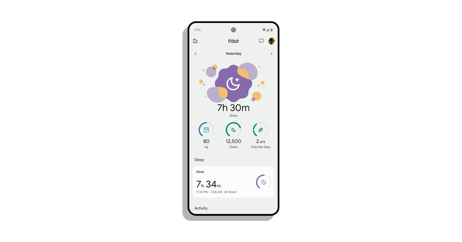
Fitbit’s attempt to revamp the sleep graph layout in its app with the 4.14.1 update appears to have backfired. Instead of a more user-friendly experience, Fitbit users have been left frustrated and yearning for the old layout. Reports abound on various platforms, including the Fitbit Community, Reddit, and X, highlighting user dissatisfaction with the new sleep graph. Here’s a common thread I found amongst the complaints: users find it difficult to decipher sleep stages (awake, light, REM, deep) in the new layout.
I am adding a few complaints about the problem from users so that you have a clear picture about the problem:
Why are the sleep scores and data displayed differently? I assume it’s the new ios update, but I preferred the former presentation. (Source)
I have a Sense 2, don’t have Premium, and received the new sleep schedule “upgrade” this morning and it seems like I no longer get a sleep score or can see Light/Deep/REM/Awake, just Asleep/Restless/Awake. Going to the official forums the moderators have all of this spin about how the update is all about modernizing and actually giving you more data and making things simpler, but it seems pretty blatant that they just want to push everybody into buying Premium by stripping longtime free features. (Source)
The new sleep update is not as easy to understand, 2/10 for the update. (Source)
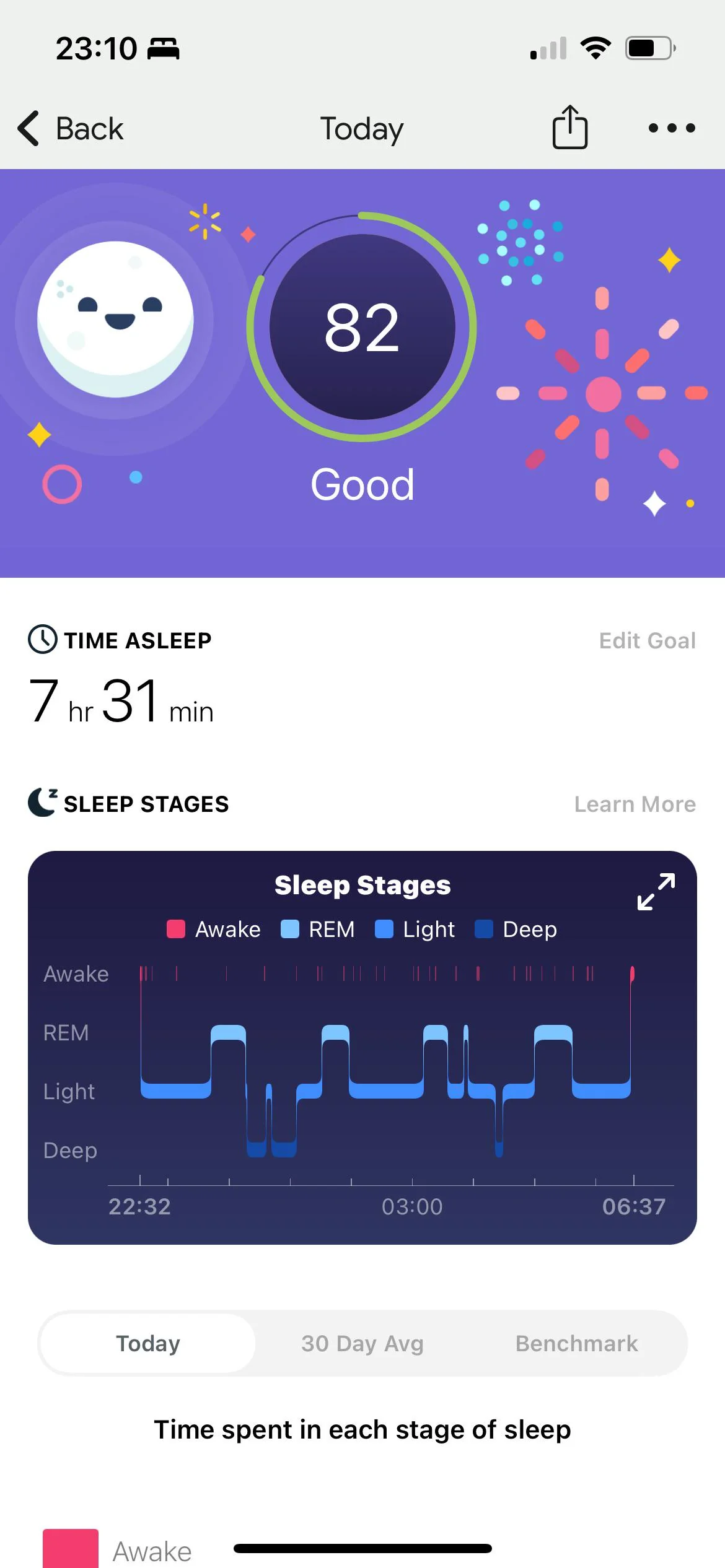
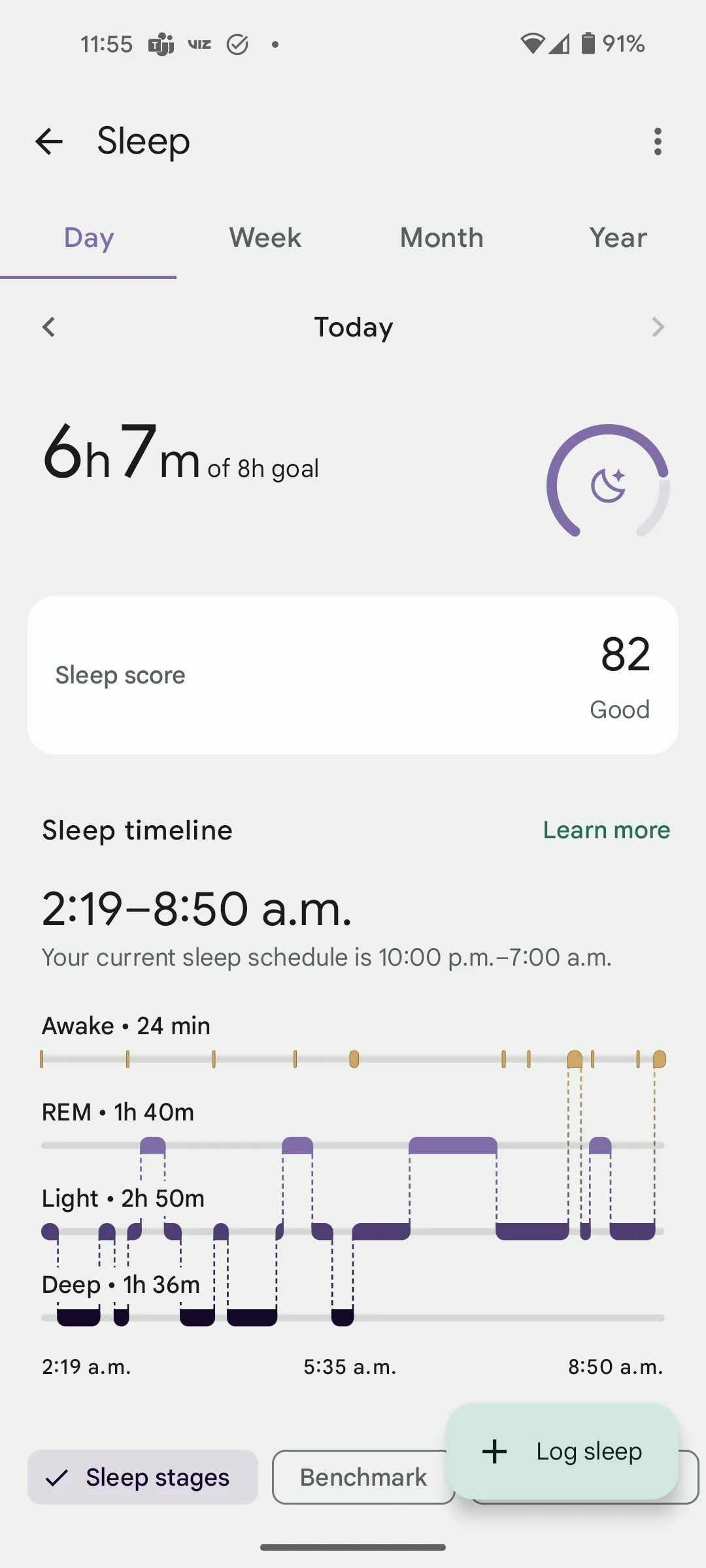
While Fitbit aimed to introduce an interactive timeline and a more effortless way to track sleep patterns, it seems the execution fell flat. Users seem to miss the clarity and detail provided by the previous layout. I’ve added a comparison between the old UI and the new UI below for reference:
That said, Fitbit might just have to rethink its new sleep graph layout. A product feedback listing on the community about the redesign now has over 400 votes from users who want a revert. This indicates that users collectively don’t appreciate the change. If you’re among those who dislike the new sleep graph, you can join the chorus of voices on the Fitbit Community or social media to make your opinion heard.
According to a Fitbit blog post announcing the redesign, the new sleep experience includes a sleep timeline chart that allows you to see exactly what time you woke up last night, or when your deep sleep ended. Users can also see their sleep patterns over time using the week, month and year views. However, browsing through user reviews on the Fitbit community forums reveals that many users find the new timeline chart to be confusing and lacking in the detail they previously appreciated.
Some users specifically complain that the new graph makes it difficult to distinguish between sleep stages. Previously, the sleep graph used color-coded bars to represent different sleep stages (awake, light, REM, deep) which many users found easy to understand at a glance. The new timeline chart seems to have moved away from this clear color-coding system, making it more difficult for users to track their sleep cycles.
Fitbit users have also expressed frustration with the new layout’s lack of granularity. While the new chart allows users to see exactly when they woke up during the night, some users report missing the ability to see the duration of each sleep stage. This was apparently a feature of the older sleep graph that many users found helpful. Speaking of which, to get back the old UI and layout, you can try rolling back (downgrading to an older version of the Fitbit app).
Downgrade to older Fitbit app to revert the change
Note that this is only an option for Fitbit app users on Android. iOS users cannot downgrade to an older version.
- Stop auto-updates: First, prevent future surprises by disabling automatic app updates in the Play Store settings.
- Uninstall the new app: Remove the current Fitbit app from your device.
- Find an older version: Visit APK Mirror and search for “Fitbit” OR head to this link directly.
- Choose the right download: Select the version dated “Sept. 8th” and download the file named “nodpi” (this ensures compatibility with most devices).
- Install the downloaded app: Once downloaded, install the older Fitbit app on your phone.
- Sign in and enjoy: Launch the app, sign in with your Fitbit account, and go back to using the familiar interface.
Important Note: Downloading apps from external sources can be risky. It’s recommended for advanced users only. Consider these steps a last resort if you’re really unhappy with the update.
Overall, it seems that Fitbit’s redesign of the sleep graph has missed the mark for many users. While the intention behind the redesign seems to have been positive, the execution appears to have resulted in a less user-friendly experience. It remains to be seen how Fitbit will respond to this wave of user feedback
TechIssuesToday primarily focuses on publishing 'breaking' or 'exclusive' tech news. This means, we are usually the first news website on the whole Internet to highlight the topics we cover daily. So far, our stories have been picked up by many mainstream technology publications like The Verge, Macrumors, Forbes, etc. To know more, head here.


