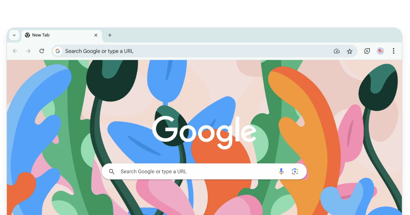
Update 21/06/24 09:56 pm (IST): With the recent update to Google Chrome, it appears Google has taken away the ability to revert to the previous UI completely. Various users have confirmed that the workarounds, including the one we shared below, no longer work. In the latest megathread on the “UI” topic on the Chrome Subreddit, a moderator indicates that there are no known workarounds right now.
However, they also urged users not to downgrade to older versions of Chrome and risk their online security just for the sake of the old UI. The mod did also state that “Future updates will have the option to switch sides of the tab search feature (not any of the other complaints), this was already confirmed in May. That’s a rarity for them to have an option like that in the first place. They are targeting stable 127 for this.”
Original article published on May 23, 2024 follows:
Google’s controversial Chrome UI refresh from 2023 has been a thorn in the side of many users who preferred the classic layout. While previous Chrome updates allowed disabling the new UI via experimental flags, the latest Chrome 125 seems to override those settings.
Reports indicate that users are now seeing the new UI on Chrome after the v125 update. Adding to the frustration, several users also said couldn’t find any flags to revert to the previous UI.
If you’ve updated to Chrome 125 only to find the flags workaround no longer works, don’t fret – there’s still a way to revert to the old UI, at least temporarily.
The workaround
You can launch Chrome with a special command line argument that disables the new side panel UI. The workaround was shared by ‘Bug Artisan’ on Medium. Here’s what you need to do:
- Right-click on your Chrome shortcut (the icon you use to open Chrome).
- Select “Properties”.
- In the “Target” field, append the following to the end of the existing text:
--disable-features=CustomizeChromeSidePanel - Click “Apply” to save the change.
Now when you open Chrome using that shortcut, it should load with the classic UI instead of the new side panel design.
Background on the UI change
The refreshed Chrome UI, dubbed “Chrome Refresh 2023”, began rolling out gradually in late 2023. It introduced a revamped side panel, tab layout, and bookmark manager among other visual changes.
Many users found the new look cumbersome, wasting valuable screen space and disrupting established workflows. Previous versions of Chrome allowed disabling parts of the UI update by tweaking experimental flags like “Chrome Refresh 2023” and “Chrome WebUI Refresh 2023”. However, Chrome 125 seems to override those settings, forcing the new look.
While the workaround mentioned above provides temporary reprieve, it’s unclear how long it will remain effective given Google’s push for the new UI. Users may want to make their voices heard via Chrome’s “Report an issue” tool and discussion forums to advocate for customization options.
TechIssuesToday primarily focuses on publishing 'breaking' or 'exclusive' tech news. This means, we are usually the first news website on the whole Internet to highlight the topics we cover daily. So far, our stories have been picked up by many mainstream technology publications like The Verge, Macrumors, Forbes, etc. To know more, head here.


Madeline01-09-2024
Found an answer, which hopefully doesn't change soon. Many other websites, reddit posts and videos are just saying go to "chrome://flags" and type..... "NTP Single row Shortcut", but it doesn't come up anymore. Instead, type "NTP Modules Redesigned" and disable it. (28/08/24)
Reply