

![[Updated] Don't like the new Google Chrome desktop UI design? Here's how to switch back to the old layout](https://techissuestoday.com/wp-content/uploads/2024/03/google-chrome-fi.webp "[Updated] Don't like the new Google Chrome desktop UI design? Here's how to switch back to the old layout")
Update 23/05/24 02:00 pm (IST): The new Chrome 125 update overrides the flags and enables the new UI anyway. However, there’s still one working method to get back the new UI.
Update 17/05/24 04:02 pm (IST): After a recent Chrome update, several users are reporting that the side panel is glitched and has a red background. Here’s a screenshot shared by a Redditor for reference:
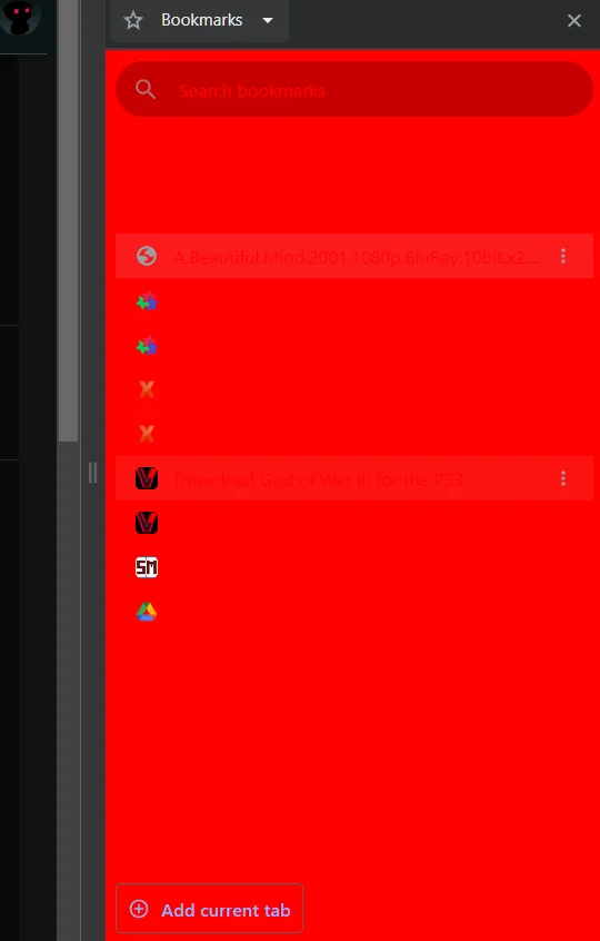
This glitch appears to be a result of users using the workaround to revert to the previous UI, as described below. So it seems users should now consider adopting the new layout or deal with the red sidebar along with other bugs like misaligned favicons.
Update 30/04/24 9:45 am (IST): Unfortunately, the workaround to revert to the old UI is not longer working. At the time of this update, there’s no new permanent workaround to retain the old layout. I spotted a thread on Reddit where a user managed to get back the old UI temporary with some steps, but it automatically changed back to the new UI soon after.
Original article published on March 28, 2024 follows:
As a tech enthusiast, I know how frustrating it is when the software you rely on undergoes a major visual overhaul without for seemingly no reason. Google Chrome’s recent UI refresh has undoubtedly ruffled some feathers, with many users scrambling for ways to revert to the familiar layout. If you find yourself longing for the previous Chrome design, don’t worry – while there isn’t yet a perfect solution, I’ve got some workarounds to help you regain a bit of control. Before that, here’s a quick look at the UI “before” and “after” the refresh to Google Chrome for desktop.
Temporary fixes: Tweaking experimental flags
For the time being, you can selectively disable certain elements of the new UI by diving into Chrome’s experimental flags page. Here’s how to give those tabs a more classic look:
- Access the flags page: Type “chrome://flags” into your address bar and hit Enter.
- Disable “Chrome Refresh 2023” and “Chrome WebUI Refresh 2023: These are the main flags behind most of the UI updates. Search for “Chrome Refresh 2023” and set it to “Disabled.” Now continue and disable “Chrome WebUI Refresh 2023” too. Chrome will prompt you to click “Relaunch” at the bottom of the screen for changes to take effect.
- Address the Search Tab and gray bookmarks: If you can’t stand the new Search Tab drop down and the ugly gray bookmarks menu then disable the following. Search for “Customized Chrome Side Panel”, change the setting to “Disabled,” and “Relaunch.”
Important note: Experimental flags are temporary by nature. These fixes might cease to work as Google modifies Chrome in future updates.
If you want a visual guide, I found a straightforward video that you can watch below:
From what I gathered, disabling the flags mentioned above fixed the problem for all users. So I’m confident you’ll have the same results too.
Many users are frustrated with new Google Chrome UI
This UI shift first began to appear in late 2023 and has been steadily rolled out across Chrome installations. It’s not just you who’s feeling the adjustment – numerous online forums are filled with users expressing (1,2,3,4,5,6,7,8,9,10,11,12,13,14,15,16) their dismay. Here’s the gist of the common complaints that I noticed after reading well over a hundred comments:
- Wasted space: Larger tabs and a bulkier overall design eat up precious screen real estate.
- Reduced productivity: Established workflows are disrupted, particularly for those who thrive with many tabs open simultaneously. Part of this blame falls on the missing separators between tabs when you have a lot of them open.
- Unnecessary change: Many find the old UI perfectly usable and question the rationale behind the revamp.
While workarounds exist, it’s vital to make your voice heard directly by Google. In Chrome, click the three dots in the top-right corner, select “Help” and then “Report an issue.” Express your concerns about the new UI and its impact on your browsing. Reddit threads and Google’s support forums are packed with folks facing the same dilemma. Adding your voice amplifies the message and helps organize feedback.
By proactively providing input, we increase the chances of Google offering customization options to satisfy a wider range of users. Hang tight, and hopefully, we’ll see a more flexible approach to Chrome’s design soon. In the meantime, try adjusting those flags to reclaim some of the classic Chrome experience. Well, that’s it from my end. I hope you found this article useful. In case you feel like I missed out on another workaround, feel free to let me know in the comments below. Thanks in advance!
TechIssuesToday primarily focuses on publishing 'breaking' or 'exclusive' tech news. This means, we are usually the first news website on the whole Internet to highlight the topics we cover daily. So far, our stories have been picked up by many mainstream technology publications like The Verge, Macrumors, Forbes, etc. To know more, head here.


Himanshu Arora
295 Posts
I have been writing tech-focused articles since 2010. In my around 15 years of experience so far, I have written for many leading publications, including Computerworld, GSMArena, TechSpot, HowtoForge, LinuxJournal, and MakeTechEasier to name a few. I also co-founded PiunikaWeb, which went on to become a huge success within 5 years of its inception. Here at TechIssuesToday, I aim to offer you helpful information in a way that you won't find anywhere else easily.


Himanshu Arora 29-04-2024
Hello @DisappointedInTheUI. Thanks for sharing your observation. I'll look into it, and update the article as and when I find any other workaround.
DisappointedInTheUI28-04-2024
Unfortunately, this workaround quit working less than a month after this article was posted. Does anybody know of another method?
Reply