If you’re wondering what’s up with your Google Photos app after a recent update, then you’re not alone. Google recently rolled out an update for its Photos app with a major overhaul. The update is hitting both iOS and Android versions of the app, with the primary change being the introduction of a new ‘Collections’ tab. This new tab is the reason why the previous ‘Library’ tab is now missing from the app.
What’s the big deal with the new ‘Collections’ tab?
The ‘Collections’ tab isn’t just a rebrand of the old ‘Library’ tab; it’s a whole new approach to organizing your photos. Google’s goal with this update is to help you find your content faster, by putting the things you use most right at your fingertips, or at least that’s how Google sees it.
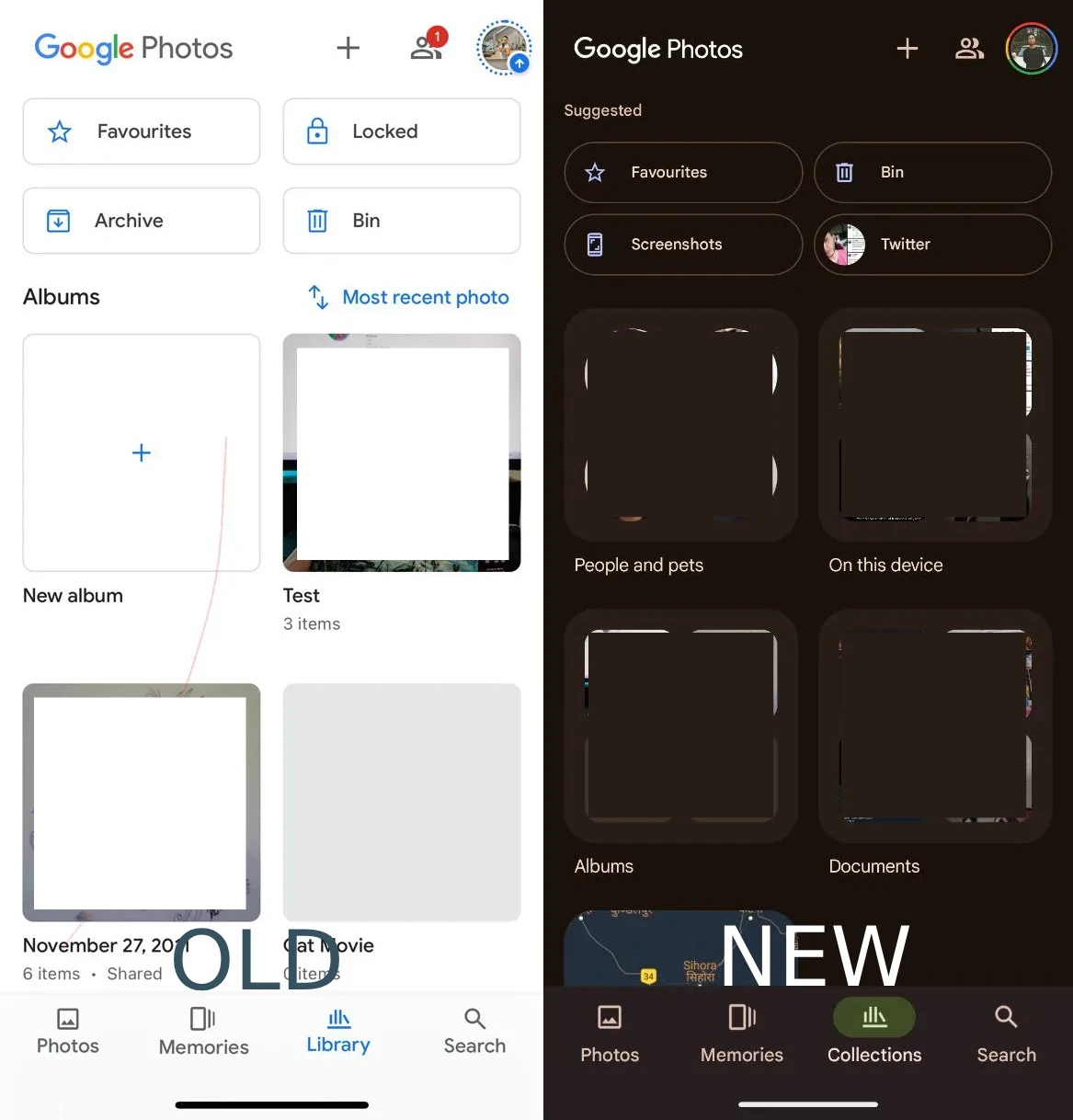
At the very top, you’ll find quick access buttons for ‘Favorites’ and ‘Trash,’ redesigned as sleek pill-shaped buttons. These are the places you’re most likely to visit often, so Google made sure they’re easy to get to.
But what really sets the ‘Collections’ tab apart is the dynamic grid below those buttons. This grid changes based on your habits. If you frequently check out screenshots or archived photos, those might pop up here. It’s Google’s way of saying, “We know what you like, so here it is.”
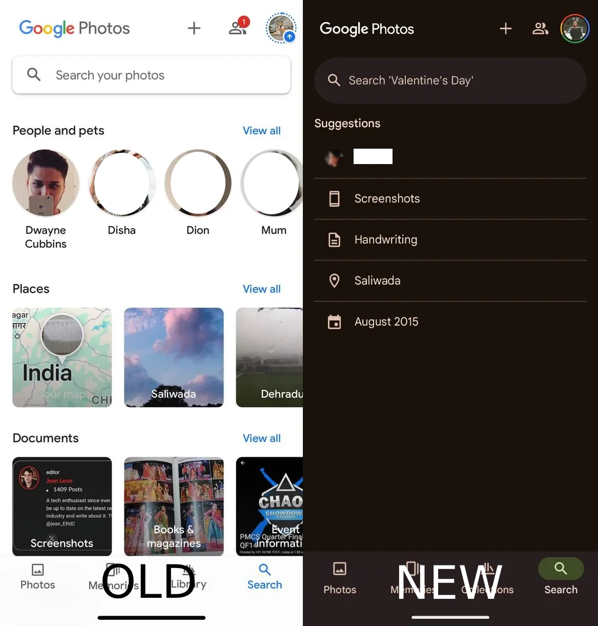
One thing you won’t find in this dynamic grid, though, is the ‘Locked Folder.’ Google decided to leave this out due to concerns about privacy. Users didn’t want their sensitive content popping up front and center, and Google listened. Here’s a screenshot of the new ‘Collections’ tab compared to the previous ‘Library’ tab. Just note that the “Old” UI screenshots shared in this article were taken via the iOS app, while the “New” UI screenshots were taken on the Android app. That said, the placement of elements are the same across both platforms.
Where are the albums from the Library tab gone?
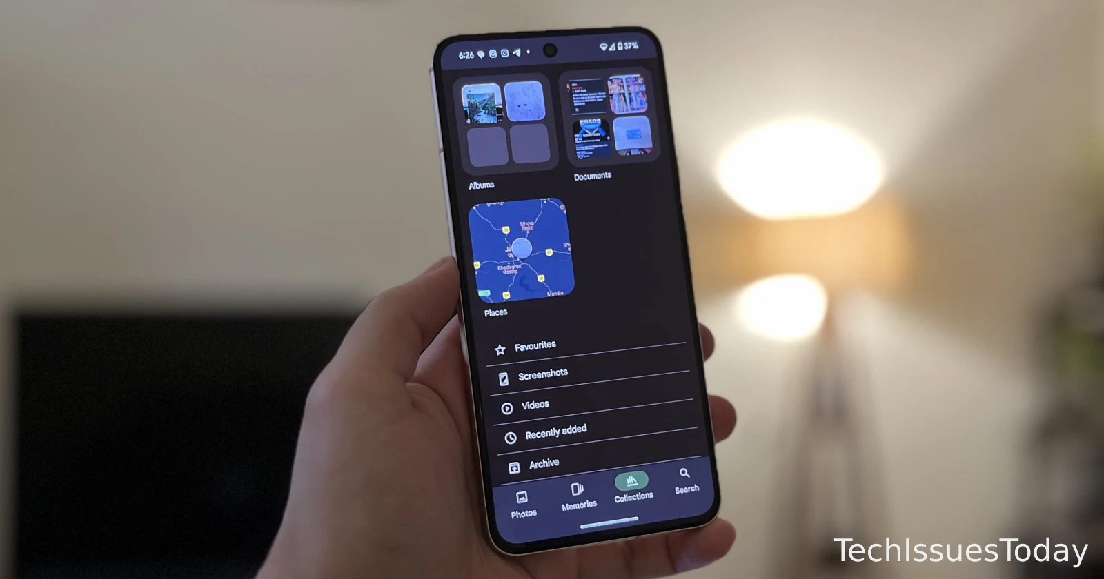
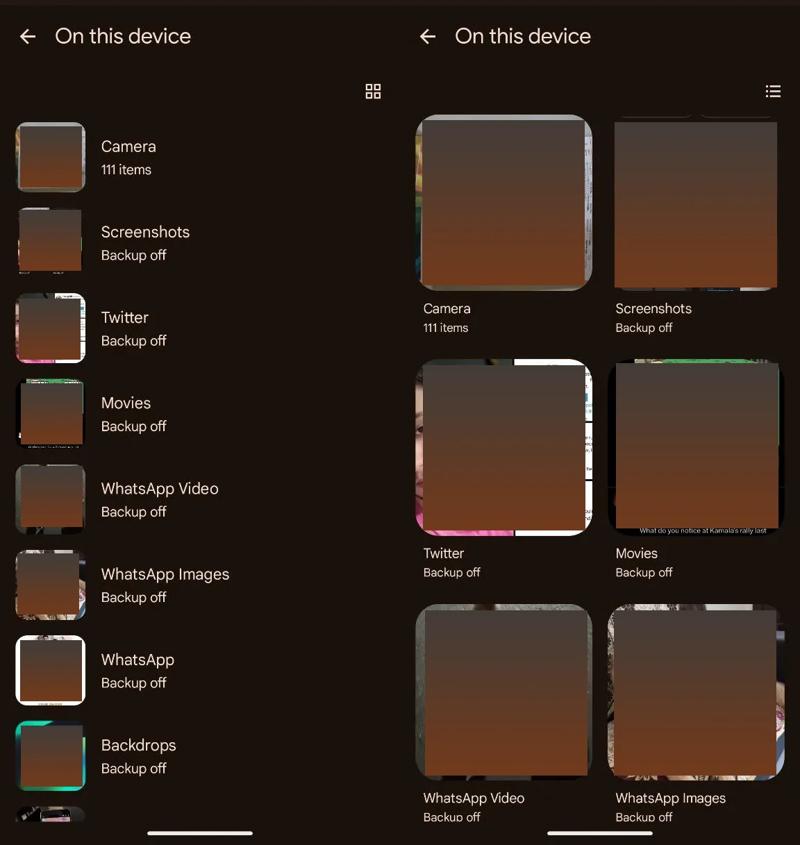
One of the biggest changes with this update is how the app handles photos stored on your device. Before, you could easily swipe through a carousel of options at the top of the ‘Library’ tab to access different albums, including those saved locally. That carousel is gone now, and in its place is the ‘On This Device’ folder, as seen in the screenshot above. This change might seem basic, but has left many users scratching their heads in confusion trying to figure out what happened with all their albums.
This folder is your new go-to for anything saved directly on your phone. Instead of having quick, one-tap access to your camera roll, you’ll now need to tap into this folder and then navigate to the specific album you want. It’s an extra step, and it might feel a bit clunky at first, but once you get used to it, it’s not too bad. You also have the option to switch from ‘grid’ view to ‘list’ view.
Digging into backed up Albums
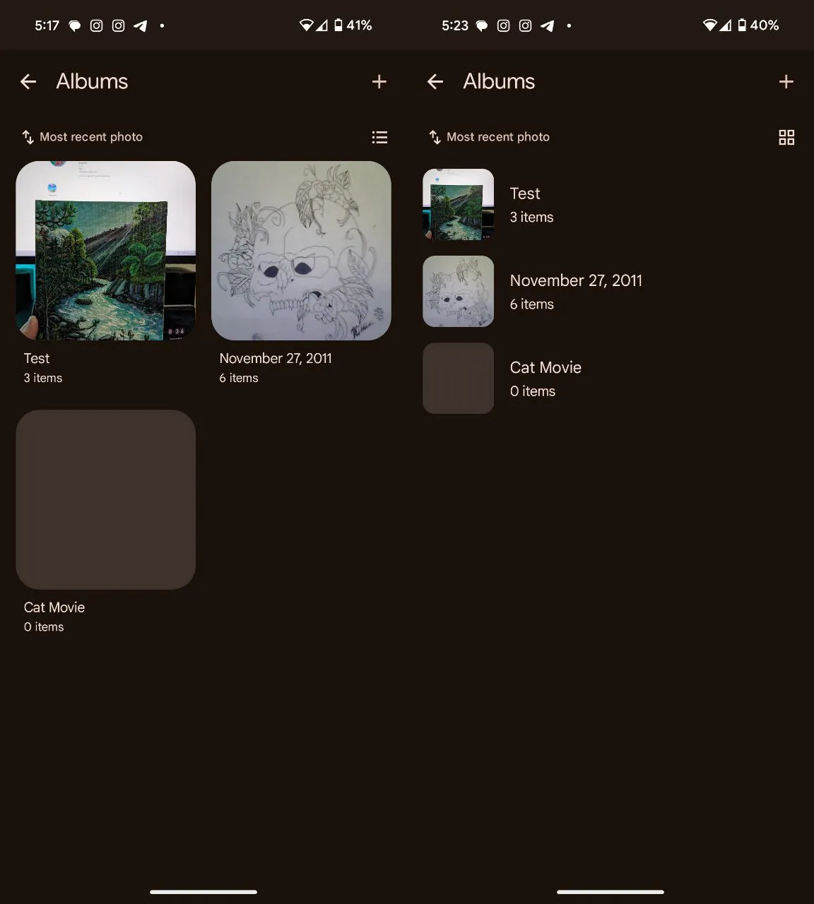
If you’re a fan of creating and organizing albums, the ‘Collections’ tab has plenty to offer, but you’ll need to adjust to a slightly new way of doing things. Instead of seeing all your cloud albums laid out in a grid in the Library tab, as seen in the screenshot of the “Old” UI shared earlier, they’re now tucked away in a folder labeled ‘Albums’.
When you open this folder, you can choose between a grid or list view to see your albums. You can also sort them by different criteria, like ‘Last modified,’ ‘Album title,’ or ‘Most recent photo.’ This might feel a little less intuitive at first, but it’s designed to help you find what you’re looking for more quickly—especially when it comes to shared albums, which were harder to locate in the previous design.
The Search tab gets a makeover
The ‘Search’ tab didn’t escape the update, either. While the core functionality remains the same, the layout has been simplified into a straightforward list. Now, when you open the ‘Search’ tab, you’ll first see your recent searches, followed by suggestions like ‘Screenshots,’ ‘Selfies,’ and ‘Menus.’ The folks over at 9to5Google report that this could be part of Google’s preparation for future AI-driven features like the Gemini-powered ‘Ask Photos,’ which promises to make searching your photos even smarter.
Where did the ‘Utilities’ go?
Note that quick access to ‘Utilities’ from the Library tab was removed from Google Photos over a month ago. But don’t worry, they haven’t disappeared—they’ve just been moved around in a way that might actually make more sense in the long run.
Here’s a rundown of where to find the tools you need:
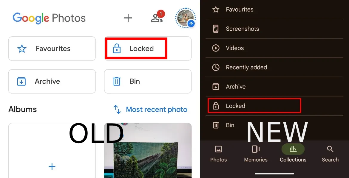
- Locked Folder: If you’re looking for your ‘Locked Folder,’ you’ll now find it in the ‘Collections’ tab, but you’ll need to scroll to the bottom to access it. It’s still there, just a bit more tucked away for added privacy. This is the only big change after the new update. The other options mentioned below work the same as before.
- Import Photos: To bring in photos from other places, tap on the ‘Create +’ button at the top of the app. Under the “Get photos” section, you’ll see the option to import. This works in the same way as it did before the update.
- Create New Content: Whether you want to make a new album, collage, or animation, all of these creation tools are now grouped under the ‘Create +’ button. It’s a one-stop-shop for anything new you want to put together. This too works the same as it did before the new update that brought the Collections tab.
- Free Up Space: Need to clear out some space on your device? Just tap on your account profile photo at the top of the screen. You’ll see the ‘Free up space on this device’ option right there, again, as it did before the update.
- Archive Photos: Archiving is still an option, but it’s a bit more tucked away. Select the photo you want to archive, tap on the ‘More’ button, and then choose ‘Move to archive.’
- Manage Photo Frames: This feature has been moved under your account settings. Tap on your profile photo, go to ‘Photos settings,’ and then ‘Apps & devices.’ From there, you can manage your photo frames.
Wrapping it up – Getting comfortable with the chyanges
Change can be a little uncomfortable, especially when it’s something as familiar as your favorite app. But the new ‘Collections’ tab in Google Photos is designed to make your experience smoother and more personalized. While it might take a few extra taps to get to some things, the idea is to give you quicker access to the content you actually use and care about.
If you’re missing the old ‘Library’ tab, give ‘Collections’ a chance. It’s a new way of thinking about how you organize and access your photos, and once you get the hang of it, you might find that it works even better for you. So, take some time to explore the new layout.
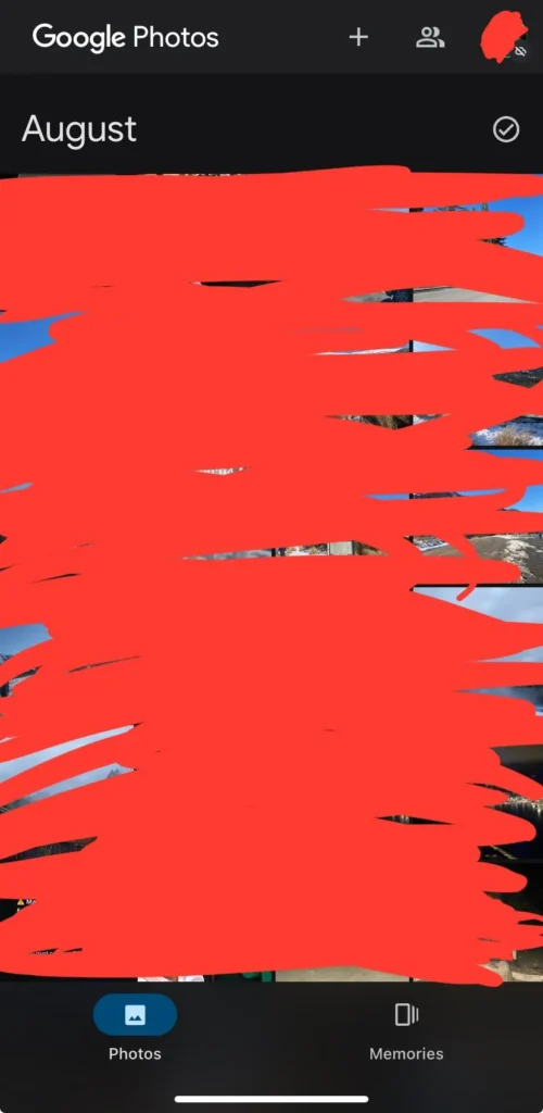
That said, I did come across a few reports from iOS users noting that the whole bottom bar is messed up, and they only have the Memories and Photos tab. The Library/Collections tab and the Search tab is missing.
I could not replicate the issue on my iOS device with Google Photos v6.94. If you’re one of the affected, hang in there and look out for an update. It’s likely that Google will fix the bug ASAP!
TechIssuesToday primarily focuses on publishing 'breaking' or 'exclusive' tech news. This means, we are usually the first news website on the whole Internet to highlight the topics we cover daily. So far, our stories have been picked up by many mainstream technology publications like The Verge, Macrumors, Forbes, etc. To know more, head here.


RN13-08-2024
now when I download pics, the thing wont save them to my phone downloads. Wtf
Reply