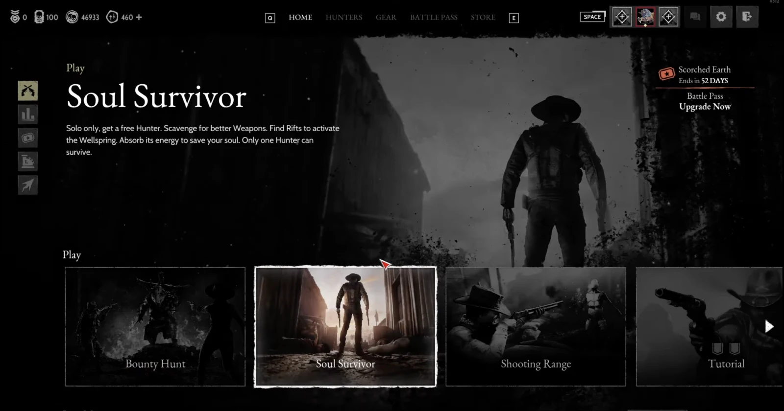
Hunt: Showdown 1896 has found itself in hot water following a major UI overhaul that has left many players frustrated and demanding changes. The update, aimed at modernizing the game’s menu system, has instead sparked widespread criticism from the community.
Players have flooded online forums and social media with complaints about the new UI, describing it as “clunky,” “cluttered,” and a “massive downgrade” from the previous version. Common grievances include an increased number of clicks required to navigate menus, difficulty in viewing loadouts and hunters, and a general sense that the redesign caters more to console players at the expense of the PC experience.
I found a video that pretty much highlights the main issues with the new UI. You can check it out below:
One Reddit user summed up the sentiment: “Who would have guessed that Netflix type menus are barely usable on PC, right? Crytek moment.” Another player on Steam lamented, “I swear, I need to do so much more clicking to get what I need before starting the match. I don’t like the new UI at all, sorry.”
The backlash has been swift and severe enough to prompt an official response from Crytek, the game’s developer. In a statement, a Crytek representative acknowledged the negative feedback:
Thanks for your review. We’re sorry that the new UI hasn’t met your expectations. We’re paying close attention to player feedback and will take the necessary steps to make it more comfortable and user-friendly. The overhaul was a long-requested and much-needed improvement, and our design team is dedicated to ongoing enhancements. We’re striving to strike the right balance between simplicity and functionality as we continue to refine the UI.
Crytek’s original goals for the UI update included enhancing accessibility for both PC and console players, implementing community feedback, streamlining navigation, and creating a scalable framework for future features. However, it appears the execution has fallen short of these ambitions in the eyes of many players.
Some users have pointed out that this isn’t the first time Crytek has faced criticism for UI changes, citing similar issues with previous titles like Ryse: Son of Rome.
Despite the overwhelmingly negative reaction, a few players have defended the changes or urged others to give the new UI time. “Not baiting, people are just scared for changes, come on. It’s great to change out the old gold with something new, we just gotta get used to it. I like it,” wrote one Steam user.
All eyes are now on Crytek to see how they will address the community’s concerns and whether they will make significant adjustments to the UI in future updates. That said, feel free to share your thoughts on the new UI in the comments section below.
TechIssuesToday primarily focuses on publishing 'breaking' or 'exclusive' tech news. This means, we are usually the first news website on the whole Internet to highlight the topics we cover daily. So far, our stories have been picked up by many mainstream technology publications like The Verge, Macrumors, Forbes, etc. To know more, head here.


