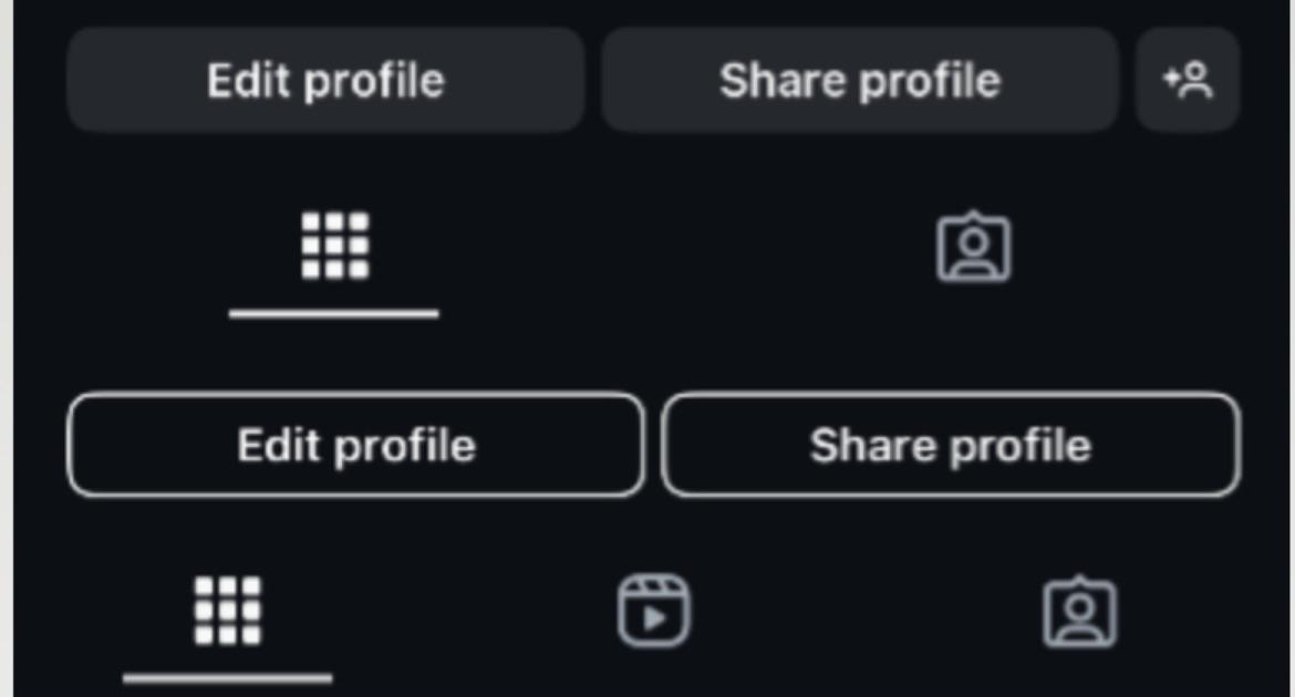
Reports surfacing online suggest that Instagram might be testing a few minor tweaks in the profile tab. A few users have taken to Reddit and X to discuss the new UI they’re seeing on profile pages. The most obvious change is that with the redesigned buttons. The new Edit, Share profile, Follow, and Message buttons that you see when you visit your profile or others’ profiles now have an outline around the buttons rather than a solid color. Here’s a comparison for reference (the top portion is the old UI while the bottom is the new UI):
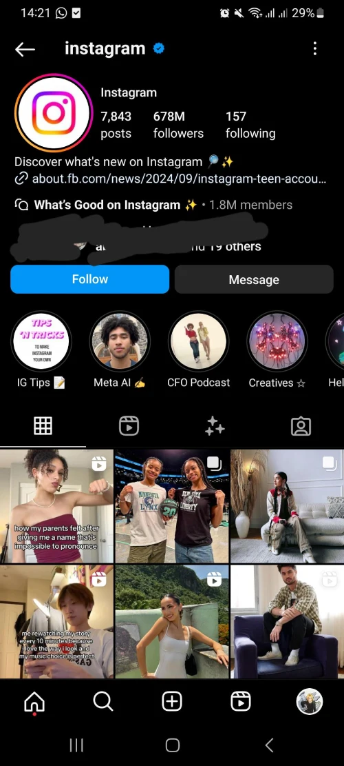
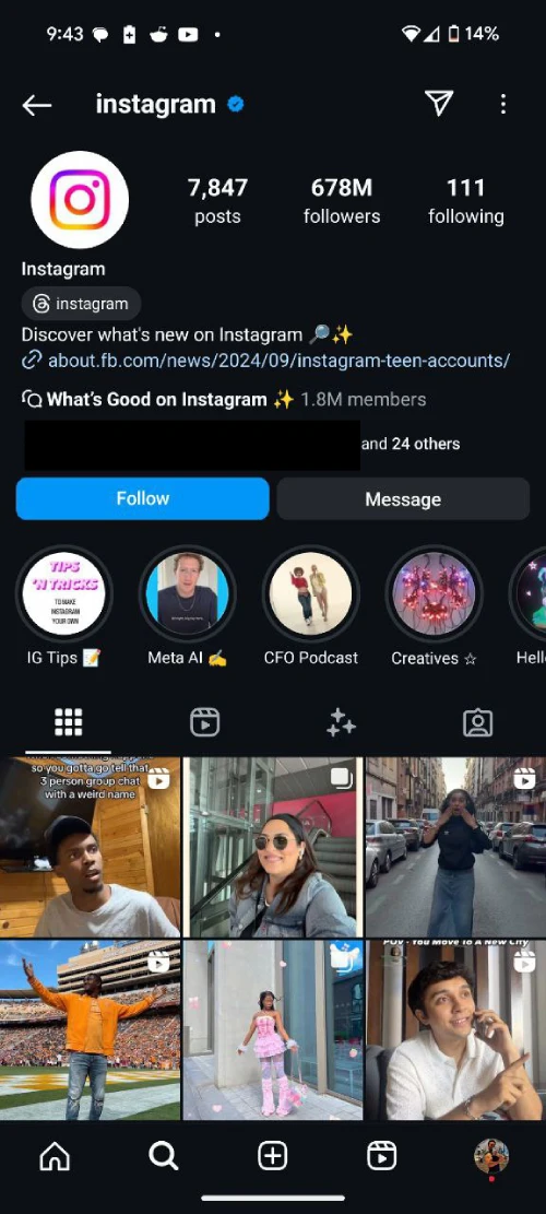
But that’s not all. Some have even pointed out the slightly tweaked layout of the profile stats. The Posts, Followers, and Following numbers are now left-aligned instead of center-aligned. In fact, the whole section seems to be shifted more toward the left and looks a bit clunky. I’ve not received this new UI on any of my devices (iOS and Android), so here’s a screenshot of the new UI shared on Reddit and a screenshot I took highlighting the current UI.


You might have noticed that the screenshot of the alleged UI being tested doesn’t have the new buttons highlighted earlier. So it seems like potentially new UI testing is segregated even further, with some seeing the new buttons while others seeing the new layout for the profile stats.
As expected, not everyone seems to be happy with this new UI Instagram’s testing. One individual took to X stating, “As a UX design student the new profile interface design on Instagram is 👎🏾” That said, this isn’t the only thing Instagram’s testing lately. We recently noticed the company testing a new layout for carousel posts, a new feature that’ll help you track the content you share, and also the ability to cross-post Reels to Threads.
Just note that not all features that show up in tests go live to a wide audience. So it’s possible that we might not see these new changes in the profile UI at all. Let us know your thoughts on the layout in the comments below!
TechIssuesToday primarily focuses on publishing 'breaking' or 'exclusive' tech news. This means, we are usually the first news website on the whole Internet to highlight the topics we cover daily. So far, our stories have been picked up by many mainstream technology publications like The Verge, Macrumors, Forbes, etc. To know more, head here.


