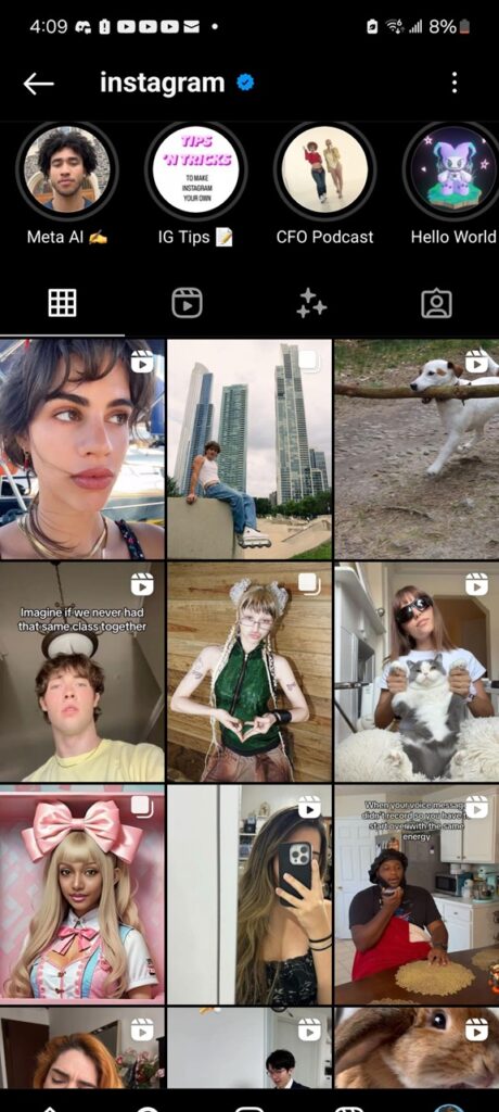
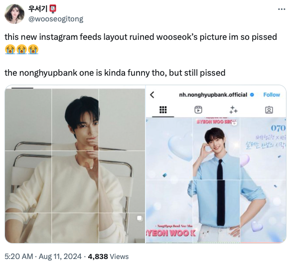
Update 20/08/24: Instagram chief Adam Mosseri has now confirmed that the company is indeed testing a new layout that aligns with the vast majority of content uploaded to Instagram today.
We’re actually testing a vertical grid, for those of you who haven’t seen it yet, for your profile, instead of squares. Now, squares are from way back in the day when you could only upload square photos to Instagram. And I know this can be annoying for some of you who really spend a lot of time curating and making sure everything lines up, but I would really like to do better by the content [creators of] today. And the vast majority of what is uploaded to Instagram today is vertical; it’s either 4:3 in a photo or 9:16 in a video, and cropping it down to a square is pretty brutal, so I’m hoping we can figure out a way to manage this transition.
Original article follows:
Instagram is at it again with another unexpected tweak, and this time it’s the profile layout that’s causing a stir. According to reports doing rounds, it seems Instagram is experimenting with a new layout for the “Posts” tab that ditches the iconic square format in favor of a rectangular grid, similar to portraits in the Reels tab.
Traditionally, Instagram’s “Posts” tab has displayed content in a neat, square grid, making it easy for users to showcase their photos and videos in a uniform manner. However, a growing number of users are now seeing their profiles switch to a rectangular grid, similar to the layout used for Reels. This shift is stirring the pot, with users on both Android and iOS reporting the change — though not everyone is affected. My colleagues and I still have the old square grid on both Android and iOS, suggesting the rollout of the portrait grid, if it’s actually happening, is gradual.
The reaction from Instagram’s community has been swift and vocal. Some users are wondering if the new layout is a glitch or an intentional update. Android and iPhone users alike have chimed in, some still seeing squares on some of their accounts while others have transitioned to rectangles. The inconsistency only adds to the frustration.
Artists and content creators, in particular, are feeling the pinch. Many who had carefully curated their profiles with square-format content found their work awkwardly cropped and misaligned in the new rectangular layout.
Given the haphazard rollout, it’s plausible that Instagram is conducting A/B testing to gauge user reactions. This method allows them to compare the engagement and satisfaction levels between different groups of users. However, if the feedback is any indication, the rectangular grid is not winning any popularity contests.
Let’s face it, change can be hard, especially when it disrupts the aesthetic harmony of a carefully curated Instagram profile. While it’s understandable that Instagram wants to innovate and keep the platform fresh, rolling out such a significant change without clear communication can leave users feeling blindsided.
If you’re one of the users stuck in this rectangular nightmare, take heart. Changes like these often come with a wave of backlash that can prompt a re-evaluation from the powers that be. For now, let’s hope that Instagram listens to its community and either provides an option to revert to the classic square grid or, at the very least, offers more clarity on the reasons behind the change.
In the meantime, it might be a good idea to keep an eye on those app updates and maybe, just maybe, back up those precious square posts.
In other news, Instagram users are reporting that the UI when sharing reels now shows random people. Others have also been dealing with an issue where they can’t pause or mute their reels. Hopefully, all issues, including the new layout, get addressed soon.
TechIssuesToday primarily focuses on publishing 'breaking' or 'exclusive' tech news. This means, we are usually the first news website on the whole Internet to highlight the topics we cover daily. So far, our stories have been picked up by many mainstream technology publications like The Verge, Macrumors, Forbes, etc. To know more, head here.
linn30-12-2024
it’s making me not wanna use instagram anymore from all the misaligned texts and lines. ocd nightmare.
ReplyPaige26-10-2024
The rectangles look disgusting! the squares look perfect. i hope they keep it square or at least give the option for individual creators to choose how their feed looks. plenty of people still post horizontal photos and videos too, its not all about going viral with reels!
ReplyPhilippe V01-10-2024
Give us the squares back. Hate those rectangle making your grid a non sense!
ReplyP26-09-2024
It looks disgusting! I really hate it!! It makes me not want to go on Instagram on my account it’s done it to
ReplyJoekqz12-09-2024
I really really really dislike it! Hopefully there'll be an option to choose which grid you prefer. One of the things that charmed me the most about insta was the square pic grid.
ReplySmall fragrance business owner09-09-2024
OMFG...this is a Fking disaster as a small business owner whom has spent tremendous amount of time carefully arrange my posts.....it's all messed up overnight! the stupidest thing is that tho I have been using 1350x1080 for my post, the new rectangular grid decided to crop the image from both sides even with this aspect ratio? if I use 1350x1080 in the first place then it shouldn't be cropped right? WTF?
ReplyRosy22-08-2024
HATE HATE the rectangles
ReplyMaria15-08-2024
It's horrible. Many of us carefully cropped and manage to make everything fit nicely... now in groups pictures, some are missing and the entire look it's so unprofessional. Very inconsiderate for them to make such a change without giving the user the opportunity not to.
Replyjayden15-08-2024
i absolutely hate it
Replyinliminela14-08-2024
The vertical format is for children on Tik Tok. Stop this nonsense. There are now so many pages ruined by this formatting.
ReplyNot an influencer13-08-2024
For me it looks 10x better with the new layout, but I am not a content creator, just using the platform for fun.
ReplyTurtle13-08-2024
This is horrible. I want my sqaures back ugh!
ReplyShreya13-08-2024
We put so much efforts to keep our profiles polished and here comes new Instagram feature making my profile look so bad! I need Square format.
ReplyHelena12-08-2024
It’s horrible. My posts look totally unprofessional now
ReplyJo12-08-2024
This new rectangle format makes all out content look unprofessional with cut off text. Please revert to the square format for feed
ReplyRoshani11-08-2024
This is crazy
ReplyAngry Digital Marketer10-08-2024
This completely messes up my content that has text on it!! Please allow us to choose which one we want!
ReplySteve D10-08-2024
The downfall of this app is crazy. The disregard of user satisfaction in favor of trying to catch up to Tik Tok is baffling. As if they couldn't have developed a new app to compete instead of ruining a great one.
ReplyAlicia10-08-2024
I'm a fan of the new design, but can understand the frustration & pushback. I think it would be nice if instagram created a toggle/setting, so users could choose what grid format they're wanting for their profile? It's good to have options. Not sure how hard/realistic it is in reality & it's probably something they've already considered
ReplyBRD10-08-2024
Updates are indeed necessary, but let the user decide whether they want the new update or not.
ReplyDale09-08-2024
I despise the new vertical format that IG has foisted upon us.
ReplyMonica08-08-2024
YOU RUINED MY DAY!!!
ReplyDaniel08-08-2024
Me encanta en rectangular. Es lo lógico en una fotografía 🤩 >>I love it rectangular. It's the logical thing in a photograph 🤩
ReplyRick McGinnis07-08-2024
Years of carefully designed posts in my feed ruined in one day. After the algorithm changes that have reduced engagement so steeply this seems like one more way to ruin what was my favorite social media app. Thanks, Meta.
Reply


Josh 18-01-2025
Option 1: Why not allow people to choose what format works for them the best. (Configuration setting) Option 2: keep squares until a specific announced date - then change format only after that date forwards.
Reply