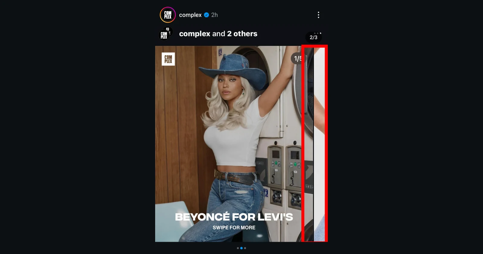
Carousel Posts showing the edges of next and previous photos
byu/thenewgaijin inInstagram
Recent reports from users indicate that Instagram is testing a new style of carousel posts that no one really asked for. According to screenshots shared online, you can now see a hint of the next or previous image in the carousel along with the current image.
If you’ve been on Instagram for long enough, you already know that this would ruin those multi-stitch posts that some creators use to give their carousel posts the illusion of a continuous landscape image that you can scroll through. So as expected, Instagram users who’ve got this new layout want nothing to do with it.
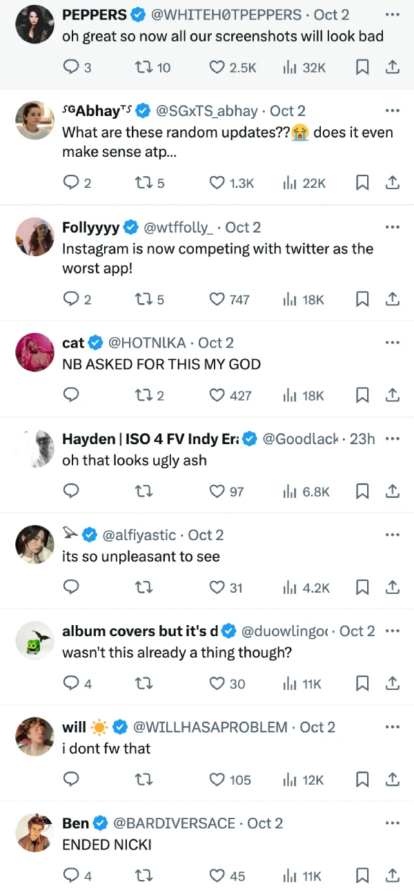
One user on Reddit said, “I’m losing my mind i need it gone immediately.” Another frustrated Instagrammer titled their post on Reddit as This week’s edition of “how can we make shit worse.” A post on X by Pop Base highlighting this change also drew a lot of criticism against the move.
Upon checking for the new layout on my iOS and Android devices, I guess I’m lucky this test hasn’t hit my account yet, however, your mileage may vary. That said, more often than not, features being tested with a wide audience usually end up going live for everyone eventually, such as the new floating “liked by” indicators.
Let me know if you’ve also got the new carousel layout for Instagram posts in the comments section below.
Featured image credits: thenewgaijin / Reddit
TechIssuesToday primarily focuses on publishing 'breaking' or 'exclusive' tech news. This means, we are usually the first news website on the whole Internet to highlight the topics we cover daily. So far, our stories have been picked up by many mainstream technology publications like The Verge, Macrumors, Forbes, etc. To know more, head here.


Jo09-11-2024
Hate this app
Reply