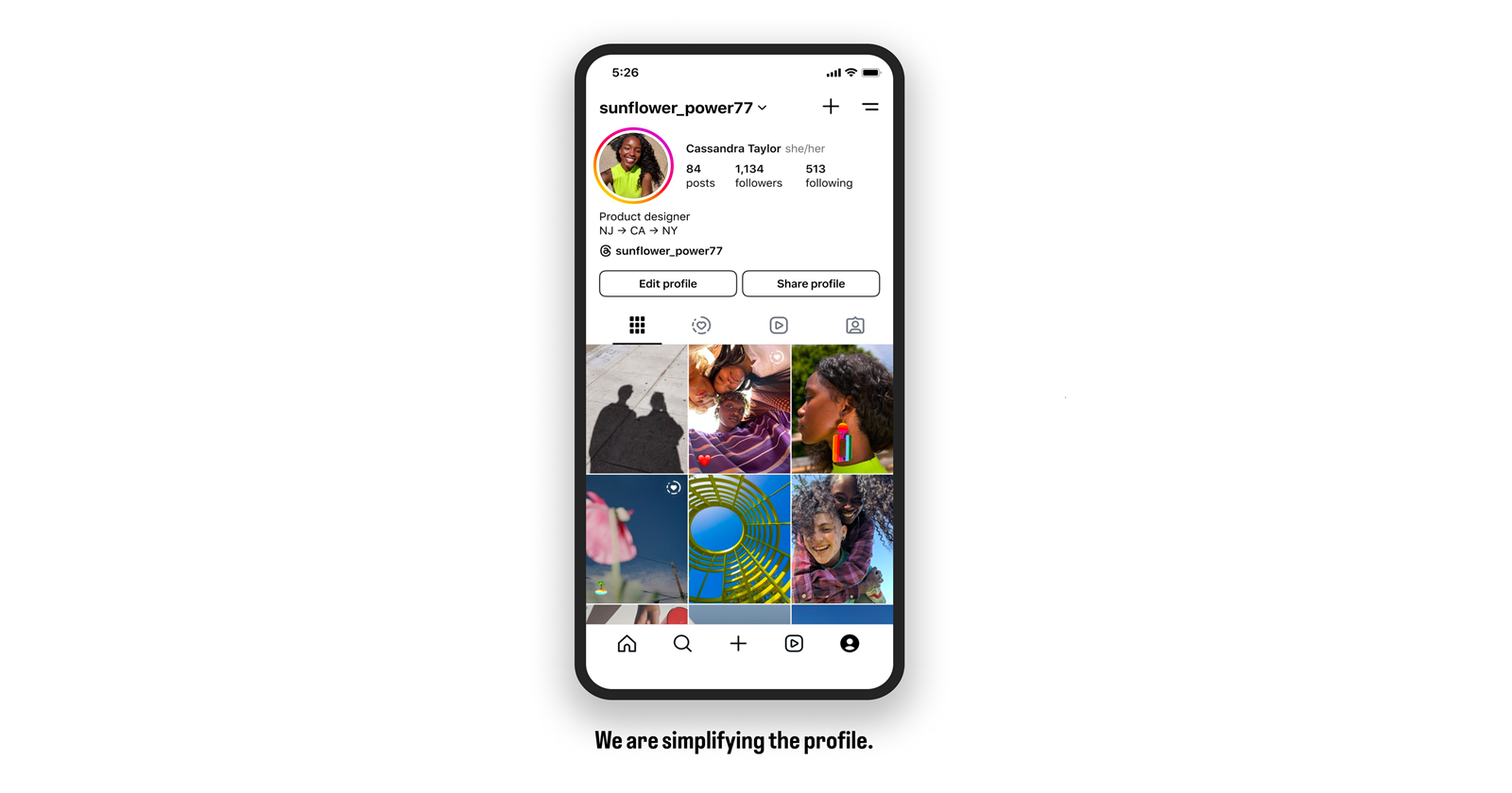
Last August, Instagram users found themselves at the epicenter of a digital uproar. The familiar, comforting square grid of the ‘Posts’ tab had been replaced by a mysterious new rectangular layout. It popped up unannounced, throwing countless carefully curated feeds into disarray. A couple of weeks later, Instagram chief Adam Mosseri stepped in to confirm what many had suspected: the platform was testing a new layout.
In a statement that felt like a gentle nudge towards modernity, Mosseri explained back then, “We’re actually testing a vertical grid, for those of you who haven’t seen it yet, for your profile, instead of squares. Now, squares are from way back in the day when you could only upload square photos to Instagram. And I know this can be annoying for some of you who really spend a lot of time curating and making sure everything lines up, but I would really like to do better by the content [creators of] today. And the vast majority of what is uploaded to Instagram today is vertical; it’s either 4:3 in a photo or 9:16 in a video, and cropping it down to a square is pretty brutal, so I’m hoping we can figure out a way to manage this transition.”
Fast forward to last week, and the controversial rectangular profile grid is rolling out widely. Unsurprisingly, it’s met with a familiar mix of cheers and jeers. The backlash prompted Mosseri to hop onto Threads to give us a peek behind the curtain and explain the method to the madness.
Profile roadmap: What’s coming next?
In a refreshingly candid post Mosseri admitted, “One of the mistakes I made was not giving people enough of a heads up.” Lesson learned! Here’s the scoop on Instagram’s profile evolution plans:
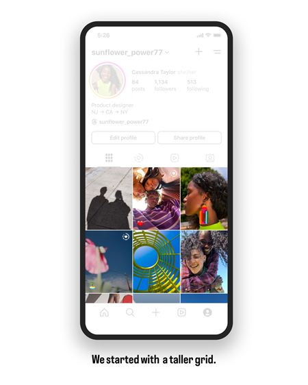
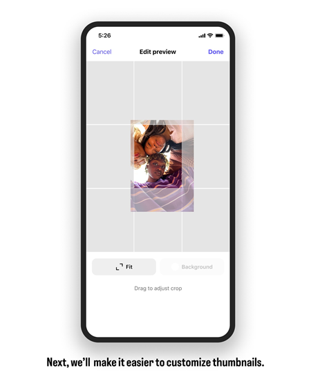
- The tall grid takeover: Instagram’s new vertical layout is all about embracing the current content trends. “Most photos and videos that are uploaded to Instagram at this point are vertical,” Mosseri pointed out. “Rectangles do a better job showing off those photos and videos.” Sure, it’s a bummer for those who spent hours perfecting their square grids, but fear not — help is on the way. “We’re going to improve the ability to customize those thumbnails to make it easier to get back to a place you’re happy with,” Mosseri promised.
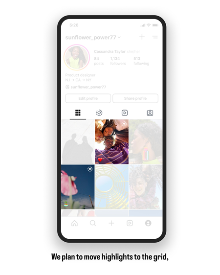
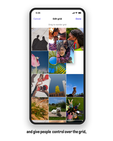
- Highlights get a makeover: Highlights are moving into the grid and will soon have their own tab. “Highlights are a great way to showcase your favorite stories, but they are visually complicated and push your grid down,” Mosseri explained. The solution? A new tool allowing creators to reorder their entire grid, giving them the power to create their dream profile layout.
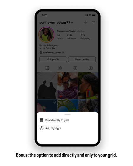
- Direct posting to grid: In a move that’s sure to delight many, Instagram is adding the option to post directly to your grid, sidestepping the feed entirely. This feature promises more control over how and when your content appears.
Mosseri wrapped up his update with a note of caution and hope. “This plan may very well change as we iterate over the next couple months, but I’m hoping sharing our intentions early will help avoid any more harsh surprises.”
So, whether you’re a fan of the new rectangular grid or longing for the good old days of squares, one thing is clear: Instagram is on a mission to evolve. And, love it or hate it, we’re all along for the ride.
Here’s Mosseri’s full post as shared on Threads:
Profile roadmap 🗓️
We launched a new tall grid on the Instagram profile this week and I got a lot of feedback, both positive and quite negative. One of the mistakes I made was not giving people enough of a heads up, so here are some details about how we plan to evolve the profile over the next few of months. The goal is a simpler, cleaner place that maintains, and even increases, creator control.
We started with the tall grid because most photos and videos that are uploaded to Instagram at this point are vertical and rectangles do a better job showing off those photos and videos. That said, I know some of you spend a lot of time tweaking your grids and this blew all of that up, so we’re going to improve the ability to customize those thumbnails to make it easier to get back to a place you’re happy with.
We’re also looking to move highlights into the grid and add them as a tab. Highlights are a great way to showcase your favorite stories, but they are visually complicated and push your grid down. In order to maintain creator control we’re building a tool so you can re-order your entire grid and make it whatever you want.
And as a bonus, we’re adding the ability to post directly to your grid, in case you want to bypass feed entirely.
This plan may very well change as we iterate over the next couple months, but I’m hoping sharing our intentions early will help avoid any more harsh surprises.
TechIssuesToday primarily focuses on publishing 'breaking' or 'exclusive' tech news. This means, we are usually the first news website on the whole Internet to highlight the topics we cover daily. So far, our stories have been picked up by many mainstream technology publications like The Verge, Macrumors, Forbes, etc. To know more, head here.

