Apple’s iOS 18 rollout has brought plenty of changes, but not all of them are being welcomed with open arms. The overhaul to the Photos app and Control Center has users talking, and not always in a good way. While some praise the new features, many are frustrated with usability issues — and to make matters worse, there’s a growing number of reports about the Control Center crashing.
Is the Photos app in iOS 18 too much of a good thing?
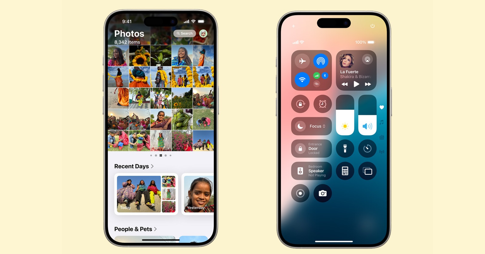
The revamped Photos app is one of the hot topics. Apple has waved goodbye to the convenient tab-style interface, where users could easily jump between “Library,” “For You,” “Albums,” and “Search.” In its place is a single-page, scrollable layout that puts everything — including collections like “Recent Days” and “People & Pets” — front and center. For some, this is a welcome change, but for many others, it’s a frustrating downgrade.
Before the update, users could effortlessly switch between tabs and get to their desired content in a few clicks, but now, the new all-in-one view means you’ll lose your place every time you navigate away from the main scroll. Going back to your library? Get ready to start scrolling from scratch. This shift has sparked a wave of complaints, with many lamenting the loss of the clean, tabbed design that they had grown comfortable with.
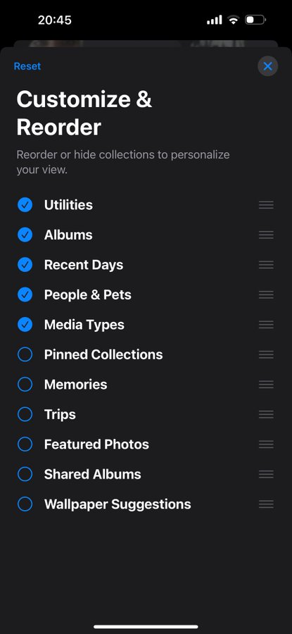
For those who love personalizing their photo experience, iOS 18 does introduce a “Customize & Reorder” feature (as seen in the screenshots below). Users can now rearrange and choose what collections they want to see upfront — be it media types, albums, or the ever-curated “Memories” section. However, for users who want their photo library to stay strictly focused on their own albums, the emphasis on system-generated collections feels like Apple is pushing its AI-fueled content curation too aggressively.
iOS 18 Control Center isn’t just inconvenient, it’s buggy too
While the Photos app changes are causing some frustration, the iOS 18 update to the Control Center has sparked an even bigger outcry, primarily because of new bugs. Apple made significant tweaks to the Control Center’s layout, adding a “Connectivity” folder to house Airplane Mode, Wi-Fi, Bluetooth, and Mobile Data. Surprisingly, Mobile Data was bumped from its usual spot in favor of AirDrop, a decision that has annoyed users who rely on quick access to cellular settings. Now, getting to Mobile Data requires extra clicks, undermining the whole point of having a Control Center for easy toggling.
Worse still, a growing number of users are reporting crashes when trying to customize the Control Center. According to various reports, attempts to add a new control often result in the phone crashing — triggering a black screen with a loading symbol, before dumping the user back on the Lock Screen. For some, the Control Center is completely unusable, with crashes occurring every time they try to add or modify controls.
So far, a few users have found success by updating or uninstalling problematic apps that were recently installed or updated. While this has worked for some, it’s hardly a permanent fix, leaving most users stuck with a frustrating, unreliable Control Center experience.
Is the redesigned Control Center a major step back?
Even without the crashing issue, the new Control Center design isn’t exactly winning hearts. As mentioned, Mobile Data has been relegated to a sub-menu, which adds unnecessary complexity. Wi-Fi, similarly, now requires an extra tap to access its settings, making what was once a seamless process more cumbersome.
Users argue that AirDrop, which now has a prime spot in the Control Center, isn’t something they need to access regularly. Most people use it sporadically — certainly not often enough to justify burying critical connectivity features. Apple has long been celebrated for its intuitive designs, but this change feels like a step backward in terms of user convenience.
While iOS 18 introduces a few innovative changes, both the Photos app and Control Center updates come with significant downsides. The Photos app’s single-page design may appeal to those who want a simplified view, but for many users, the loss of the tabbed interface has made managing their photo library unnecessarily cumbersome.
The Control Center’s new design, while visually sleek, sacrifices ease of use — especially with crucial settings like mobile data buried under extra steps. And, adding insult to injury, the Control Center is also plagued with a crashing bug that affects users’ ability to customize their controls, with those affected left looking for solutions that may or may not work.
Ultimately, iOS 18 feels like a mixed bag, with its potential dampened by these glaring usability and stability issues as well as the missing Apple Intelligence features. Unless Apple addresses these problems in future patches, iPhone users might find themselves longing for the simplicity and reliability of earlier iOS versions. For now, it seems the latest update has left many questioning whether the new features are worth the growing pains.
TechIssuesToday primarily focuses on publishing 'breaking' or 'exclusive' tech news. This means, we are usually the first news website on the whole Internet to highlight the topics we cover daily. So far, our stories have been picked up by many mainstream technology publications like The Verge, Macrumors, Forbes, etc. To know more, head here.


