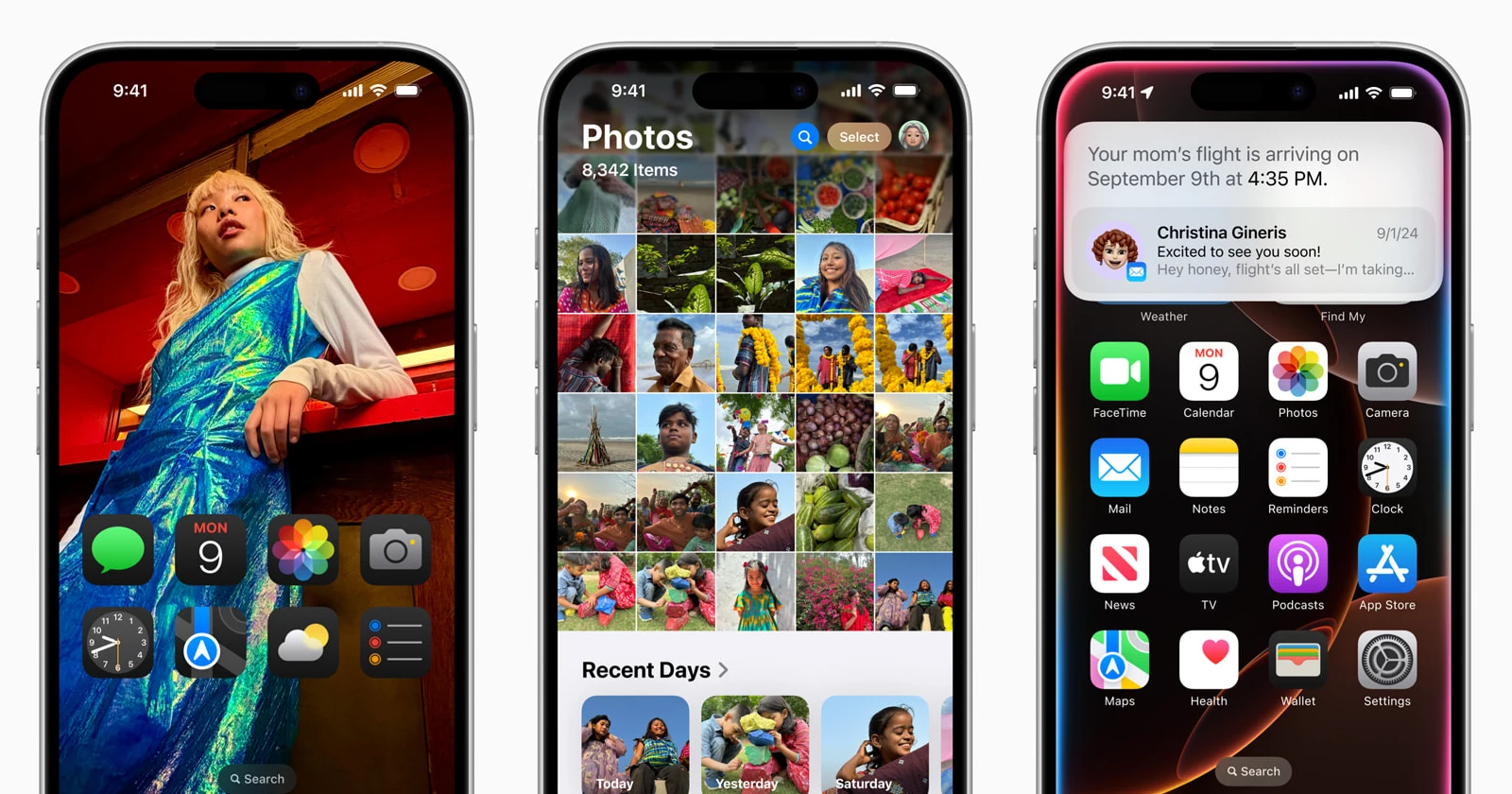
Apple’s new iOS 18 has landed, and many of the major features touted with the update are still not here. What’s here, however, is a disastrous Photos app update, according to many users who’ve found themselves wanting to get back to iOS 17 after opening the Photos app.
Users have taken to platforms like Reddit, X, and even the Apple community forums to vent their frustrations over the redesign. Here’s what some people are saying about it:
Guys i rlly hate this ios 18 update. why do i not know how to access pics from my camera roll now.. (Source)
If you’re going to update to iOS 18 I’d recommend otherwise as my camera roll is an absolute mess now and I have no clue where anything is. (Source)
iOS 18 messed up the camera roll. Why make it so confusing? (Source)
There are many similar complaints about the confusing new Photos app layout. Judging by the complaints online, the main problem seems to be how people access their “Camera roll”. The last time people were this confused with the Photos app was when Apple completely got rid of the term “Camera roll” in the Photos app with iOS 13. The most common complaint is about how unorganized the Photos app is now.
Unlike the Photos app in iOS 17, which had useful tabs to navigate around the Photos app, the new layout is just one page with literally everything in it. Naturally, this has left people feeling disoriented when using the app. However, all is not lost. While the new Photos app layout may seem overwhelming at first, there are ways to navigate it more efficiently.
Most users recommend customizing and reordering the layout of the Photos app. To do this, simply scroll to the bottom of the app and tap the “Customize & Reorder” button. Here, you’ll see a list of collections that you can reorder or hide from view. This should help in making the app feel a little more organized. However, for those who’re looking to only see their camera roll, you might have to exit the Photos app and get into the Camera app instead. As one user pointed out, “the old camera roll is only in the camera app.” While this view doesn’t offer a grid format, it does provide access to your most recent photos, allowing users to scroll through their latest captures one at a time.
Some users have found solace in the “Recent Days” section, though it’s not a perfect replacement for the previously available format. One user noted, “My ‘recent days’ shows that I haven’t taken a picture since August 16th, even though I have 17 other photos in the ‘library’ since then.” This discrepancy highlights the confusion many are experiencing with the new organization system.
Remember, the Library is now the same thing as the Recents UI that previously housed all your images. You simply need to scroll up the screen to check out all the images, like you could with the previous Photos app. Here’s how one user explained it:
Your library is the camera roll. What was called “Camera Roll” was changed to “Recents” in a past iOS update (forget which one) and has now dropped that name and is just your Library. Any picture you take will be in your library, and as such that is your camera roll. I don’t believe there has ever been a separate Camera Roll to the general library. It was just called “Camera Roll” but contained the same things Library does now. (Source)
It’s important to note that these workarounds aren’t perfect solutions. Many users are still calling for Apple to “give us the option to use the old camera roll view instead of this library crap.” Some have even considered downgrading their iOS version to regain the old layout.
Apart from the cluttered UI, many have also noticed that Apple seems to have nerfed video scrubbing in the Photos app. First off, some users are disappointed that they can’t scrub through videos in full-screen mode. Others have noticed a weird bug that doesn’t let users see the full video preview when scrubbing through the video. Here’s a video for reference:
I was able to replicate the bug on my end as well. However, a Redditor did point out something interesting. Here’s what they said:
Weird bug. It seems to only happen in the first second of the video. If you let it play longer or skip forward it works normally. (Source)
I could confirm this on my iPhone 13 running iOS 18.1 beta. Furthermore, if you want to scrub through videos in full-screen mode, you can try zooming into the video and then scrubbing through it. Doing this brings up the video controls on top of the zoomed in video itself, rather than taking you out of the full-screen view. It’s not the most practical workaround, but it’s a decent option.
Let’s just hope Apple sees all the complaints about the new Photos app flooding the internet and works on refining it further. I mean, I would describe myself as being tech-savvy, yet I also find myself not being able to get used to the overly complicated Photos app. iOS was supposed to be very user-friendly, no?… That said, feel free to share your thoughts on the messy Photos app in the comments section below. Also, let us know if you found other ways to make finding photos easier with the new layout.
TechIssuesToday primarily focuses on publishing 'breaking' or 'exclusive' tech news. This means, we are usually the first news website on the whole Internet to highlight the topics we cover daily. So far, our stories have been picked up by many mainstream technology publications like The Verge, Macrumors, Forbes, etc. To know more, head here.


