I'm a bit concerned with readability pic.twitter.com/8XZLfzzvG2
— Marques Brownlee (@MKBHD) June 9, 2025
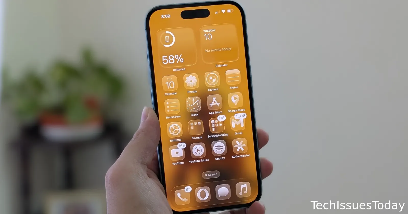
Apple’s new ‘Liquid Glass’ design language is finally here, and oh boy has it got a lot of people talking. Much like any other change, some users like it, others hate it, and then there are some who are on the fence.
I have to say, I quite like the overall concept of Liquid Glass. It’s expressive and delightful, as Tim Cook himself put it. This new flexible material constantly adapts to its surroundings and promises a unified design across all Apple platforms. But it is still very much a work in progress. Remember, we are only on the iOS 26 Developer Beta 1. However, in some situations, it quickly becomes a readability nightmare.
A lot of folks are echoing this sentiment. MKBHD, the popular tech reviewer, even posted his concern, “I’m a bit concerned with readability.”
He’s not alone. Many users who have downloaded the developer beta are finding it tough on the eyes. I’ve shared some screenshots of posts from users highlighting the concerns:
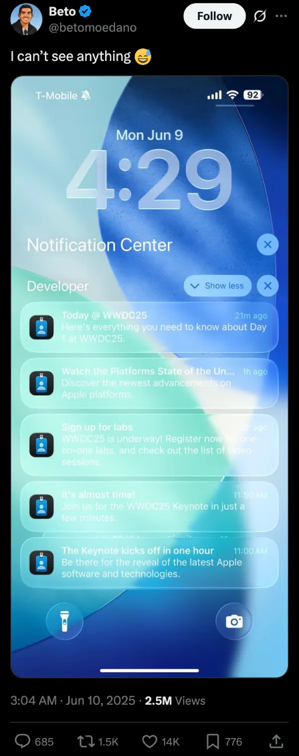
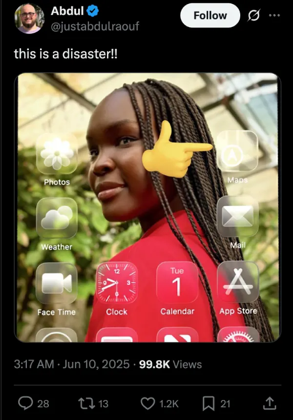
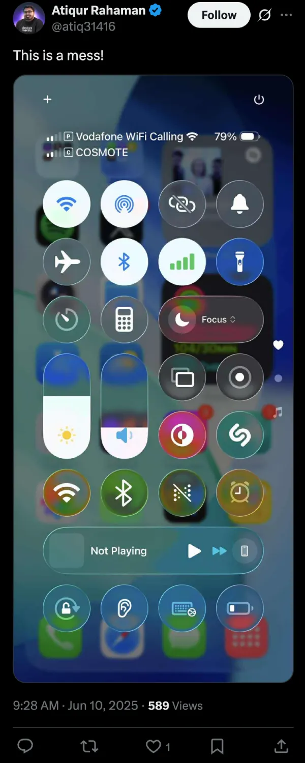
These are just some of the hundreds of posts online taking a dig at the all new Liquid Glass design language. It seems the transparency, while conceptually cool, is causing some serious headaches. But it’s worth pointing out that the problem is exacerbated with certain wallpapers, especially ones that have a lot of white or bright colors.
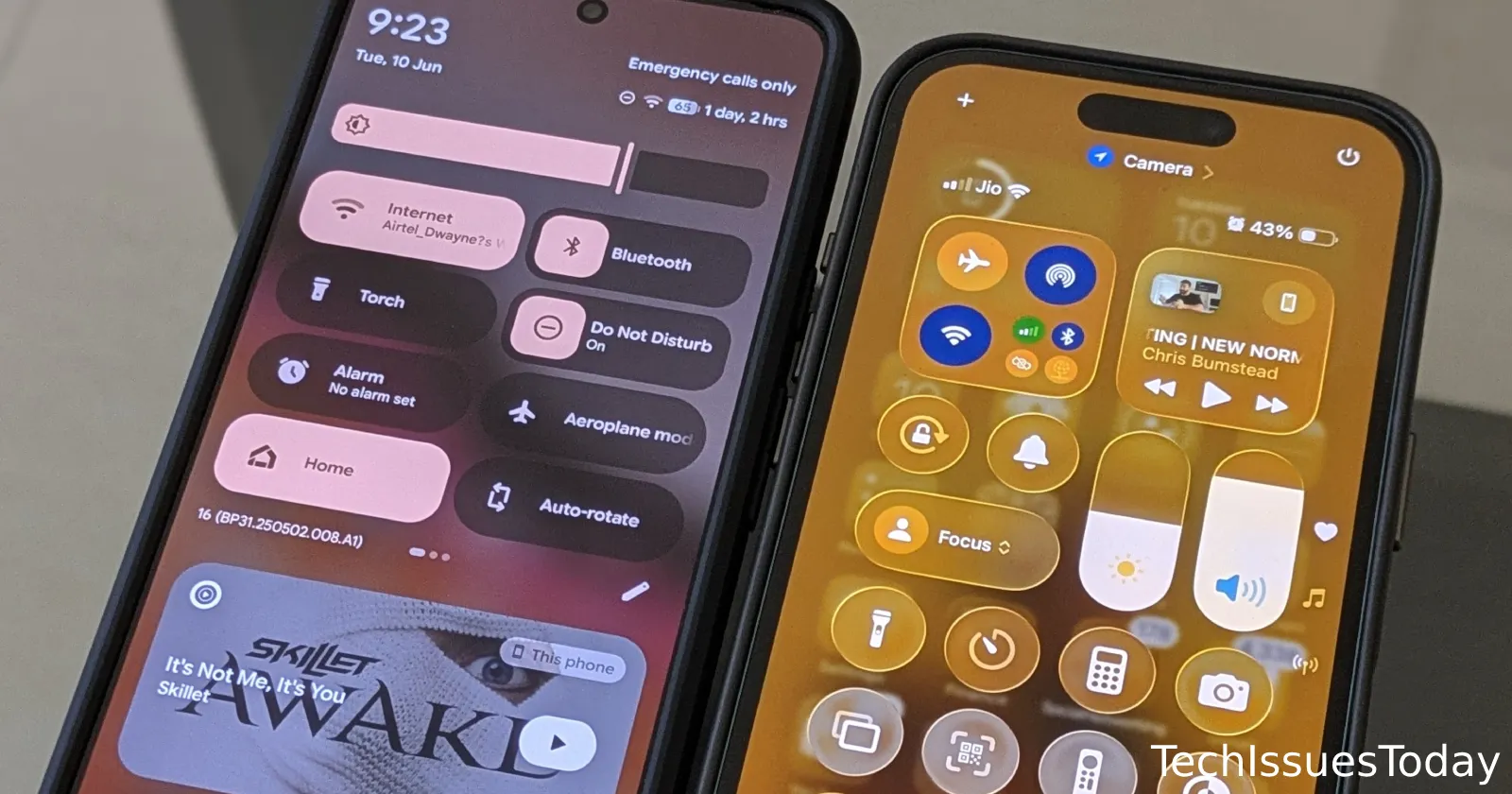
That said, the transparency doesn’t necessarily need to be a mess. Take for example the new Android 16 QPR1 beta, which introduced Google’s all new Material 3 Expressive design language. It, too, uses transparency in some key areas, including the notification shade, however, Google has made it look a lot cleaner.
They did this by simply bumping up the blur in the background of the toggles. This alone makes everything look better and doesn’t hamper the readability.
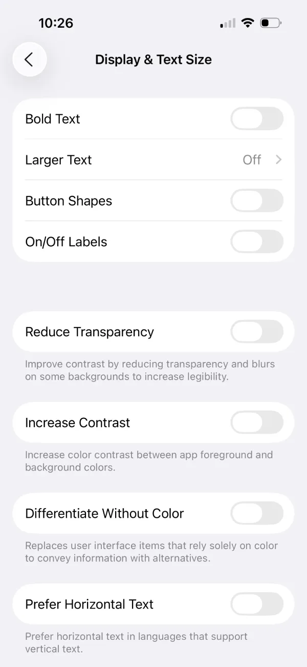
The good news is there’s a quick fix available right now for those testing the beta. If you are struggling with the ‘Liquid Glass’ effect, you can easily improve readability. Just head over to Settings, then Accessibility, and finally Display & Text Size. From there, you can turn on Reduce Transparency. It makes a huge difference.
Here’s a quick before and after for reference:
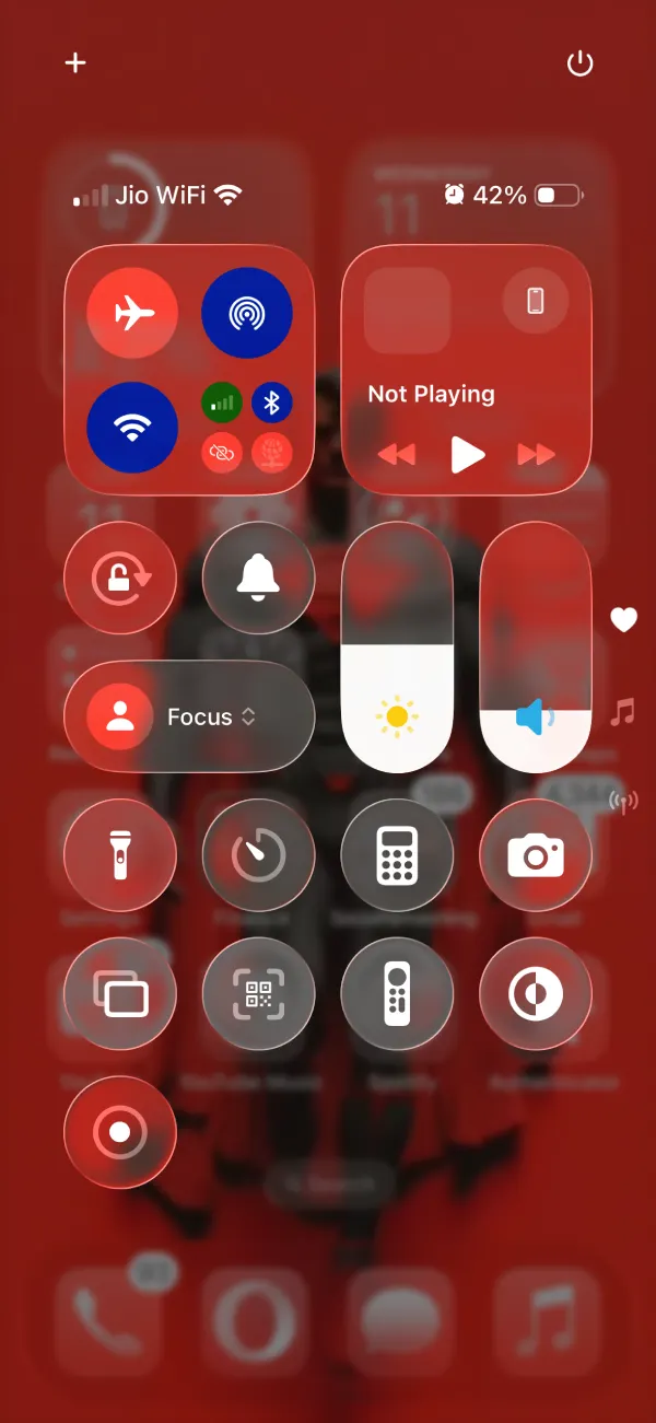
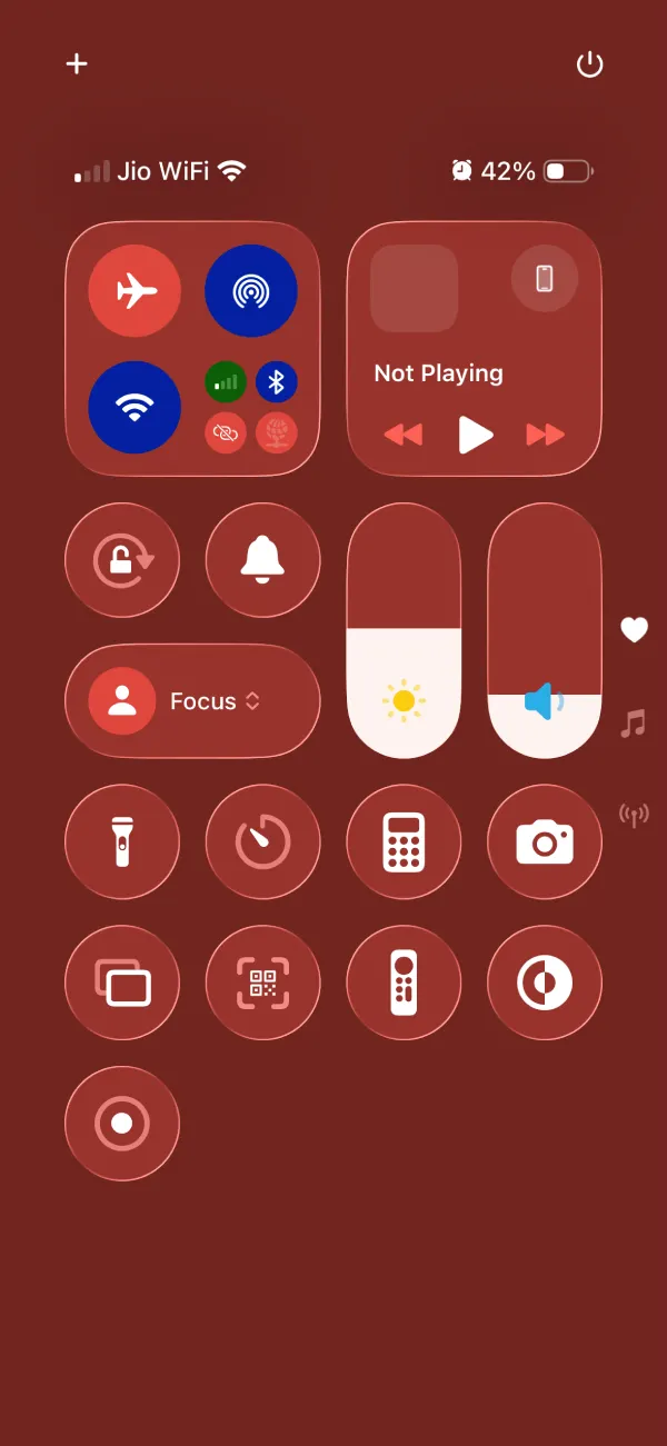
Hopefully, Apple takes this feedback to heart. Many are hoping for a middle ground. Something that keeps the aesthetic of Liquid Glass without sacrificing basic usability. After all, it’s a beta for a reason. And user feedback is crucial for refining the final product. Let’s hope the next few beta updates bring that much-needed balance.
That said, if you’ve installed the update, here are two new hidden features that you should know about. We’ll also continue our digging and will highlight other hidden features and also solutions to bugs and issues that you might notice with the update. So stay tuned to our Apple coverage for more details.
TechIssuesToday primarily focuses on publishing 'breaking' or 'exclusive' tech news. This means, we are usually the first news website on the whole Internet to highlight the topics we cover daily. So far, our stories have been picked up by many mainstream technology publications like The Verge, Macrumors, Forbes, etc. To know more, head here.

