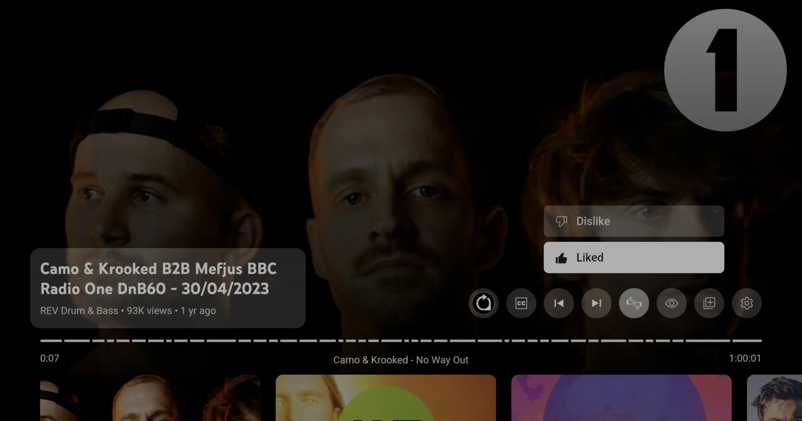
Google loves to tinker. But their latest tweak to the YouTube app on Android TV and Google TV? It’s got users puzzled — and not in a good way. The company has decided to fuse the once separate ‘like’ and ‘dislike’ buttons into one single, confusing button. With this change, liking or disliking YouTube videos on TV isn’t a one-step process anymore. Instead, YouTube has introduced a new dual-purpose button that adds an unnecessary extra step to express your feelings.
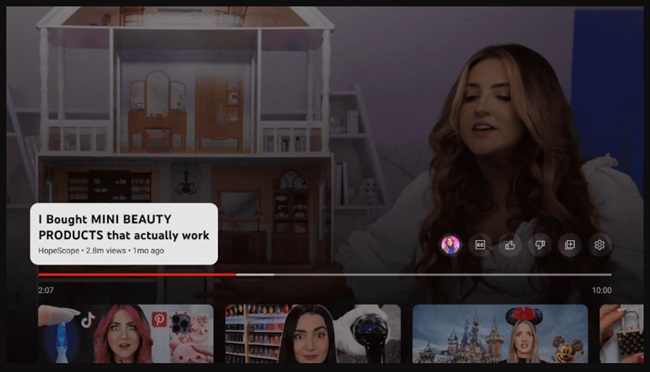
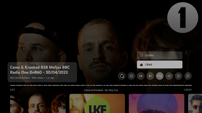
Previously, things were simpler on YouTube for TV. You had your dedicated ‘like’ and ‘dislike’ buttons sitting conveniently above the progress scrubber bar, alongside other handy controls like settings, playlist actions, and quick links to channels. For music videos, you could also toggle album artwork on and off. But now, that’s all been crammed into a single, two-in-one button. Clicking this new unified button doesn’t just register your choice — it opens a mini pop-up menu where you can finally decide to ‘like’ or ‘dislike’ a video. This little menu comes with enhanced animations, matching the recent visual tweaks to YouTube’s home sidebar menu.
When did this sneaky change roll out, you ask? The exact timeline is a bit fuzzy, but 9to5Google reports that it’s been quietly making its way to devices over the past 48 hours. It’s already popped up on a number of Android TVs and Chromecast with Google TV setups. But, get this — I haven’t seen it on my own Chromecast with Google TV yet. With no updates pending on my device, I’m left wondering if this is a server-side change or a sneaky A/B test limited to select users and regions. So, if you’re like me and your buttons are still blissfully separated, count yourself lucky… for now.
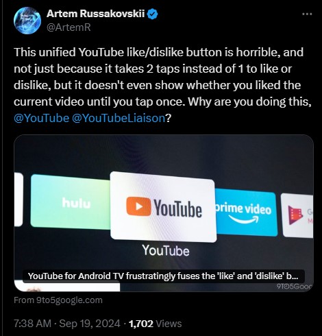
User reactions on X (formerly Twitter) capture the sentiment perfectly.

YouTube’s support team, keeping it diplomatic, responded by encouraging users to submit feedback via their official tool. But let’s be real — how often do user complaints about button placements make a swift comeback? Sure, the dislike counter never came back, but I hope this change doesn’t stick around.
we really appreciate you sharing your thoughts on this. you can always submit your feedback & suggestions using our official tool here: https://goo.gle/3Ty2oj4 that way we can track requests for future improvements
So, if you’re seeing this new fusion of ‘like’ and ‘dislike’ on your Android TV or Google TV, just know you’re not alone — and I bet plenty of people won’t be thrilled about it. For those of us still holding onto the old button setup, we’ll cherish our speedy one-tap interactions for as long as they last.
Have you seen the change on your device yet? And more importantly, do you think this update is really necessary? Share your thoughts in the comments section.
TechIssuesToday primarily focuses on publishing 'breaking' or 'exclusive' tech news. This means, we are usually the first news website on the whole Internet to highlight the topics we cover daily. So far, our stories have been picked up by many mainstream technology publications like The Verge, Macrumors, Forbes, etc. To know more, head here.


