


The Meta Quest mobile app has donned a new outfit and stepped out with a fresh name: Meta Horizon. As the app starts rolling out its snazzy new look and features, the internet is buzzing with a mix of cheers and jeers. Some users have taken to social media to express their dismay at the UI overhaul, with some comparing it to the look of Roblox.
If you’re wondering what all the fuss is about, let’s dive in.
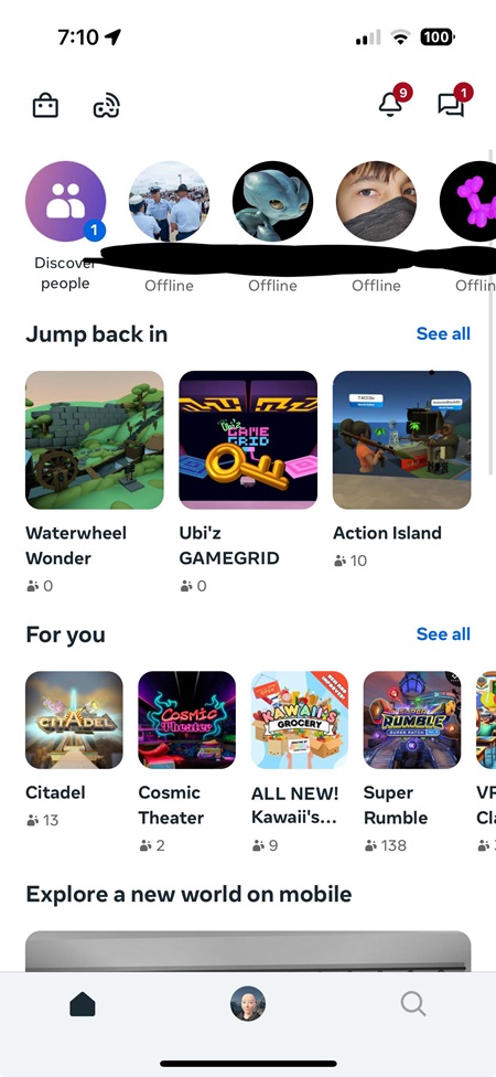
Back in April, Meta announced its grand vision for Meta Horizon OS, promising a more open metaverse where you can work, play, and create across mixed reality, mobile, and desktop devices. Fast forward to last week, and we have the newly rebranded Meta Horizon mobile app hitting our screens. The app still does everything you loved (or tolerated) from before — managing your MR headsets, browsing through immersive experiences, and staying connected with friends. But now, it packs a punch with some additional features and a fresh coat of paint.
What’s new?
- There’s a shiny new tab for customizing your avatar and expressing your mood. Unlock exclusive avatar styles, items, and emotes right from the app by completing Meta Horizon Worlds quests.
- The app now makes it easier to discover and join new worlds. Whether it’s catching a live stand-up set, diving into a battle royale, or just chilling out, you can do it all from your phone.
- For those who like to switch things up, the app now offers a light mode alongside dark mode.
The mixed reactions
Of course, with every major redesign, there’s a flurry of opinions. Some users are excited about the new features and design, while others… not so much.
Several users couldn’t help but notice a striking resemblance to another popular app. Comments like “Is it just me, or does this look like some Roblox UI?” and “They’re ripping it straight out of Roblox” were echoed by quite a few. The similarity to Roblox’s interface has stirred up a bit of a storm, with some feeling like Meta’s new design is more of a copy-paste job than an original creation.
Among the more critical voices, usability was a common gripe. Some users found the navigation less intuitive, with key functions buried deeper in menus. “Why make it harder for me to access the store and give them money?” one user lamented. The positioning of icons, especially for right-handed users, was also a sore point.
On the flip side, some folks see the changes in a different light. “I don’t see anything wrong with it, to be honest,” said one Redditor, emphasizing that backlash is pretty standard with any major redesign and that users will likely get used to the new look in no time.
So, is the new Meta Horizon mobile app a hit or a miss? Well, that depends on who you ask. I think the safe bet is that, like most app redesigns, it’ll take people a while to get used to it. After all, we’re all creatures of habit, and sometimes even a small change can feel like a big disruption. But hey, change is rarely universally popular, and there are definitely people who dig the new app.
Ultimately though, time will tell if the new Meta Horizon mobile app wins over users or if it ends up being a Meta-morphosis for the worse.
Do let us know your thoughts about the rebranded Meta Horizon app in the comments below.
TechIssuesToday primarily focuses on publishing 'breaking' or 'exclusive' tech news. This means, we are usually the first news website on the whole Internet to highlight the topics we cover daily. So far, our stories have been picked up by many mainstream technology publications like The Verge, Macrumors, Forbes, etc. To know more, head here.


Hillary Keverenge
712 Posts
Tech junkie. Gadget whisperer. Firmware fighter. I'm here to share my love-hate relationship with technology, one unboxing at a time.
