


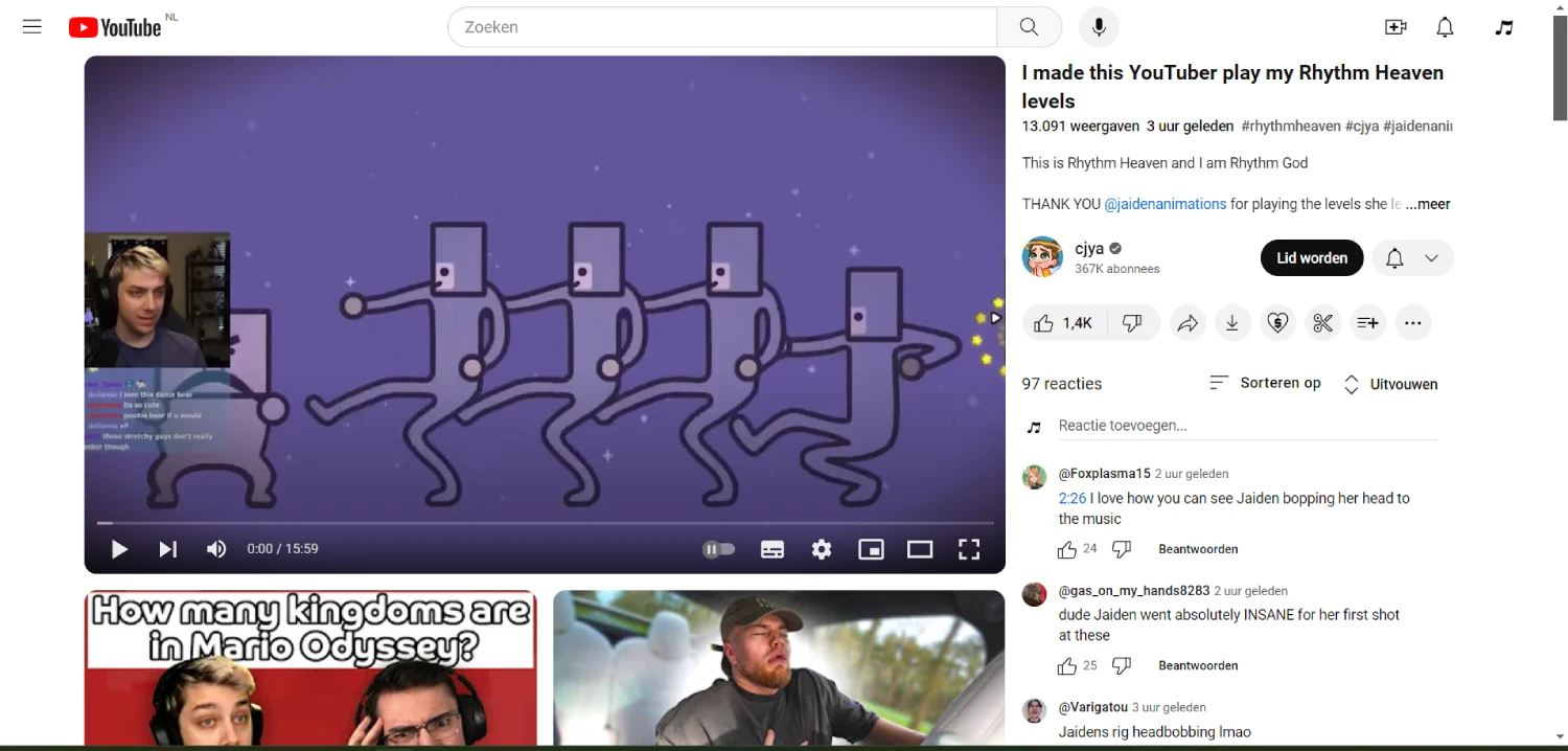
YouTube is no stranger to tweaking its interface, but the latest desktop layout change has viewers reaching for the rewind button. In a move that’s generated significant online buzz, YouTube has swapped the positions of comments and video suggestions on desktop browsers. Previously, comments resided beneath the playing video, with suggestions neatly tucked to the right. Now, comments occupy the right side of the screen, while suggestions have been relegated to a strip below the video.
This seemingly minor alteration has sparked a firestorm on social media, particularly on the r/youtube subreddit. Users are expressing their disapproval with phrases like “annual terrible design decision” and “This is a monstrosity!” The common thread? Disruption to established viewing habits. Many viewers find the comment section to be an integral part of the video experience, offering a space for real-time engagement and community interaction. Having it shifted to the side throws off their usual workflow and disrupts the visual flow of the platform. I’ve added before/after screenshots for reference below:
While the reasons behind this change remain unclear, YouTube hasn’t stayed entirely silent. The TeamYouTube account on X acknowledged the layout shift, stating it’s part of an experiment.
Are you referring to YouTube’s new UI where the video description and comments are showing on the side of the watch page? if so, YouTube is constantly experimenting w/ new features to improve the experience. this is one such experiment: https://goo.gle/3TPhosi
This suggests YouTube might be A/B testing the layout to gauge user response and potentially gather data on viewing behavior. For those yearning for the good ol’ days of comment-section proximity, there’s a potential silver lining.
While YouTube hasn’t offered an official method to revert to the old layout, some users have reported success with browser extensions. These extensions, designed to customize the YouTube experience, might offer options to tinker with the layout and potentially return comments to their familiar position. I found one comment from a user who shared the following:
You can currently fix this with a ublock origin filter.
Here is the filter
youtube.com##+js(set, yt.config_.EXPERIMENT_FLAGS.kevlar_watch_grid, false)
It’s important to note that these extensions come with their own set of considerations, and their effectiveness can vary. However, for users who simply can’t stomach the new layout, they might be worth exploring.
Ultimately, the fate of the comment-on-the-right layout for YouTube on desktop browsers remains to be seen. With enough user feedback and a close eye on the experiment’s data, YouTube might decide to revert the change or offer users more control over their viewing experience. So make sure to let your opinion on the new UI be heard. I’ll keep track of the situation and post an update if and when there are any new developments. If you found this article to be useful, please consider tapping that like button.
Featured image credits: u/Tikiho1 / Reddit
TechIssuesToday primarily focuses on publishing 'breaking' or 'exclusive' tech news. This means, we are usually the first news website on the whole Internet to highlight the topics we cover daily. So far, our stories have been picked up by many mainstream technology publications like The Verge, Macrumors, Forbes, etc. To know more, head here.


Himanshu Arora
295 Posts
I have been writing tech-focused articles since 2010. In my around 15 years of experience so far, I have written for many leading publications, including Computerworld, GSMArena, TechSpot, HowtoForge, LinuxJournal, and MakeTechEasier to name a few. I also co-founded PiunikaWeb, which went on to become a huge success within 5 years of its inception. Here at TechIssuesToday, I aim to offer you helpful information in a way that you won't find anywhere else easily.

