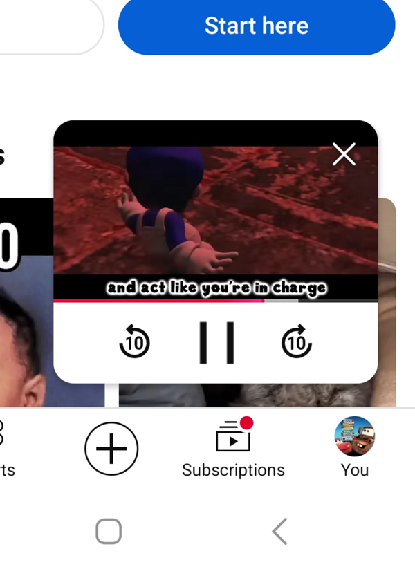
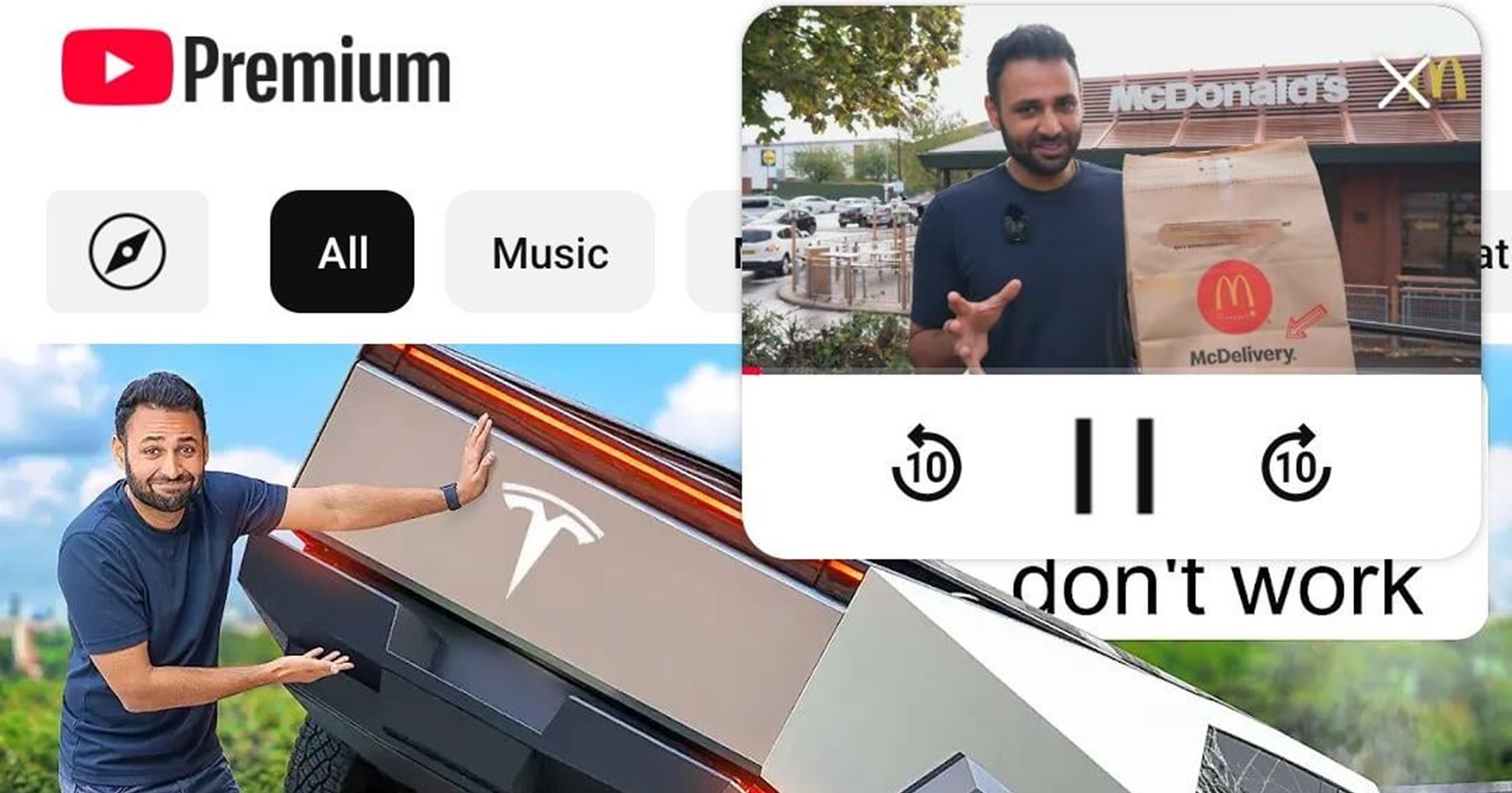
YouTube’s recent rollout of a redesigned miniplayer on Android has ignited a firestorm of user backlash. Following version 19.41.39, the new miniplayer has been widely implemented, but many users are not thrilled with the changes. Replacing the classic, stable mini bar that nestled comfortably at the bottom of the screen, the new floating picture-in-picture (PiP) style player now hovers ominously around any of the four corners, much to the dismay of frequent scrollers.
The old miniplayer had the convenience of staying docked, leaving plenty of screen real estate for browsing while a video played. Now, it floats and bounces around the screen, making it more distracting than helpful for users who want to scroll or multitask. One frustrated user lamented on Reddit, “I hate the new mini player, it’s genuinely frustrating. It gets in the way.” Another sarcastically noted, “Whoever thought this was a good idea needs to be fired.”

A major pain point seems to be the unpredictability of the new design. Users complain that controls, like the pause and close buttons, have migrated unpredictably across the screen. Gone are the days when you could pause without thought. As one commenter aptly said, “The X could be anywhere, and swiping the mini player down five times out of ten just moves the mini player a bit off screen and it bounces back up instead of closing.”
Others have pointed out that the redesign caters less to users who just want the video to play in the background while they scroll. “Most people don’t use miniplayer to watch or pay full attention to a video but to scroll. The new version takes up more vertical space, and the bit of space you get on the side just feels awkward and useless,” one user explained. Many users are also asking for the ability to switch back to the old mini bar or at least have the option to opt out of the new floating format.
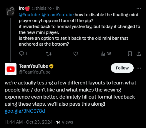
Despite the uproar, YouTube support on X has remained cautiously optimistic, responding to user complaints by saying the team is testing “a few different layouts to learn what people like/don’t like.” However, there’s a reason to be skeptical given that the feature appears to be rolling out more widely than any experimental testing would imply. It’s led many to question why YouTube felt the need to “fix” something that wasn’t broken.

For those accustomed to the old YouTube system, the redesigned miniplayer feels more like a downgrade than an improvement. To some users, YouTube is the very definition of “if it ain’t broke, don’t fix it,” something we’ve all seen before with other controversial changes. Whether YouTube will address the overwhelming demand for change remains to be seen, but for now, the redesigned miniplayer has certainly sparked plenty of conversation — mostly negative.
The outcry continues, with users begging for YouTube to make the old version an option. “Change it back,” pleads one user, echoing the feelings of many. Some have even gone so far as to try workarounds like uninstalling and reinstalling the app, only to find that the new miniplayer persists.
The future of the new YouTube miniplayer remains unclear, but it’s clear that the community is not shy about voicing their disdain.
TechIssuesToday primarily focuses on publishing 'breaking' or 'exclusive' tech news. This means, we are usually the first news website on the whole Internet to highlight the topics we cover daily. So far, our stories have been picked up by many mainstream technology publications like The Verge, Macrumors, Forbes, etc. To know more, head here.


