


Samsung’s Galaxy S25 series has arrived with a shiny new One UI 7, bringing a host of updates and tweaks to the user experience. But not all changes are being met with applause — especially when it comes to the new battery indicator. The updated design has sparked a heated debate among users, with some praising its sleek look and others lamenting its lack of readability.
One UI 7 battery icon is sleek but… tiny?
One UI 7 introduces a horizontal battery icon that replaces the vertical one we’ve grown accustomed to over the years. The new design is undeniably modern, with a clean, minimalist aesthetic. The battery percentage now sits inside the icon, rather than beside it, and the power level fills from left to right like a progress bar. Sounds cool, right? Well, not everyone thinks so.
Some users are finding the new design frustrating, particularly because the battery percentage text is now much smaller and harder to read. On the Galaxy S24 and earlier One UI versions, enabling “Show battery percentage” would replace the battery icon with a larger numerical percentage. But on the S25 and One UI 7, the percentage is crammed into the battery icon, making it almost unreadable for some. And it’s not just about size — some users are also complaining about the lack of contrast between the percentage text and the gray background, making it even harder to see at a glance when in light mode. For some, switching to dark mode solves this problem.
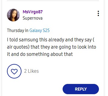
Understandably, affected users are calling the new battery indicator “unreadable,” “useless,” and even “a terrible choice.” Some are nostalgic for the simplicity of the older design, where the percentage stood alone next to the battery icon. One frustrated user even reached out to Samsung and was apparently told that the company would “look into it.”
Others are pointing out that the new design becomes particularly problematic when the battery level drops and splits the percentage numbers. “It’s very hard to read when the bar drips down into splitting the numbers,” one user noted. But of course, not everyone is hating on the new design. Some users appreciate the streamlined look and the fact that it takes up less space in the status bar. Others haven’t had any issues reading the percentage and find the new icon to be a neat upgrade.
At the very least, Samsung should give users an option to separate the numbers and graphic like before. After all, customization is one of the hallmarks of Android, and Samsung has always been a leader in that department.
What do you think?
Now it’s your turn to weigh in! Are you a fan of the new horizontal battery icon, or do you miss the old design? Do you find the percentage text too small, or is it just right for your eagle eyes? Let’s get the conversation going — drop your thoughts in the comments below or share your feedback directly with Samsung via the Samsung Members App. Who knows? Your voice might just be the one that pushes them to make a change.
TechIssuesToday primarily focuses on publishing 'breaking' or 'exclusive' tech news. This means, we are usually the first news website on the whole Internet to highlight the topics we cover daily. So far, our stories have been picked up by many mainstream technology publications like The Verge, Macrumors, Forbes, etc. To know more, head here.


Hillary Keverenge
712 Posts
Tech junkie. Gadget whisperer. Firmware fighter. I'm here to share my love-hate relationship with technology, one unboxing at a time.

Bryan Pearson01-05-2025
Samsung made several things smaller and/or harder to read. Notification text no longer honors the font settings. Icon labels are much smaller and not adjustable. And this battery indicator was just a really bad idea from a visibility standpoint. The fact that the status bar isn't adjustable anyway means it is starting from a bad place already. Weakening the few visibility enhancements we had, like the battery indicator, is at least thoughtless, if not cruel.
ReplyMaris20-04-2025
Hate it! As power diminishes, the white pill color fades to a grayish shade, and the percentage is impossible to read. Please allow the option to return to numbers only and get rid of the pill icon.
ReplyM Pyfer 13-04-2025
I hate it. I'm frustrated that there aren't at least widget choices to replace it with that are just single battery widgets without the gingerbread of other devices that I can't omit. Also it's too small😡
ReplySteven6820-02-2025
Samsung needs to just get rid of the percentage bar and keep the percentage value % problem solved, readability would be fine.
Reply
Ron S16-05-2025
I could not care less about "Modern" or artsy-fartsy anything. I want rapid, useful visibility. Nothing more.
Reply