


I hate how the Quick Panel still picks colors from my wallpaper even with Color Palette turned off
byu/AbyssNithral inoneui
It seems Samsung’s latest skin – One UI 7 – based on Android 15 is receiving a pretty mixed response from users. Last week, I highlighted a few controversial changes with the update, which could thankfully be reverted. However, reports on Samsung’s community forums and Reddit indicate there are still a few changes and tweaks that many users aren’t in favor of. A few key areas seem to be common pain points: the redesigned Quick Settings panel, the new app drawer search bar placement, and inconsistencies with the color palette.
The Quick Settings panel, a frequently used feature for many, has undergone a visual overhaul. However, not everyone is pleased with the new layout. Some users are finding it cluttered with sections they rarely, if ever, use. For instance, elements like “Smart View,” “Modes,” “Play last song,” “Media output,” “Nearby devices,” and “SmartThings” now occupy significant space in the expanded view.
Here’s a screenshot of the section in question for reference:
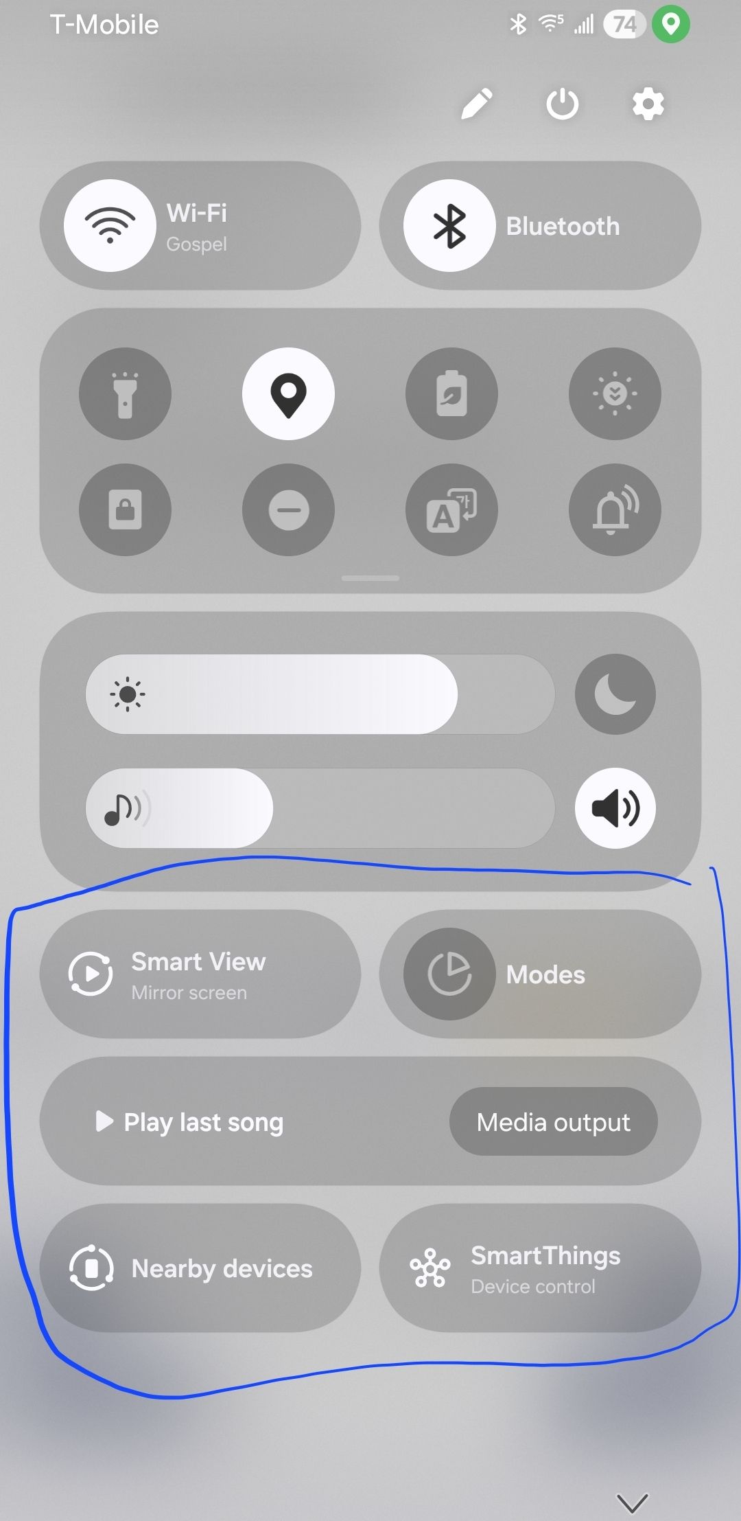
User BriniaSona on Reddit stated, “I have never used these sections in my life, and don’t think I will in the future. Is there any way to remove them?” Many are hoping for future updates to Good Lock’s QuickStar module to allow for more customization and the ability to hide or remove these “eyesores,” as one user described them. The inability to easily toggle auto-brightness from the main quick settings, a feature now tucked away deeper in the settings, is another point of contention.
Another noticeable change is the relocation of the search bar within the app drawer. It has been moved from the top to the bottom of the screen. While Samsung might argue this improves one-handed usability, many users accustomed to the top placement are finding it unintuitive. Comments like “Used to having at the top. End up searching for the search bar everytime you wanna search something” highlight the disruption to muscle memory.
Someone shared a screenshot highlighting where the bar should be (at the top) and where it actually is in the latest update:
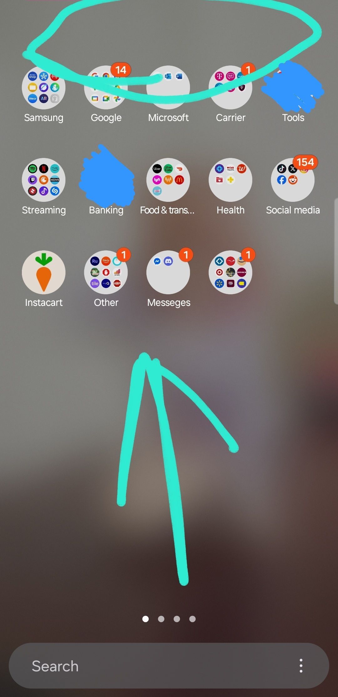
Some users feel this change, along with others, reduces the level of customization Samsung is known for, pushing them towards a more rigid interface. One user pointed out that the space previously used for switching between personal and work profiles at the bottom is now occupied by this less-used search bar, with the profile switch moving to the top.
The color palette feature, which dynamically themes UI elements based on the wallpaper, is also drawing criticism. Several users report that even with the color palette feature turned off, the Quick Panel and other UI elements like large folders continue to pick colors from the wallpaper. This sometimes results in unappealing color combinations.
Others have noticed that the color extraction itself seems different in One UI 7, leading to “uglier” icon palettes compared to previous versions, even with the same wallpaper. The lack of blur in large folders, making the automatically applied colors more prominent and sometimes clashing, has also been flagged as an unwelcome change.
While some users are adapting to or even appreciate the new design direction, a significant portion of the user base feels that One UI 7 has taken a step back in terms of user choice and customization. The sentiment echoes a desire for options, allowing users to tailor the interface to their preferences, rather than being forced to adapt to changes they find disruptive or aesthetically unpleasing. For now, many are left hoping for fixes and more granular control in subsequent updates.
TechIssuesToday primarily focuses on publishing 'breaking' or 'exclusive' tech news. This means, we are usually the first news website on the whole Internet to highlight the topics we cover daily. So far, our stories have been picked up by many mainstream technology publications like The Verge, Macrumors, Forbes, etc. To know more, head here.


Dwayne Cubbins
1443 Posts
For nearly a decade, I've been deciphering the complexities of the tech world, with a particular passion for helping users navigate the ever-changing tech landscape. From crafting in-depth guides that unlock your phone's hidden potential to uncovering and explaining the latest bugs and glitches, I make sure you get the most out of your devices. And yes, you might occasionally find me ranting about some truly frustrating tech mishaps.


Comments