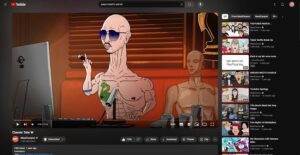
it sounds like you’re seeing an experiment/test feature. diff teams at YouTube often test new ways to improve features & experiences. we’d love your feedback on what you’re seeing: https://t.co/71mN1B8Dkm you can also check out recent experiments here: https://t.co/V79oWGhyBk
— TeamYouTube (@TeamYouTube) May 22, 2024
YouTube users have been on a tumultuous ride as the platform continues to experiment with its desktop layout, leaving many feeling seasick and frustrated. It all started in mid-April when Google unveiled a redesigned YouTube website, which promptly received a wave of backlash.
The new look, featuring video titles, descriptions, and comments relegated to the side and larger video recommendations taking center stage, was widely panned. Users found it cumbersome and disruptive to their viewing experience. YouTube, seemingly taking note of the negative feedback, reverted to the old design in the following weeks, providing a brief respite for its disgruntled users. However, the calm didn’t last long.
Just last week, the dreaded redesign reared its head once again, appearing for some users, though not in a widespread rollout. This second round of testing fueled speculation about YouTube’s intentions, leaving users wondering if this was just another experiment or a sign of things to come.

Now, in a surprising twist, reports are emerging that YouTube is once again rolling back to the old layout for some users. Reddit threads are abuzz with users celebrating the return of the familiar interface. However, this reversal seems to be happening on a per-account basis, with some users only seeing the old layout in private browsing sessions.
The back-and-forth experimentation has left users bewildered and frustrated. YouTube’s cryptic replies, referring to the new layout as an “experiment,” haven’t provided much clarity. While they claim that most experiments “only last a few weeks,” it remains unclear whether this applies to the ongoing redesign saga.
If YouTube is indeed reverting to the old layout, it demonstrates the power of user feedback. The platform’s willingness to reconsider its design choices based on user sentiment is a positive sign. However, the constant changes have undoubtedly left a sour taste in many users’ mouths, raising questions about YouTube’s overall design strategy. I never got this new layout, but some users say installing Enhancer for YouTube extension fixes the UI issue. You can also check out these potential workarounds, although I can’t guarantee they’ll work.
The saga continues, and it’s anyone’s guess where YouTube’s design journey will lead. Will they settle on a layout that pleases everyone? Or will they continue to experiment, leaving users bracing for the next unexpected change? Only time will tell.
For now, YouTube users can only hope for a stable and user-friendly interface that enhances their viewing experience rather than hindering it. After all, a happy user is a loyal user, and in the ever-evolving world of online video, user satisfaction is paramount.
TechIssuesToday primarily focuses on publishing 'breaking' or 'exclusive' tech news. This means, we are usually the first news website on the whole Internet to highlight the topics we cover daily. So far, our stories have been picked up by many mainstream technology publications like The Verge, Macrumors, Forbes, etc. To know more, head here.


