


If you’ve used Spotify on your computer recently, you might have noticed something different. A redesigned full-screen mode seems to be reaching more users, changing how music is displayed when you want an immersive view. I even noticed the change myself on the Spotify app for Windows just the other day.
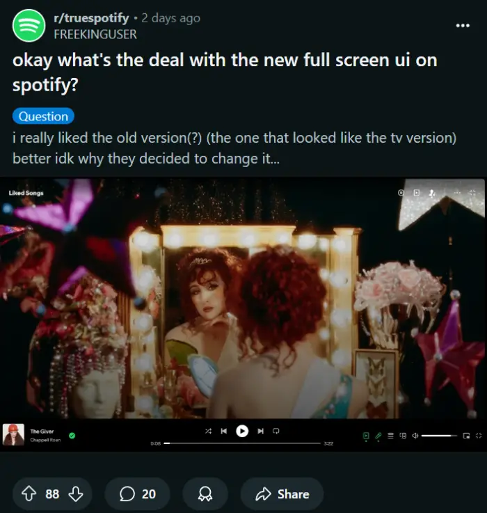
This new look replaces an older full-screen option that many users described as more minimalist, sometimes comparing it to the interface seen on TVs. That previous version often featured the artist’s banner image more prominently. The update shifts the focus squarely onto the currently playing track’s album artwork, displaying it much larger against a blurred background matching the art’s colors.
Here’s a screenshot of the UI:
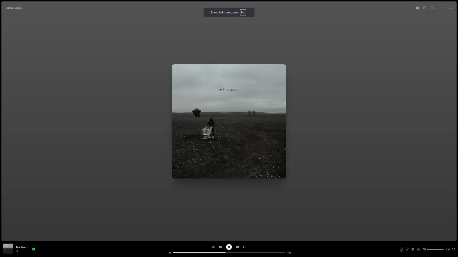
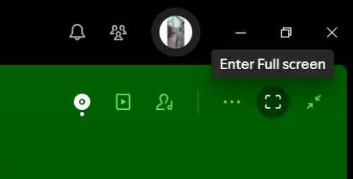
Getting to this new view isn’t quite the same as before. The old dedicated full-screen button, often found near the playback controls, is gone. Instead, you first need to click the album art in the bottom-left corner to expand the “Now Playing View.” From there, another button, usually in the top-right of this expanded view, activates the actual full-screen display. Within this new mode, Spotify offers options to toggle between the large album art view and an artist image view.
Reports online show this change has been in testing or rolling out gradually for some time. Some users on platforms like Reddit mentioned seeing variations of this new UI months ago. Now, however, it seems to be becoming the standard experience for a much larger group.
Reactions are definitely mixed. Some listeners appreciate the update, enjoying the large, high-resolution album covers. They feel it puts the visual focus back on the music’s packaging. Others aren’t so keen. They miss the cleaner look of the old version or find the new design less appealing. Some users have also pointed out features they miss from the old full-screen mode, like integrated lyrics display, which doesn’t appear to be part of the current redesign.
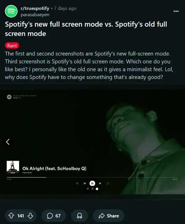
Here’s a screenshot of a post on Reddit that highlighted the old UI too:
That said, feel free to share your thoughts on the full-screen UI revamp in the comments section below. I find it rather bland! But this minimalism seems to be the UI trend for most apps and platforms lately.
TechIssuesToday primarily focuses on publishing 'breaking' or 'exclusive' tech news. This means, we are usually the first news website on the whole Internet to highlight the topics we cover daily. So far, our stories have been picked up by many mainstream technology publications like The Verge, Macrumors, Forbes, etc. To know more, head here.


Dwayne Cubbins
1453 Posts
For nearly a decade, I've been deciphering the complexities of the tech world, with a particular passion for helping users navigate the ever-changing tech landscape. From crafting in-depth guides that unlock your phone's hidden potential to uncovering and explaining the latest bugs and glitches, I make sure you get the most out of your devices. And yes, you might occasionally find me ranting about some truly frustrating tech mishaps.

