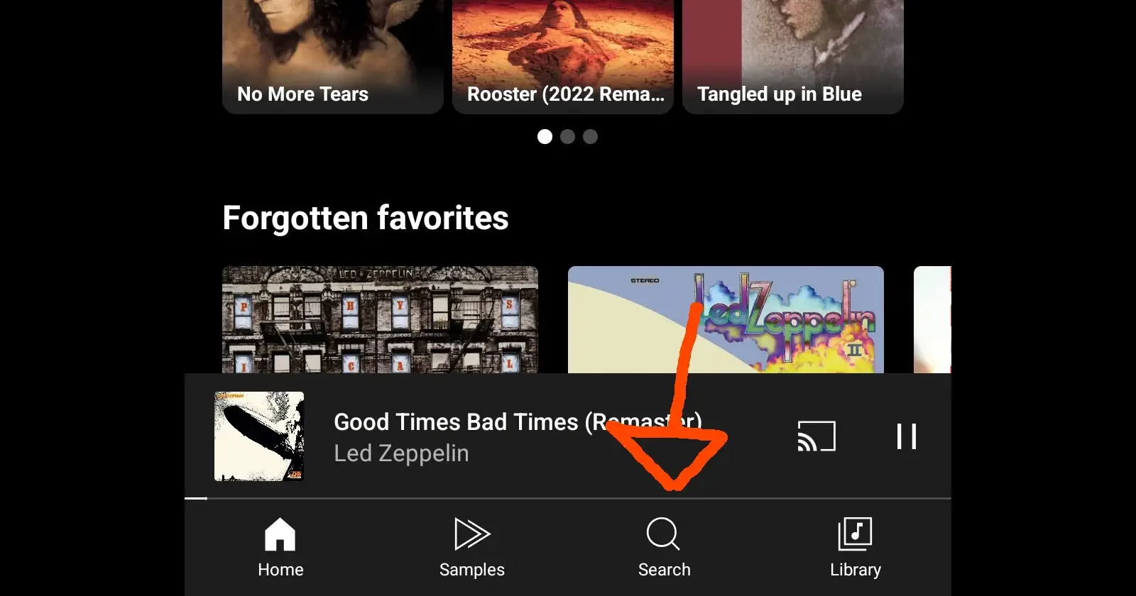
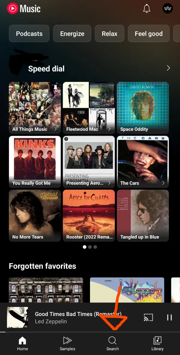
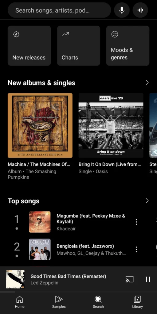
YouTube Music seems to be experimenting with the placement of the ‘Search’ button in the app. A Redditor user, Maleficent_Race1072, shared screenshots showing the new layout in action. Instead of the familiar arrangement on top that users have grown accustomed to, the search function is now in the bottom navigation bar.
This change appears to be part of an A/B test, which explains why not everyone is seeing it yet. I also haven’t spotted the change on 3 separate Android phones and neither on my iPhone, confirming that this is still rolling out selectively.
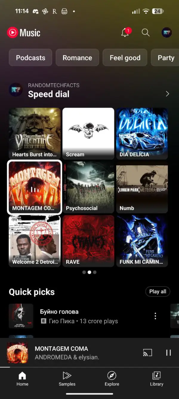
For reference, here’s a screenshot of the app before the change:
Many users are cheering the decision, arguing that search functionality deserves prime real estate at the bottom of the screen since it’s one of the most frequently used features. This will be especially useful for those with phones that have relatively bigger screens.
However, the change isn’t without its critics. The new search placement appears to come at the expense of the Samples tab, which some users actually find valuable for music discovery. As one commenter pointed out, the Samples feature was YouTube Music’s attempt at creating a TikTok-style way to discover new tracks through short previews. While many users found it hit-or-miss, there’s a vocal minority who regularly used it to find fresh music.
What’s particularly interesting is that the Explore tab hasn’t disappeared entirely. According to the original poster, users can still access Explore functionality, but it now requires an additional tap through the search interface. This extra step has some users grumbling about the added friction in their music discovery workflow.
Whether this change becomes permanent remains to be seen. I’m personally all for the change. I use Search way more than the Explore tab. So having it right at my fingertips will be a bonus. For now, most users will have to wait and see if they’re selected for this particular test. Given how these rollouts typically work, it could be weeks or even months before everyone gets a chance to experience the new navigation layout firsthand.
That said, let me know yours thoughts on this change in the comments below.
TechIssuesToday primarily focuses on publishing 'breaking' or 'exclusive' tech news. This means, we are usually the first news website on the whole Internet to highlight the topics we cover daily. So far, our stories have been picked up by many mainstream technology publications like The Verge, Macrumors, Forbes, etc. To know more, head here.


