

YouTube seems to be experimenting with new changes to its user interface, and not everyone’s thrilled about it. The updates are popping up on both mobile and desktop platforms, leaving users with mixed feelings. Some are scratching their heads over the new look, while others are outright annoyed.
On mobile, things look quite different. The video thumbnails are now smaller, and the titles sit beside them instead of below like they used to. Before, you’d see big, bold thumbnails with the titles neatly tucked underneath. Now, the smaller size and sideways titles leave a lot of empty space on the screen. One user on Reddit, Local-Butterfly-8120, simply said, “New mobile UI. Ew.” It’s a weird shift that’s throwing some people off.


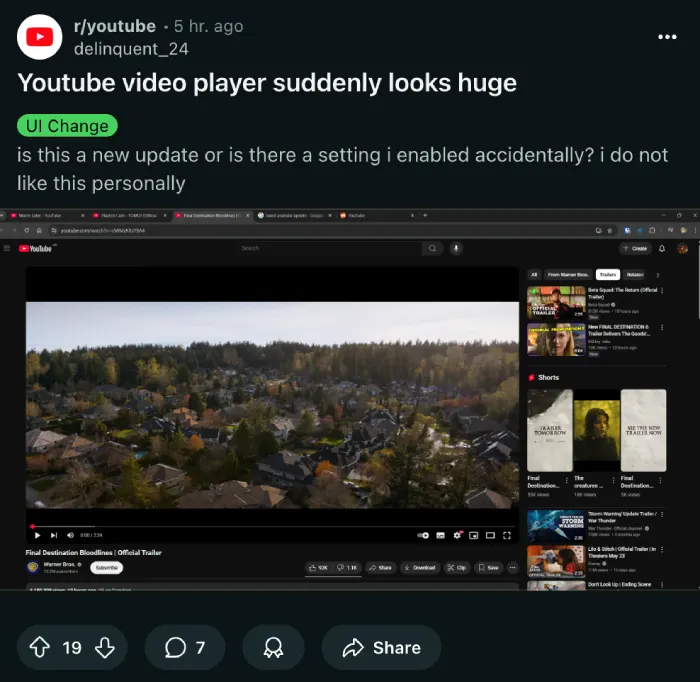
Over on the desktop, the changes are hard to miss. The video player feels massive, taking up way more space than before. This has frustrated folks who like watching videos in smaller windows or at specific resolutions. One Reddit user, Sea_Cow3569, pointed out how they can’t watch 1080p videos comfortably on their 4K monitor anymore. Plus, the side panel that used to help you navigate is now hidden, and playlists aren’t showing up the way they used to. Some are even pointing out the abnormally large thumbnails on the homepage. This is something even I’ve been noticing for the past month.
Users are hopping on social media and forums to vent. Words like “disgusting” and “awful” are floating around as people describe the new design. One person on X, @atlascrafting, asked, “Why. Just why.” It’s not all final yet, though. These tweaks are simply A/B tests, where YouTube tries out different layouts on different users to see what sticks. Judging by the immediate feedback online, let’s just hope that YouTube drops the new UI.
For now, it’s up in the air whether YouTube will keep this new UI or roll it back based on what users say. Either way, it’s clear the changes are sparking a lot of chatter.
TechIssuesToday primarily focuses on publishing 'breaking' or 'exclusive' tech news. This means, we are usually the first news website on the whole Internet to highlight the topics we cover daily. So far, our stories have been picked up by many mainstream technology publications like The Verge, Macrumors, Forbes, etc. To know more, head here.


Dwayne Cubbins
1461 Posts
For nearly a decade, I've been deciphering the complexities of the tech world, with a particular passion for helping users navigate the ever-changing tech landscape. From crafting in-depth guides that unlock your phone's hidden potential to uncovering and explaining the latest bugs and glitches, I make sure you get the most out of your devices. And yes, you might occasionally find me ranting about some truly frustrating tech mishaps.

