appreciate this report, we're looking into this rn. if you havent yet, you can try updating/reinstalling the app + restarting your device to see if it fixes the issue
— TeamYouTube (@TeamYouTube) July 4, 2024
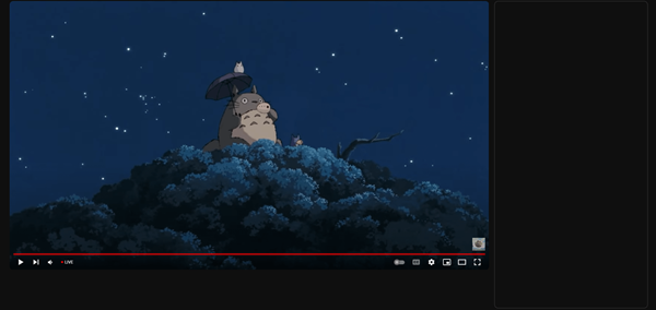
YouTube is once again facing backlash over a new user interface (UI) currently in testing. Several users have reported that the experimental UI is causing videos to appear without titles, descriptions, comments, or recommendations.
The issue seems to primarily affect desktop users on various browsers, including Chrome, Firefox, and Microsoft Edge. While the homepage functions normally, clicking on a video leads to a barebones interface displaying only the video player and the “Live” indicator. This frustrating glitch persists across multiple accounts, browsers, and devices, but strangely enough it doesn’t appear when users switch to incognito mode or sign out of their accounts. Below is a screenshot shared by one of those affected by this issue.

Reports of the issue have been flooding online forums and social media for a week now, with users expressing their discontent with the broken UI. Some users even claim that the problem only occurs when they’re logged into their YouTube Premium accounts, while others have noticed that it only affects downloaded videos.
YouTube support has picked up reports of the issue on X and apparently, the team is looking into it. There’s still no feedback on whether this is a bug or an intended change, but given some of YouTube’s recent decisions, it’s easy to expect anything at this point.
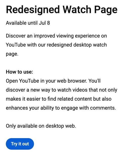
Interestingly, YouTube is indeed testing a redesigned watch page for desktop users that promises “an improved viewing experience.” This new UI aims to make it easier for users to find related content and engage with comments. However, the current version that users are seeing seems to be a far cry from what YouTube intended, as it fails to display essential video information like the title, description, recommendations, and even the same comments that users are supposed to better engage with.

Fortunately, there’s a workaround for YouTube Premium users. By turning off the “redesigned watch page” option in “Experimental features” setting, you can revert back to the old, familiar UI. To do this, click on your profile icon, open premium benefits, click on “Try experimental new features” and then turn off redesigned watch page.
Unfortunately, non-Premium users don’t have access to this setting, but they have options too. Some have resorted to log out of their accounts to restore the old UI, while others have found success by uninstalling and reinstalling the app. But be warned that the issue resurfaces once YouTube updates to the latest version. To prevent this, turn off the app’s auto-updates by heading to Google Play Store > Search for YouTube and on the app’s Play Store page, tap on the 3-dot menu in the top-right corner, and uncheck “Enable auto update” option.
This isn’t the first time YouTube has faced criticism for its UI changes. In the past, the platform has received backlash for various updates, including the removal of the dislike count and changes to the layout of the video page. However, this latest incident seems to be an unintentional misstep, as the experimental UI appears to be a broken version of what YouTube intended to test.
The good news is that the test run for this experimental UI is scheduled to end on July 8. Hopefully, YouTube will address the issues and provide a more polished version of the redesigned watch page. In the meantime, affected users can try the workarounds mentioned above or simply wait for the test to conclude.
TechIssuesToday primarily focuses on publishing 'breaking' or 'exclusive' tech news. This means, we are usually the first news website on the whole Internet to highlight the topics we cover daily. So far, our stories have been picked up by many mainstream technology publications like The Verge, Macrumors, Forbes, etc. To know more, head here.


Patrick13-07-2024
Can confirm that as of July 12, the issue still persists even though the new UI features should be disabled (I checked my account settings and the option is not there). And if I go to the same video in Incognito mode, the description is there. Youtube, you suck, get your shit together FFS !!!
Reply