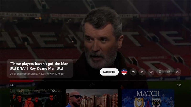
If you’ve got an Android TV or a Chromecast with Google TV, YouTube has rolled out another update to make things easier, and I, for one, am here for it. Over the past few months, YouTube has been tweaking its app interface, from hiding view counts on the homepage to shuffling around the “Like” and “Dislike” buttons. But this latest change? It’s all about the Subscribe button, and it’s front and center like never before.
Now, when watching on your Android TV or Chromecast with Google TV, the Subscribe button has muscled its way into the main player UI. No more going on a scavenger hunt to support your favorite creators. Just one tap while the video plays, and boom – you’re subscribed. As someone who loves discovering new channels, this is a game-changer. First discovered by the folks at 9to5Google, I’ve been trying it out on my Chromecast, and honestly, I’m loving it.

And the best part? It’s not just about making life easier for viewers like you and me; it’s a boost for creators too. Let’s face it: not everyone is willing to jump through hoops to hit that subscribe button, especially if they’re less tech-savvy or simply don’t want the hassle. Now, they don’t have to. Just one button in the spotlight, encouraging more subscriptions and growth for channels big and small. It’s a win-win.
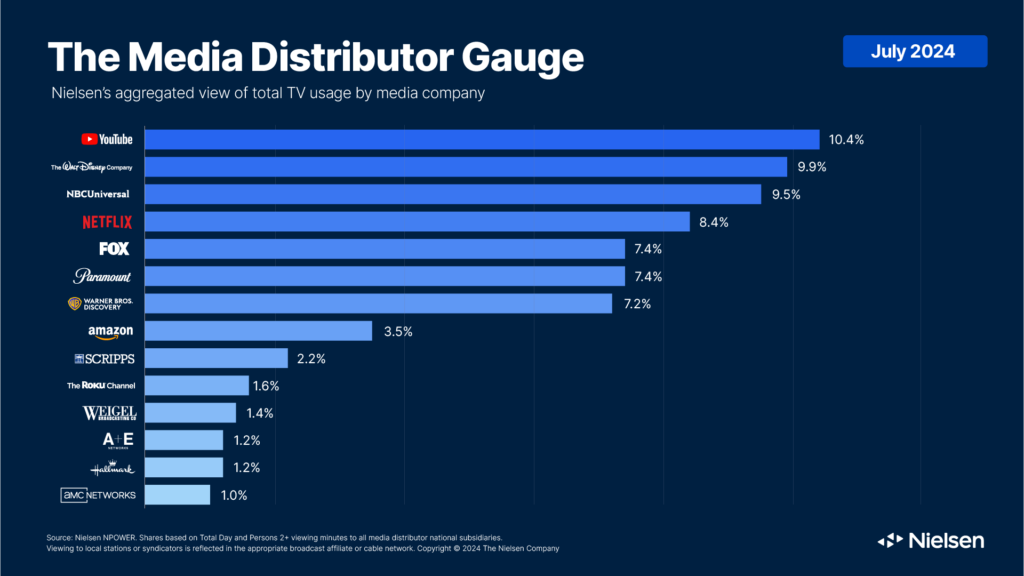
And it’s a move that makes perfect sense for YouTube. Right now, YouTube is the go-to streaming platform on TVs for a lot of people, even rivaling the likes of Netflix. More and more users are settling in on the couch, remote in hand, browsing YouTube on the big screen. With such a growing audience on TVs, YouTube has clearly recognized the need to simplify the subscription process, making it seamless for viewers to follow creators they enjoy without any fuss. This change isn’t just a win for viewers and creators — it’s YouTube smartly evolving to meet the habits of its ever-expanding TV audience.
There’s a trade-off, of course – with the Subscribe, Like, and Dislike buttons now sitting side-by-side, the UI does look a bit cramped. But who cares? This small sacrifice means more people can connect with content they enjoy. Besides, having these buttons separated again is almost nostalgic, a little throwback to the YouTube we all grew up with, even if it’s a tad cluttered.
So, YouTube’s new update isn’t just a visual tweak; it’s a friendly nudge for viewers and a helping hand for creators. I know not everyone loves constant UI changes, but when they save me time and give creators more opportunities, I’m all in.
TechIssuesToday primarily focuses on publishing 'breaking' or 'exclusive' tech news. This means, we are usually the first news website on the whole Internet to highlight the topics we cover daily. So far, our stories have been picked up by many mainstream technology publications like The Verge, Macrumors, Forbes, etc. To know more, head here.


Chaos!21-11-2024
To be honest, I do! I had both versions of the UI to "test"... and I can say that I very much prefer the version WITHOUT the Subscribe Button in the Player UI! It makes the UI look cramped! I got it via the Nintendo Switch Youtube App! NOW assume you are watching Youtube via Switch App mobile, not having the Docking station or a TV... How much clutter do you want / need?!
Reply