


Update 10/06/25 – 12:00 pm (IST): Recent reports on Reddit and X suggest that YouTube might have expanded the test of the new UI to more users. Over the past few hours, several users have posted about the new UI, with many seeking an option to revert to the old one.
Original article published on April 23, 2025, follows:
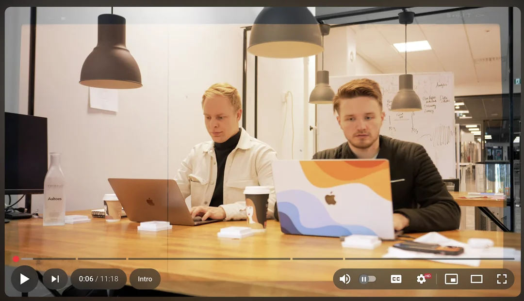
YouTube seems to be experimenting with a revamped UI for the media player on desktop browsers. Over the past few days, some users have taken to X and Reddit to highlight the new new UI they see when watching YouTube videos on the desktop.
The changes involve a noticeable shift in the layout of the media player controls and a new floating buttons style for playback controls. Check it out below:
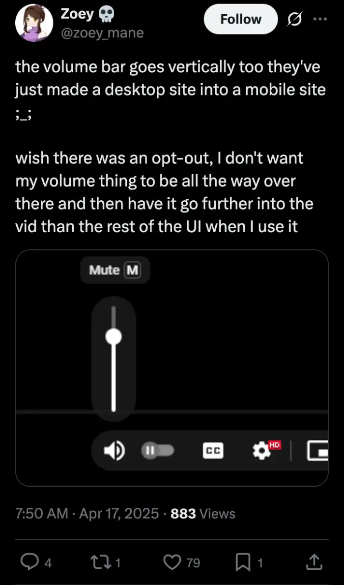
As seen in screenshots, the volume slider has been moved from its usual spot to the right. Adding to that, when users try to adjust the volume, they’re greeted with a vertical slider, instead of the usual horizontal one we’ve all grown accustom too.
This tweak has thrown off some people who are used to the old setup. These floating buttons seem to be the standout feature of this new design, giving the player a different look compared to what users have known for years.
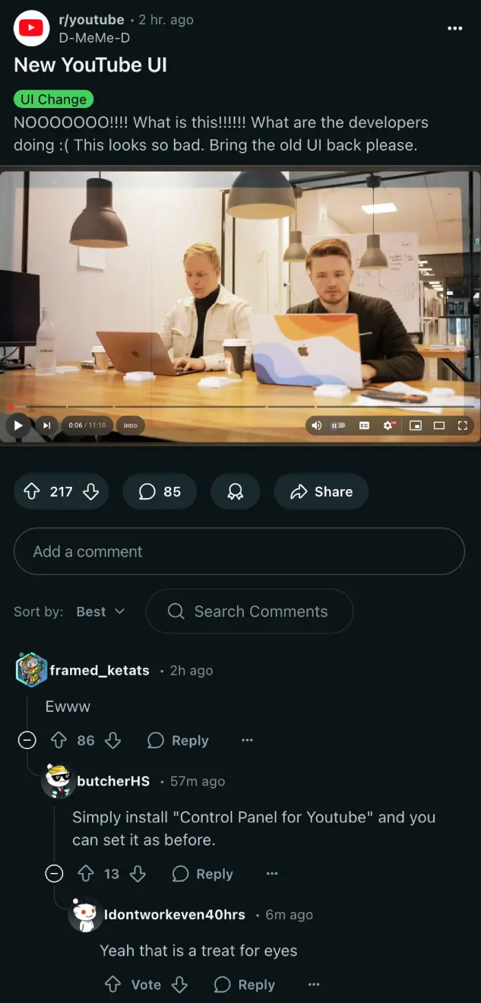
Much like any other UI update, not everyone is thrilled about it. On Reddit, user D-MeMe-D posted a screenshot and didn’t hold back, writing, “NOOOOOOO!!!! What is this!!!!!! What are the developers doing 🙁 This looks so bad. Bring the old UI back please.” Another user, TheDeerBlower, zeroed in on the volume slider, saying, “The audio slider is just f****ng horrible…” These reactions show how jarring the changes can be for those who rely on the familiar layout to navigate their viewing experience. I might get a lot of flak for this, but I quite like the new design, at least by the looks of it. I’ve not yet got the UI to try out.
In fact, I’m not alone. A few others also actually like the new vibe. Uagubkin shared a more positive take, commenting, “I, personally, don’t see any problems. Looks pretty good to me. I honestly like it.” That split in opinions is pretty clear across social media, with some embracing the fresh design while others wish it would disappear.
That said, it looks like YouTube is running an A/B test, which is when they roll out a feature to a small group of people to see how it lands. For now, some accounts get the new UI while others stick with the classic version.
Why the change? YouTube hasn’t spilled the details, but it’s easy to guess they might be trying to spruce up the desktop player. Perhaps they’re just aiming to make the controls stand out with those floating buttons. Whatever the case, it’s clear not everyone’s a fan of it.
It’s possible that YouTube might scrap the change entirely based on feedback, but we’ll just have to wait and see how this new media player UI upgrade pans out. Let me know if you hate the UI or if you dig it in the comments section below.
Featured image credit: @TheiKevin / X
TechIssuesToday primarily focuses on publishing 'breaking' or 'exclusive' tech news. This means, we are usually the first news website on the whole Internet to highlight the topics we cover daily. So far, our stories have been picked up by many mainstream technology publications like The Verge, Macrumors, Forbes, etc. To know more, head here.


Dwayne Cubbins
1453 Posts
For nearly a decade, I've been deciphering the complexities of the tech world, with a particular passion for helping users navigate the ever-changing tech landscape. From crafting in-depth guides that unlock your phone's hidden potential to uncovering and explaining the latest bugs and glitches, I make sure you get the most out of your devices. And yes, you might occasionally find me ranting about some truly frustrating tech mishaps.

