YouTube finds itself in hot water once again as its latest attempt at a mobile redesign falls flat with users. Hot on the heels of a disastrous desktop experiment, which saw titles, comments, and recommendations disappear altogether, the video giant is facing a fresh wave of criticism over its mobile app’s new look.
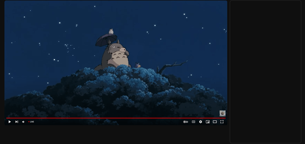
Just yesterday, YouTube desktop users encountered a broken redesign that resulted in a barebones interface. Essential features like titles, descriptions, recommendations, and comments were missing, leaving users with just the video player as seen in the screenshot below. This glitch has caused significant inconvenience, with users unable to access basic information that typically accompanies a video.

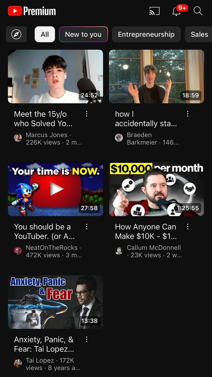
As if the desktop issues weren’t enough, mobile users have discovered that YouTube is also testing a redesigned layout on mobile devices. The reactions have been overwhelmingly negative, with users highlighting several issues with the new layout, from truncated video titles and shrunken thumbnails to a cluttered grid view that makes it difficult to find what they’re looking for.

Many are questioning the design choices and demanding a return to the old interface. Users have also noted that the frequency and size of ads have increased, further disrupting the viewing experience. To some, the redesigned YouTube mobile UI now feels like browsing an ad-heavy shopping app.
The backlash comes as YouTube continues to test a redesigned watch page on desktop, which is currently available to YouTube Premium subscribers. It’s possible that the new mobile layout is the same redesign that YouTube intended to push to desktop, but it appears to have arrived on mobile in a less broken state. However, the changes are still far from well-received, at least going by user reports.
This isn’t the first time YouTube has faced criticism over its UI changes. The platform has previously experimented with various layouts and features, often to mixed reviews. However, the current backlash seems to be particularly intense, with some users already expressing their willingness to abandon the app altogether if the changes are not reverted.
YouTube has yet to respond to the criticism, but it’s clear that the company has a lot of work to do to win back the trust of its users. As the dust settles on this latest redesign debacle, it’s clear that YouTube’s design team has its work cut out for them.
Whether YouTube will listen to user feedback and revert to the old layout remains to be seen. If you’re unhappy with the redesigned YouTube mobile app, make sure to voice your concerns. User feedback is crucial in shaping the platform’s future, and with enough input, YouTube might just bring back the user-friendly design everyone prefers.
TechIssuesToday primarily focuses on publishing 'breaking' or 'exclusive' tech news. This means, we are usually the first news website on the whole Internet to highlight the topics we cover daily. So far, our stories have been picked up by many mainstream technology publications like The Verge, Macrumors, Forbes, etc. To know more, head here.


