


@discord please for the love of god add an option to revert back to the old ui. I will do absolutely anything to have it back. pic.twitter.com/EQ3qTQOEox
— Clown Enthusiast (@MemeDealersnut) February 5, 2025
Okay, Discord. We need to talk. I, like many of you, woke up to a jarring surprise: a brand new UI on the desktop app. And let me tell you, my first reaction wasn’t exactly rainbows and sunshine. In fact, “revulsion,” as one user so eloquently put it, is a pretty accurate summary of my feelings, and judging by the tidal wave of complaints flooding the internet, I’m not alone. This isn’t just a case of people resisting change; this is a genuine step backward.
Let’s dive into the nitty-gritty, shall we?
One of the most glaring issues with the new UI is its baffling approach to screen real estate. Discord has somehow managed to make everything feel both cramped and empty at the same time. The server icons? Tiny. The text box? Enormous. The top bar? Unnecessarily bulky. It’s like someone took a magnifying glass to the wrong parts of the app and then decided to squish everything else into oblivion.
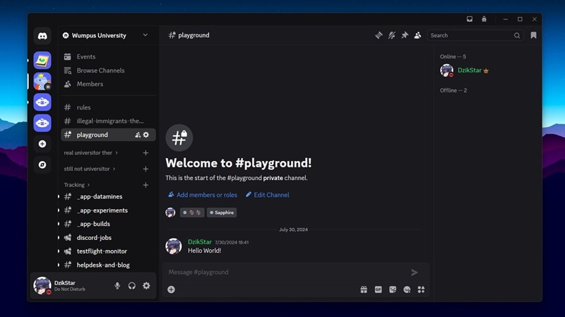
Then there’s the text box. It’s now twice as thick! Why? Are we all suddenly writing epic poems in Discord? It just takes up valuable screen real estate, pushing the chat log further up and making users scroll more. And while we’re at it, the increased title bar is equally baffling. It’s like Discord is playing a game of “How Much Space Can We Waste?” and, well, they’re winning. And the fact that the message bar has been split into two lines with the image uploader button isolated at the very bottom is just… weird.
I get it — design trends come and go, and minimalism has been the flavor of the decade. But this isn’t minimalism; it’s misplaced maximalism. The double-layered message box, for instance, is a head-scratcher. Why does it need to take up twice as much space when the old single-bar design worked perfectly fine?
And don’t even get me started on the user info panel in the bottom left. It now awkwardly floats over the server list, hiding notifications and making it harder to navigate. And if you’re in a voice channel, the voice controls balloon up, further encroaching on the already diminished channel list. It’s a mess — a chaotic, overlapping mess that feels like it was designed by someone who’s never actually used Discord.

According to many Discord users, there’s so much wasted space in the new desktop UI. The gaps between elements are massive, making the whole thing look cluttered and inefficient. It’s like they’ve embraced the “less is more” philosophy, but completely forgot the “more of what matters” part. Some users have actually had to zoom out just to see the same amount of messages as before. That’s not good design, folks.
But it’s not just about aesthetics. Accessibility seems to have taken a hit too. Smaller icons, font changes, and the general layout make things harder to see and navigate, which is a huge problem. And let’s not forget the poor Discord banners! Apparently, they’re all messed up now, forcing creators to scramble and fix their designs.
For Discord power users who rely on the platform for everything from team collaboration to late-night gaming sessions, this new UI feels like it was designed for ants — or maybe for people who exclusively use vertical monitors (do those even exist?). In addition to squinting to figure out which server you’re clicking on, the “…is typing” indicator is practically microscopic. The zoom and scaling options are laughably inadequate. No matter how much you tweak the settings, there’s no way to replicate the comfortable, functional layout of the old UI. If anything, Discord is forcing us to adapt to their vision of “modern design,” even if it means sacrificing usability.
And the worst part? There’s no way to revert! Despite previous claims that there’s an option to revert to the old UI in the Discord app’s Settings > Appearance, reports from those with the new desktop interface suggest you’re stuck with this “refresh,” whether you like it or not.
Look, I get it. UI updates are sometimes necessary. But this? This feels like a complete misstep. It reminds of the Discord mobile UI changes that backfired last year. So was the case with Sonos’ redesigned app. It’s a classic case of fixing what wasn’t broken and breaking what was perfectly fine. Discord, please, listen to your users. And maybe, just maybe, test these changes a bit more thoroughly before unleashing them on us all. Because right now, this new UI feels less like a refresh and more like a design disaster.
TechIssuesToday primarily focuses on publishing 'breaking' or 'exclusive' tech news. This means, we are usually the first news website on the whole Internet to highlight the topics we cover daily. So far, our stories have been picked up by many mainstream technology publications like The Verge, Macrumors, Forbes, etc. To know more, head here.


Hillary Keverenge
712 Posts
Tech junkie. Gadget whisperer. Firmware fighter. I'm here to share my love-hate relationship with technology, one unboxing at a time.

Comments
UI/UX Design Student06-02-2025
Not to put too fine a point on it we are currently using the new UI design in my college UI Design class as an example of doing things wrong.
ReplyName*05-02-2025
I got it too. This is hell
Reply
TomTom10-02-2025
Vencord, plus turn on experiments, restart, go into experiments and find "Desktop Refresh", activate it and set to "Treatment 0: Control" That gets you back to the proper UI and away from this new trash.
Reply