It’s not the first time YouTube has been on a UI redesign spree. From vanishing like counters and chopped-up video titles to fiddling with subscribe button on Android TV and even redesigning the miniplayer layout, the platform’s changes have stirred up their fair share of online murmurs. But now, YouTube Shorts has caught the tweaking bug, and its icons are looking a little… slimmer.
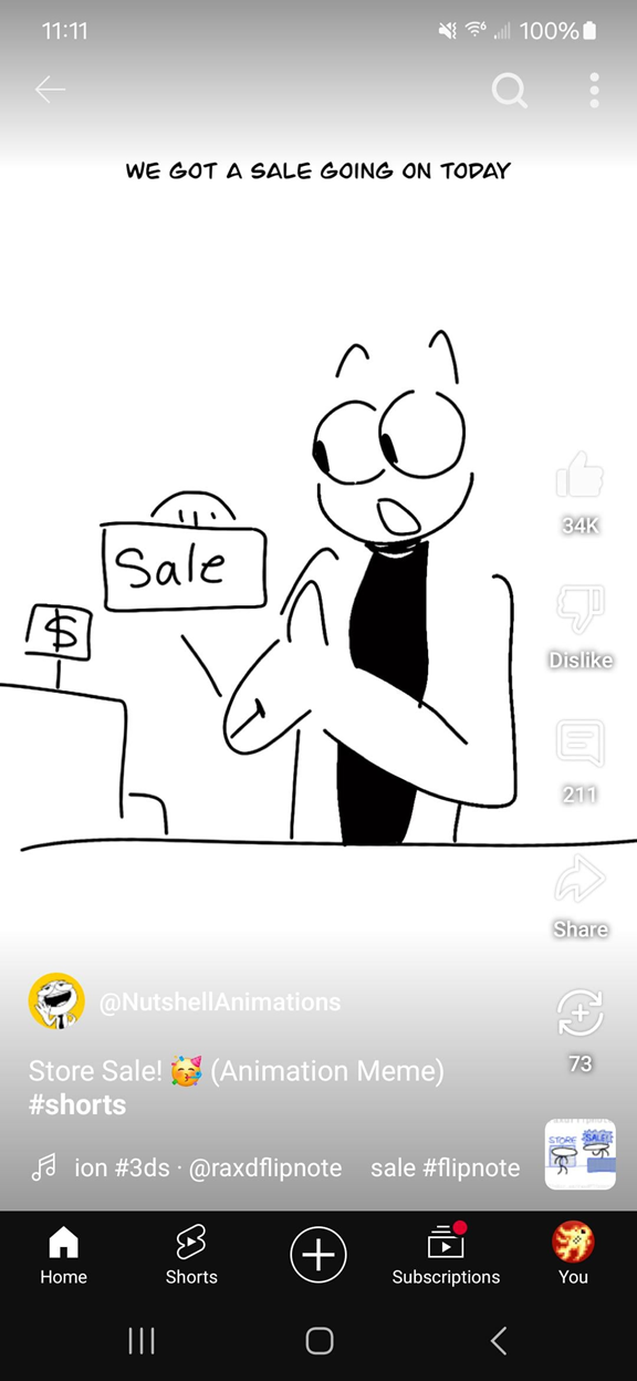
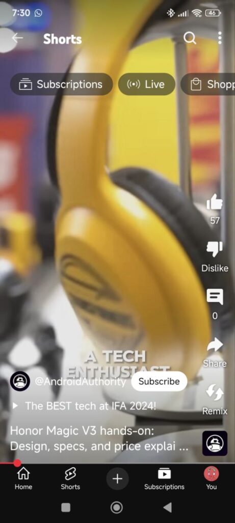
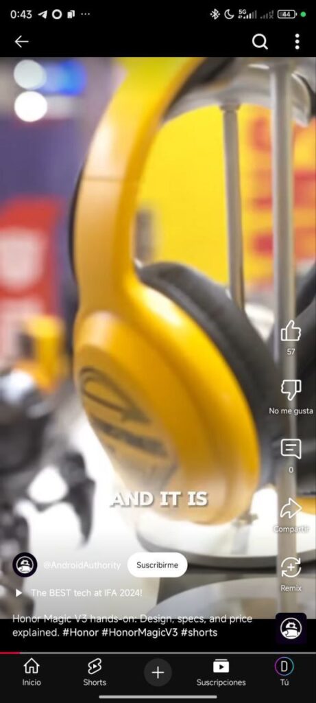
In what seems to be a phased rollout, some users have noticed a subtle yet jarring change in the icons on YouTube Shorts player UI: the once-bold, fully filled icons are now reduced to mere outlines. The thumbs up, thumbs down, and share buttons have shed their filled-in look for a more minimalist outline design. For others like yours truly, the familiar solid icons still stand strong, creating a split between the two styles that’s adding an extra layer of confusion.
As expected, the reaction has been a mix of bewilderment, frustration, and classic internet ire. Some users feel the outlined icons make the UI look weaker or less defined, especially on videos with light backgrounds where the outlined icons seemingly fade away. Others are less kind, suggesting that the new look has somehow managed to make an already divisive UI even worse.

The transparent, outline-only icons, while perhaps intended to feel sleek and modern, are getting mixed reviews from those who preferred the previous boldness of fully filled icons. For some, the change is downright disruptive — making it harder to distinguish buttons at a glance. A few have even expressed nostalgia for the “chunkier” buttons, arguing that they stood out better and felt more intuitive. And I agree.
So, what’s the deal with these constant tweaks? YouTube hasn’t yet provided a clear answer on why the Shorts icons have been given this new treatment or whether this will be the permanent look. And while user feedback hasn’t been entirely favorable, it remains to be seen if YouTube will listen or if these slimmed-down icons are here to stay. Until then, YouTube fans can add this to the growing list of design tweaks they love to hate.
For now, it seems the age-old battle continues between YouTube’s designers and its dedicated user base — some in favor of sleek minimalism, others longing for the bold and the familiar.
TechIssuesToday primarily focuses on publishing 'breaking' or 'exclusive' tech news. This means, we are usually the first news website on the whole Internet to highlight the topics we cover daily. So far, our stories have been picked up by many mainstream technology publications like The Verge, Macrumors, Forbes, etc. To know more, head here.


