


YouTube is constantly tweaking its interface. Sometimes these changes are subtle. Other times, they completely change how we interact with the app. It looks like the video giant might be experimenting with a significant visual overhaul for its mobile app, specifically how video titles and channel names are displayed on the home feed and elsewhere.
Reports have surfaced online, primarily Reddit, showing a different layout for video listings. Instead of the familiar format where the video title and channel name appear neatly below the thumbnail image, this new test UI places them directly on the thumbnail itself. A semi-transparent overlay appears at the top of the thumbnail, housing both pieces of information.
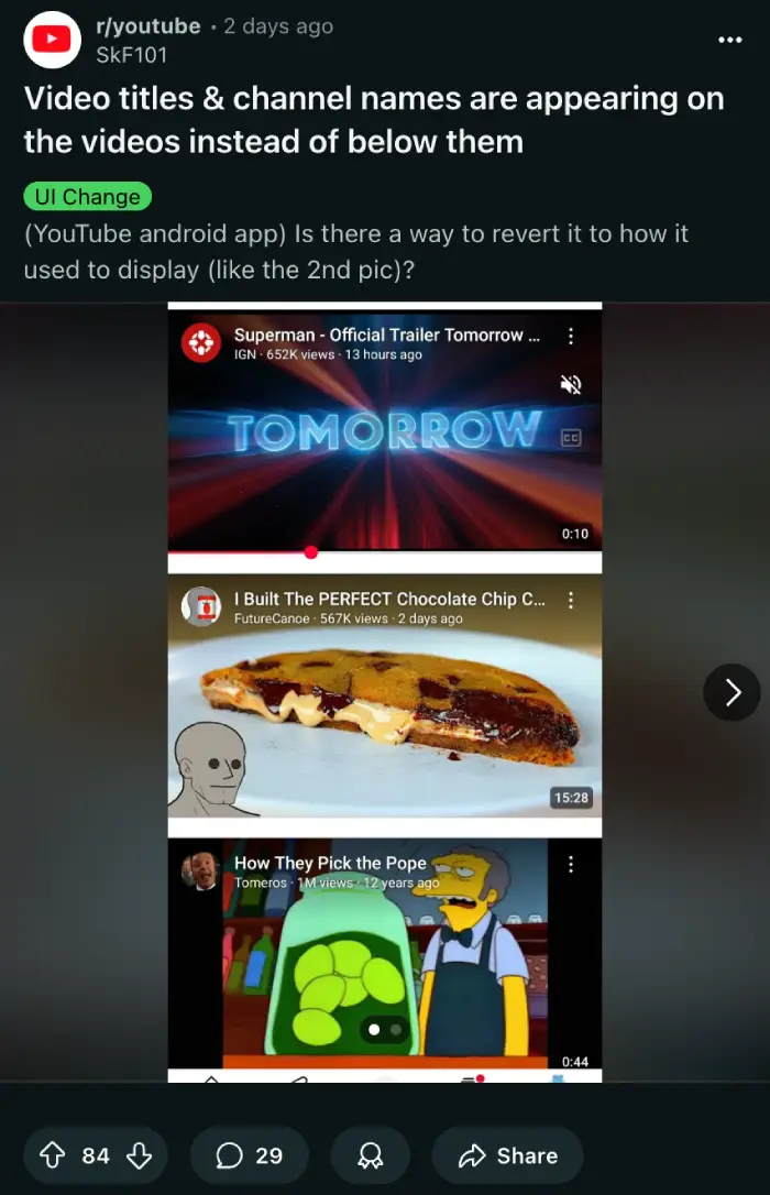
From what users are sharing, this isn’t a widespread rollout yet. It seems to be a limited test affecting a subset of users. I’ve checked on three different Android devices here, and also on an iPhone, but I can’t see this new layout on any of them. This suggests it’s likely an A/B test or a gradual release to gather feedback.
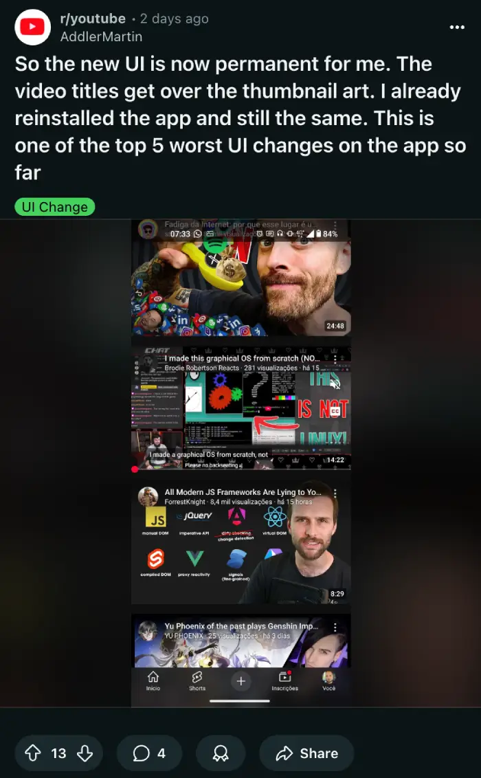
However, the initial reactions from those who do have it are not overwhelmingly positive. Many users are finding the new look disruptive. The text overlaying the image can make both the title and the thumbnail’s content hard to see.
One user on Reddit, DBialy, shared their frustration, saying,
This UI update is so stupid… Half of the time You can’t even read the title because it’s on top of white background…
Another user, Lucky-Sherbert1007, echoed similar concerns about readability.
It’s made almost all titles completely illegible, plus it’s usually covering text in the thumbnail too, making both the title and thumbnail illegible. Truly one of the worst UI changes I’ve ever seen, and I can’t find a way to switch it back.
Some comments even drew comparisons to much older versions of the YouTube app interface from around 2012, though opinions on that comparison were mixed. The main point of contention appears to be the impact on usability and the difficulty in quickly scanning through videos to find something to watch. After looking at screenshots shared online, I’m hoping this experiment doesn’t go forward.
For content creators, this potential change could also be significant. Thumbnail design is a crucial part of getting views. If titles and channel names are going to cover the top portion of the thumbnail, creators might need to adjust how they design their images to ensure key visuals or text aren’t obscured.
That said, it’s worth noting that this is just a test, at least at the time of this writing. It’s possible that YouTube may refine the UI further or even discontinue the redesign. For now, most users will continue to see the standard layout, but we’ll have to wait and see if this superimposed title design becomes a permanent fixture.
Recently, YouTube also tweaked the homepage UI with massive thumbnails. Then it’s also testing a new media player UI with floating buttons. The platform also revamped the search UI a bit to make channels stand out. So it’s clear that the team isn’t done tweaking the UI, for better or worse.
Featured image credit: jtimm615 / Reddit
TechIssuesToday primarily focuses on publishing 'breaking' or 'exclusive' tech news. This means, we are usually the first news website on the whole Internet to highlight the topics we cover daily. So far, our stories have been picked up by many mainstream technology publications like The Verge, Macrumors, Forbes, etc. To know more, head here.


Dwayne Cubbins
1455 Posts
For nearly a decade, I've been deciphering the complexities of the tech world, with a particular passion for helping users navigate the ever-changing tech landscape. From crafting in-depth guides that unlock your phone's hidden potential to uncovering and explaining the latest bugs and glitches, I make sure you get the most out of your devices. And yes, you might occasionally find me ranting about some truly frustrating tech mishaps.

